
Client: Orthoticare
Sector: Healthcare / Orthotics & Orthopedic Care
Services: Brochure Strategy / Print Collateral Design / Information Architecture / Patient & Referral Communication / Graphic Design / Print-Ready Production
Primary Audience: Patients, Families, Physicians & Healthcare Referral Partners
Project Objective: Modernize Orthoticare's existing tri-fold brochure into a clear, credible communication tool that helps patients understand its services and supports healthcare-professional referrals.
Orthoticare / A Brochure Redesign Built Around Patient Education and Healthcare Referrals
Turning an outdated clinic brochure into a clearer, more professional communication tool that helps patients understand care and physicians confidently share information.

The Problem
Orthoticare already had valuable services to offer patients, but its existing brochure was no longer communicating those services as effectively as the clinic needed.
The older tri-fold brochure required a more contemporary presentation, stronger organization and a clearer explanation of the clinic's orthotic and orthopedic care offerings.
For a healthcare clinic, this creates a challenge that extends beyond visual appearance.
Patients may be unfamiliar with orthotics or uncertain about how particular services relate to their needs. Physicians and other healthcare professionals, meanwhile, have limited time to explain every service in detail during a consultation.
Orthoticare needed printed material that could continue that conversation independently.
The challenge was to transform an aging brochure into a professional resource that patients could understand, healthcare professionals could comfortably distribute and the clinic could confidently display.

The Strategic Challenge
The project needed to accomplish more than simply updating the brochure's colours, typography and imagery.
Orthoticare's printed materials served two distinct audiences with different information needs.
Patients and families needed approachable explanations that made orthotic care easier to understand. Physicians and referral partners needed concise, credible information they could share without requiring a lengthy explanation.
The tri-fold format also introduced a physical constraint.
With only six panels available, every section needed a clear purpose. Trying to communicate too much information at once would create unnecessary reading friction and make important details harder to find.
NAV needed to balance patient education, clinical credibility, visual clarity and practical referral communication within a compact printed format.
The result had to feel professional without becoming overly technical, informative without becoming overwhelming and visually appealing without compromising its primary function.
The Strategic Insight
The central insight behind the project was simple:
A healthcare brochure should continue the conversation when the healthcare professional cannot.
Orthoticare did not simply need a newer version of its existing brochure.
It needed a printed communication tool capable of answering fundamental patient questions, establishing confidence and helping readers understand what to do next.
That required treating the brochure as an information-design project rather than a purely decorative exercise.
Each panel needed to play a deliberate role in the reader's experience, from introducing Orthoticare to explaining its services and presenting practical contact information.
Instead of asking, "How can we make this brochure look more modern?" the more useful question became:
"How can this brochure make Orthoticare's services easier to understand and refer?"
That distinction shaped the entire redesign.
The Solution
NAV Branding redesigned Orthoticare's tri-fold brochure around a clearer information hierarchy, a more contemporary healthcare aesthetic and a deliberate patient-and-referral communication flow.
The new layout organized information so readers could move naturally from recognizing the clinic to understanding its services and identifying their next step.
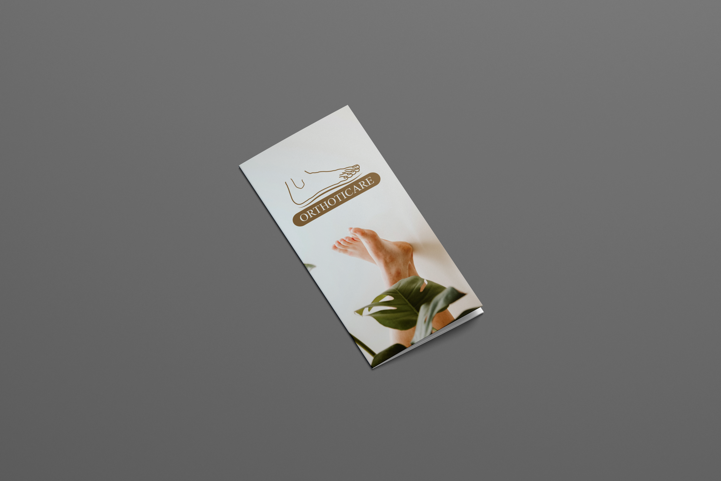
The front panel established Orthoticare's professional presence with a clean, recognizable presentation.
Inside, service information was separated into more digestible sections, using stronger typography, spacing and visual hierarchy to help patients identify relevant information without navigating dense blocks of text.
Healthcare-appropriate photography and supporting visual elements made the content more approachable, connecting clinical services to people, movement and everyday needs.
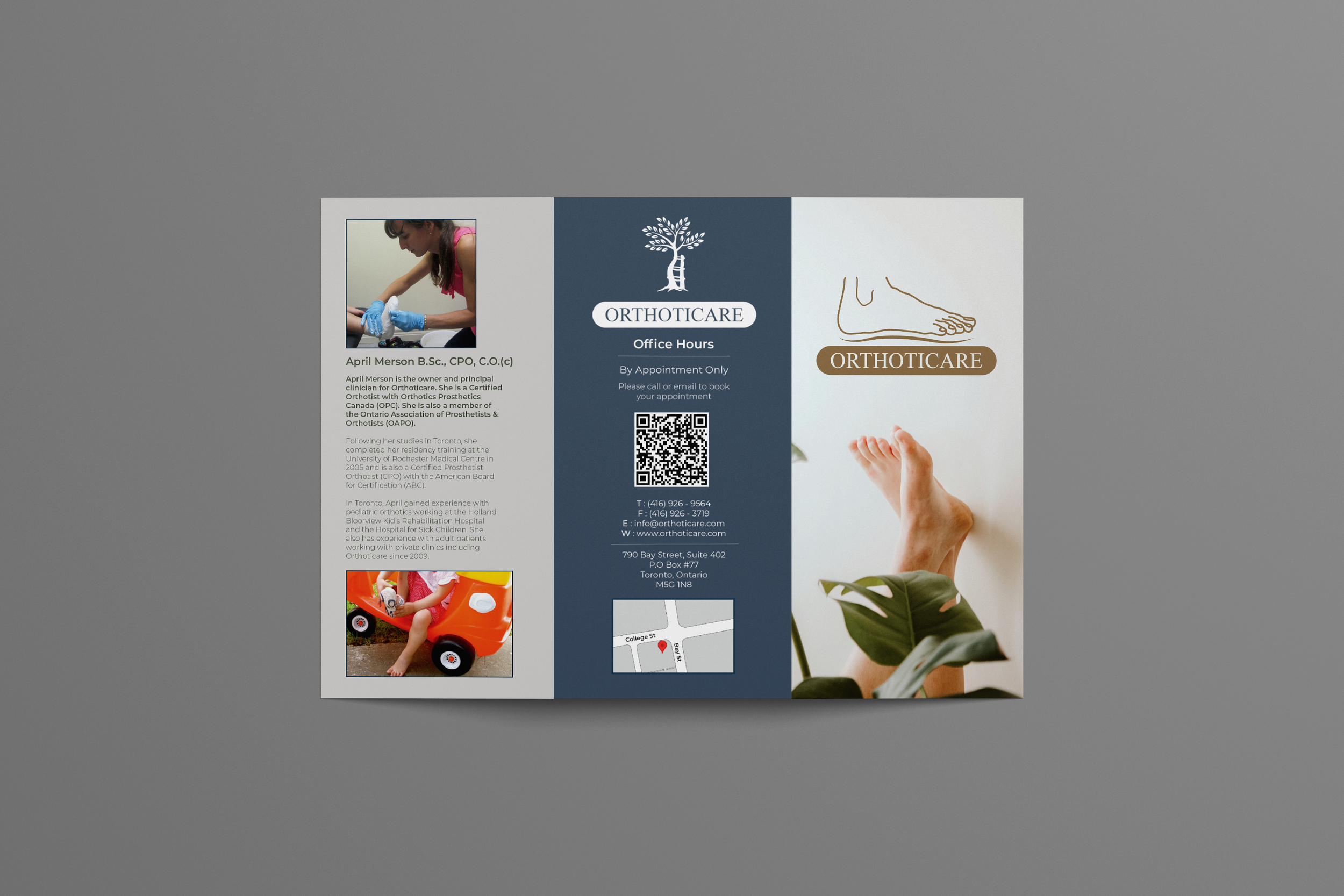
The exterior panels prioritized practical information, including contact details, office information and location guidance, so readers could quickly return to those details when needed.
Referral-oriented messaging helped connect the printed material to the conversations taking place between patients and their healthcare providers.
Throughout the design process, NAV preserved Orthoticare's established clinic identity while introducing a cleaner and more cohesive visual presentation.
The finished design was prepared for professional print production, giving Orthoticare a practical communication asset suitable for its clinic and healthcare referral environments.
The Deliverables
NAV Branding created a redesigned patient-and-referral brochure system that included:
Brochure strategy and information architecture: A clearer communication structure organized around the needs of patients, families and healthcare professionals.
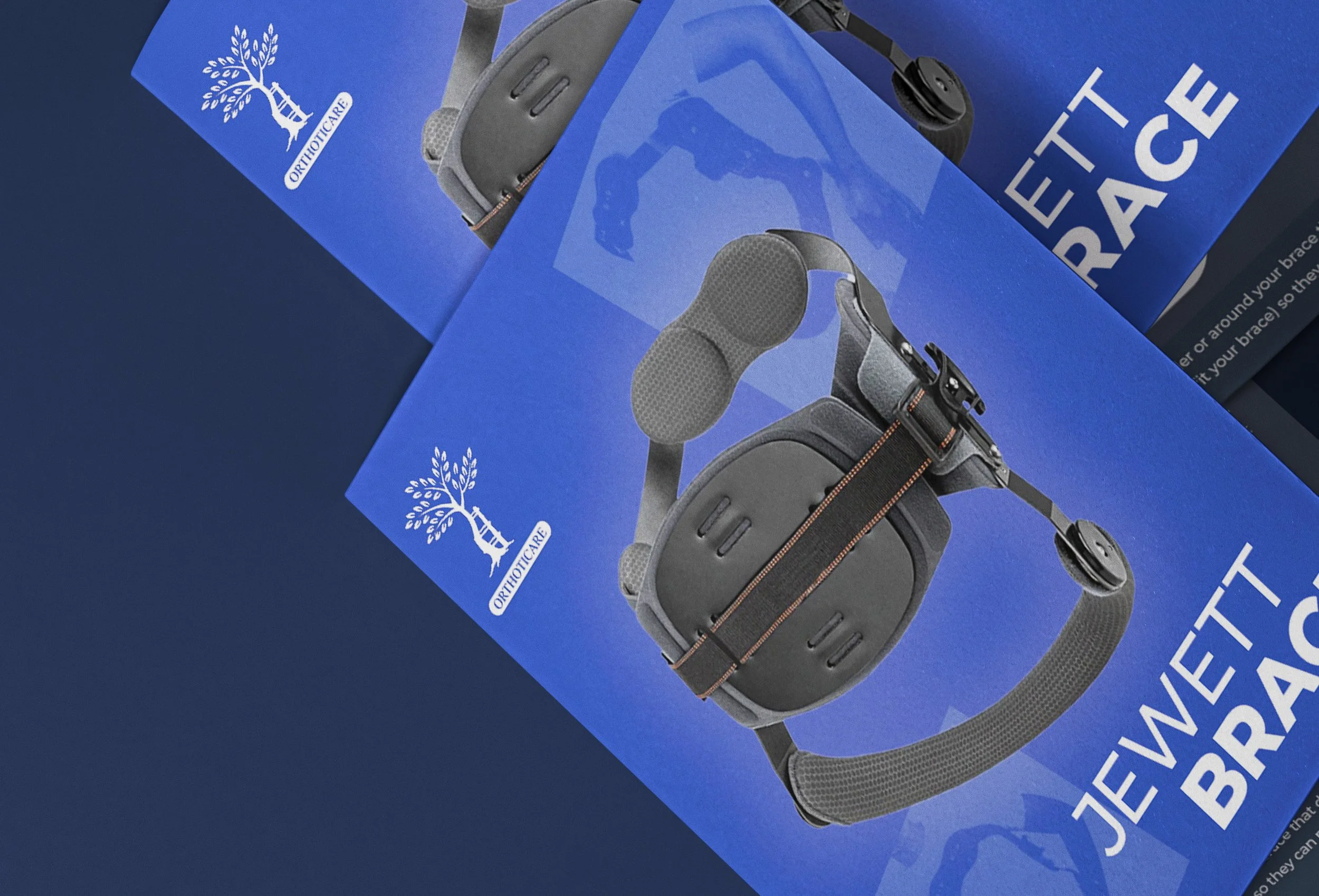
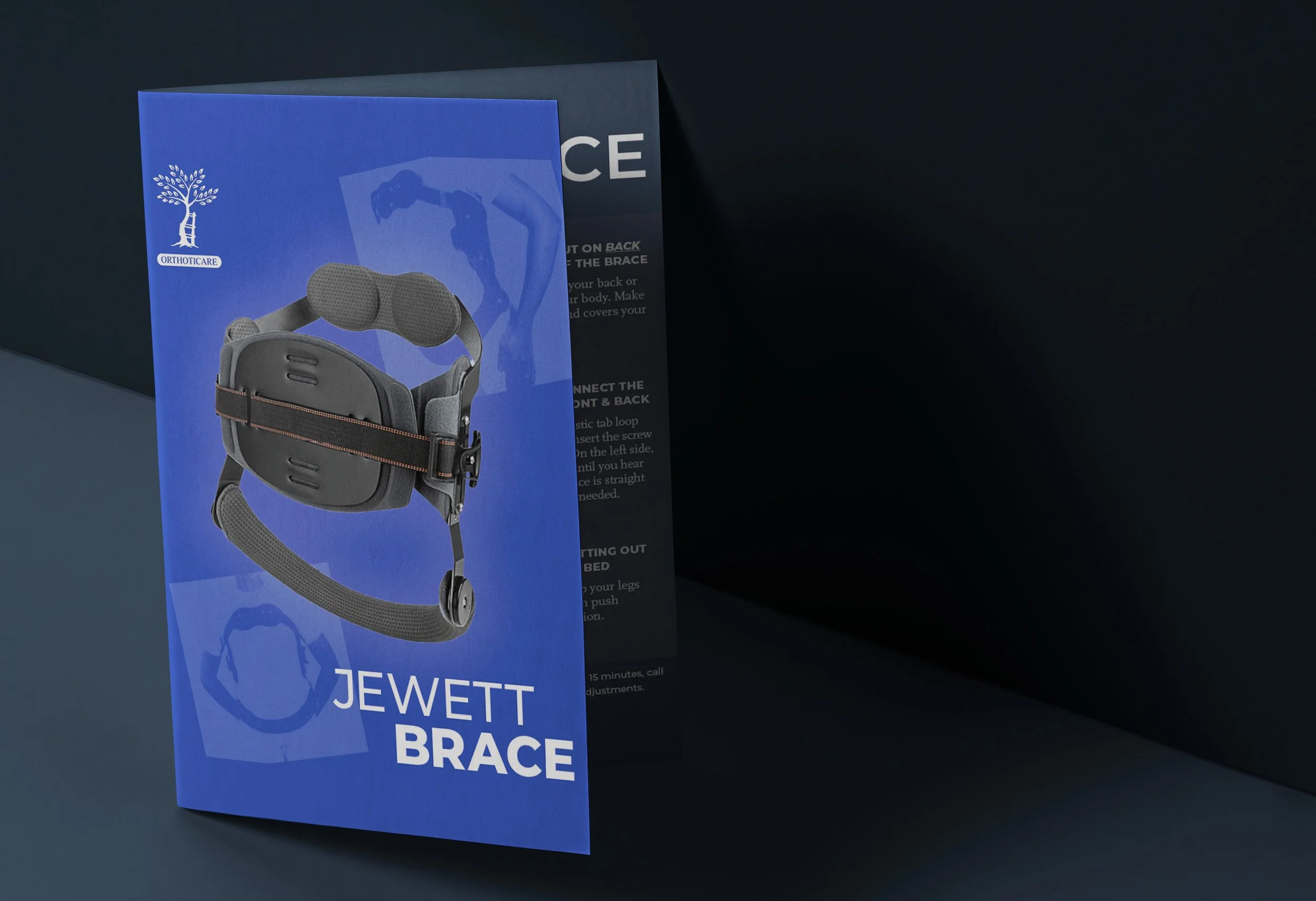
Complete tri-fold brochure redesign: A modernized six-panel layout built to present Orthoticare's services professionally.
Patient-focused information hierarchy: More scannable service content that helps readers understand relevant offerings without unnecessary complexity.
Referral-oriented messaging: Communication cues designed to help physicians and other healthcare professionals introduce Orthoticare to patients.
Updated typography and visual composition: Improved spacing, layout consistency and visual hierarchy for stronger readability.
Healthcare-appropriate imagery: Supporting photography and visual elements that make specialized care feel more understandable and approachable.
Contact and clinic information presentation: Clear placement of practical details to support the reader's next step.
Print-ready production and revision support: Professionally prepared design files, refined through collaborative feedback with the client.
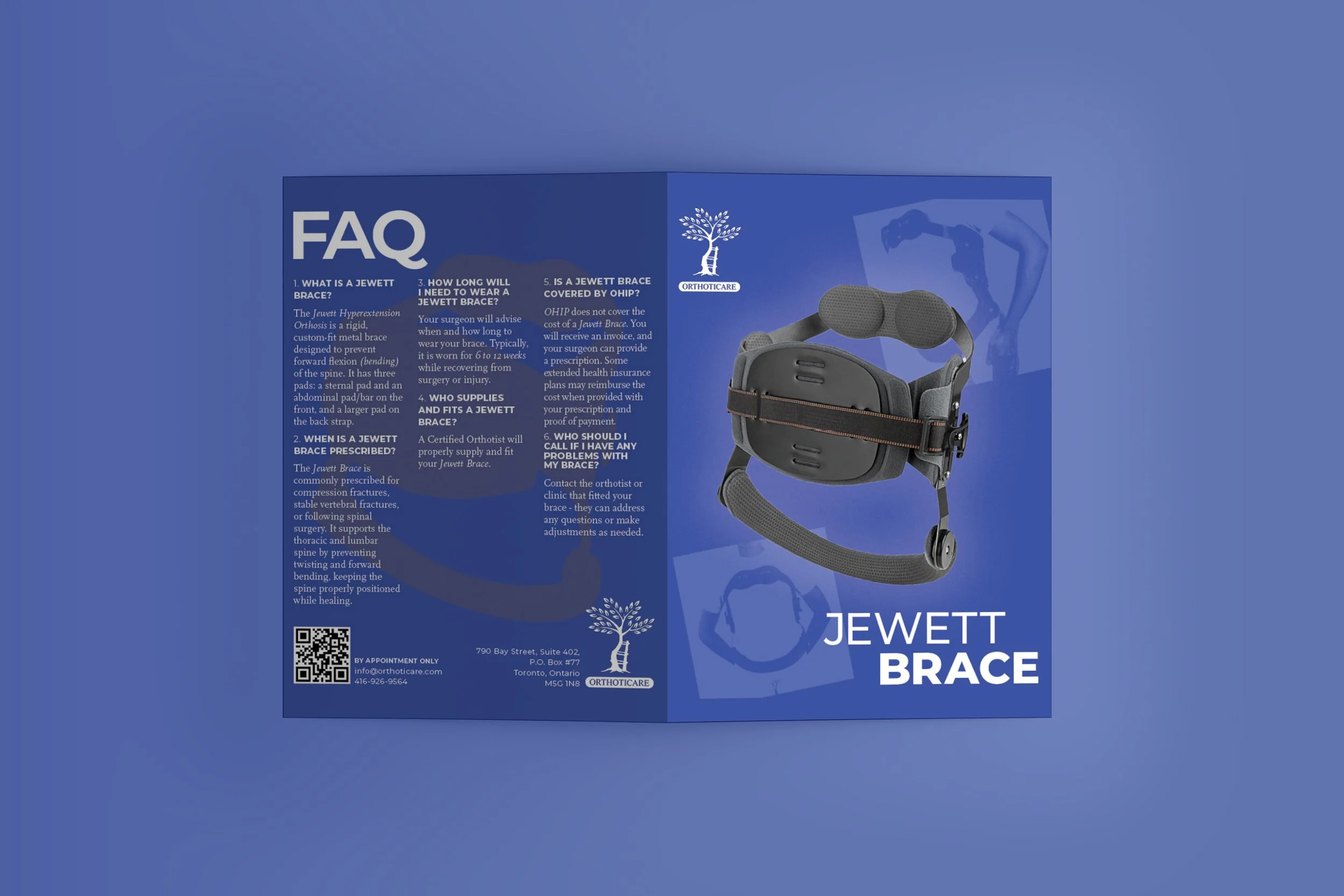
The Outcome
Orthoticare received a substantially more modern brochure designed to communicate its services with greater clarity and confidence.
For patients, the redesigned material offered a more approachable introduction to the clinic's services, helping them better understand the information being presented.
For physicians and referral partners, the brochure provided a practical resource for explaining Orthoticare's offerings beyond a brief consultation.
For the clinic, it created a more professional and consistent physical representation of its work.
NAV's previously published account of the project reported that physicians actively distributed the brochures and that patients arrived better informed.
That same account attributed a 30% increase in referrals within the first two months to the project, as reported by Orthoticare's owner.
While this remains a previously reported result rather than an independently verified performance measurement, it illustrates the potential value of strategically designed healthcare collateral.

"NAV BRANDING took my old brochures and updated them with great detail and created a more modern look."
— April Merson, Owner, Orthoticare
When Printed Materials No Longer Reflect the Quality of Your Services
Many established healthcare organizations outgrow their printed materials long before they realize it.
A clinic may provide excellent care, employ experienced professionals and have a strong reputation, while continuing to rely on brochures and patient materials that no longer communicate that quality effectively.
The information may be accurate, but its presentation can make it difficult to absorb. Important services become buried in paragraphs. Contact details compete with less essential content. Healthcare professionals may need to supplement the materials with additional explanations.
Those are not always problems that require more information.
Often, they require better communication.
Through the Orthoticare project, NAV Branding used strategic information design, visual hierarchy and a referral-focused structure to help an established clinic present its expertise more clearly.
A well-designed brochure should do more than occupy space in a waiting room or physician's office.
It should help people understand your services, reinforce confidence in your organization and make the next step easier.

Does Your Clinic's Expertise Still Live Inside Outdated Patient Materials?
Your clinic may not need another brochure filled with more information.
It may need a clearer, more effective way to communicate the value of the services you already provide.
NAV Branding helps clinics, healthcare organizations and professional service businesses transform complex information into clear, credible print collateral that patients can understand and healthcare professionals can confidently share.
From brochures and educational materials to branded publications and professional collateral, we design communication tools that work beyond the page.