
Project Description: Dual-Sided Flyer Design for Marvelous Touch Cleaning (Rebrand Collateral)
Client: Marvelous Touch Cleaning
Project Type: Two-Sided Flyer Design (Print + Digital)
Services Provided: Graphic Design, Layout & Composition, Brand Alignment, Print-Ready Production
Overview
As part of Marvelous Touch Cleaning’s rebrand, NAV Branding designed a high-converting, dual-sided flyer built to do two jobs at once: grab attention fast and close the trust gap that stops people from booking a cleaning service. The flyer was structured for real-world distribution—mail drops, lobbies, community boards, and partner referrals—while remaining clean and readable for digital sharing.
Issues Identified
Needed stronger “first impression” marketing: The business required a flyer that instantly communicates professionalism, service scope, and reliability.
Trust + conversion needed to live in one piece: Prospects needed quick reassurance (licensed/insured, experience, guarantee) alongside a clear booking path.
Offer clarity for new client acquisition: A simple promo needed to be obvious, easy to claim, and easy to track.
Key Outcomes
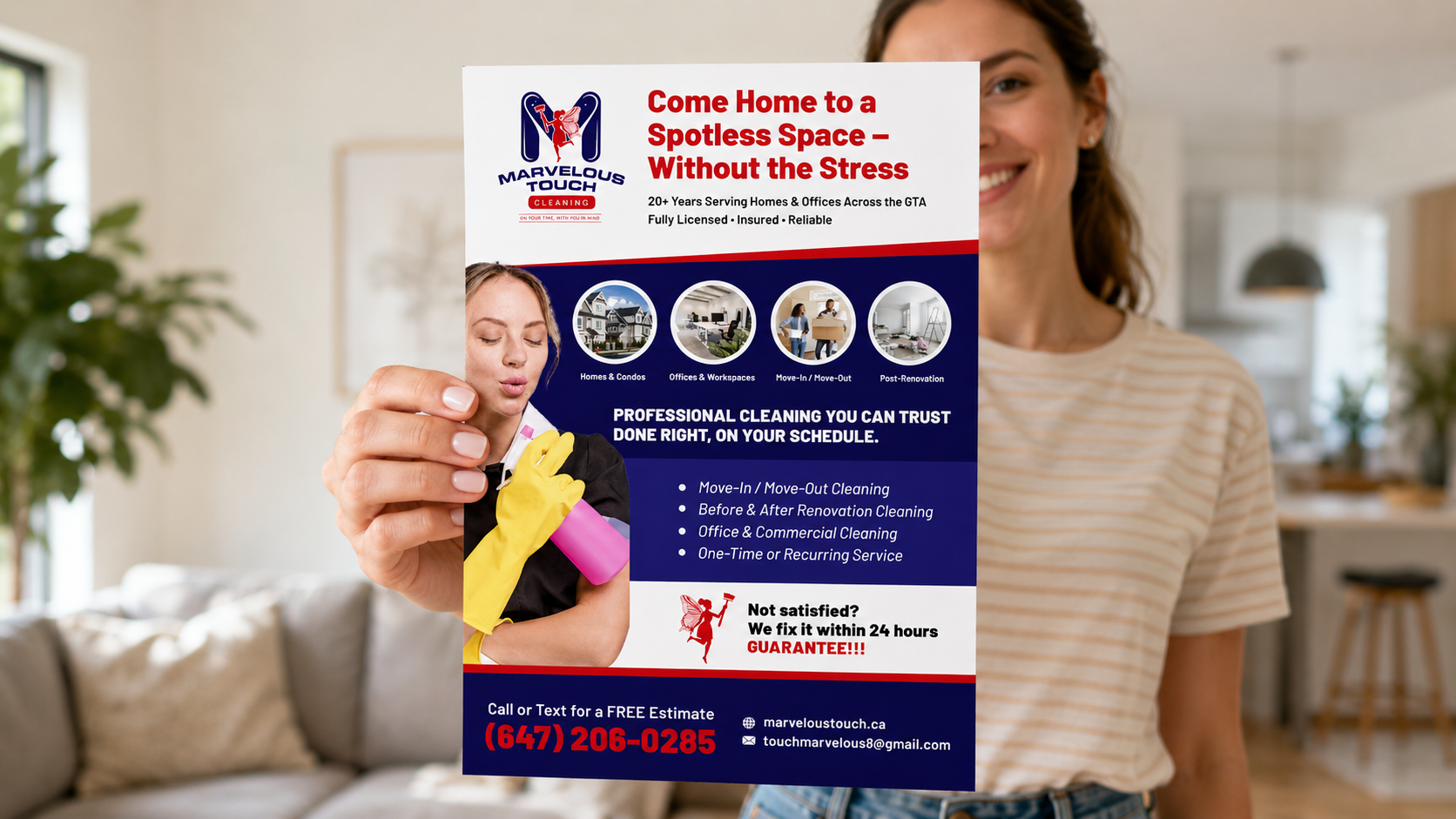
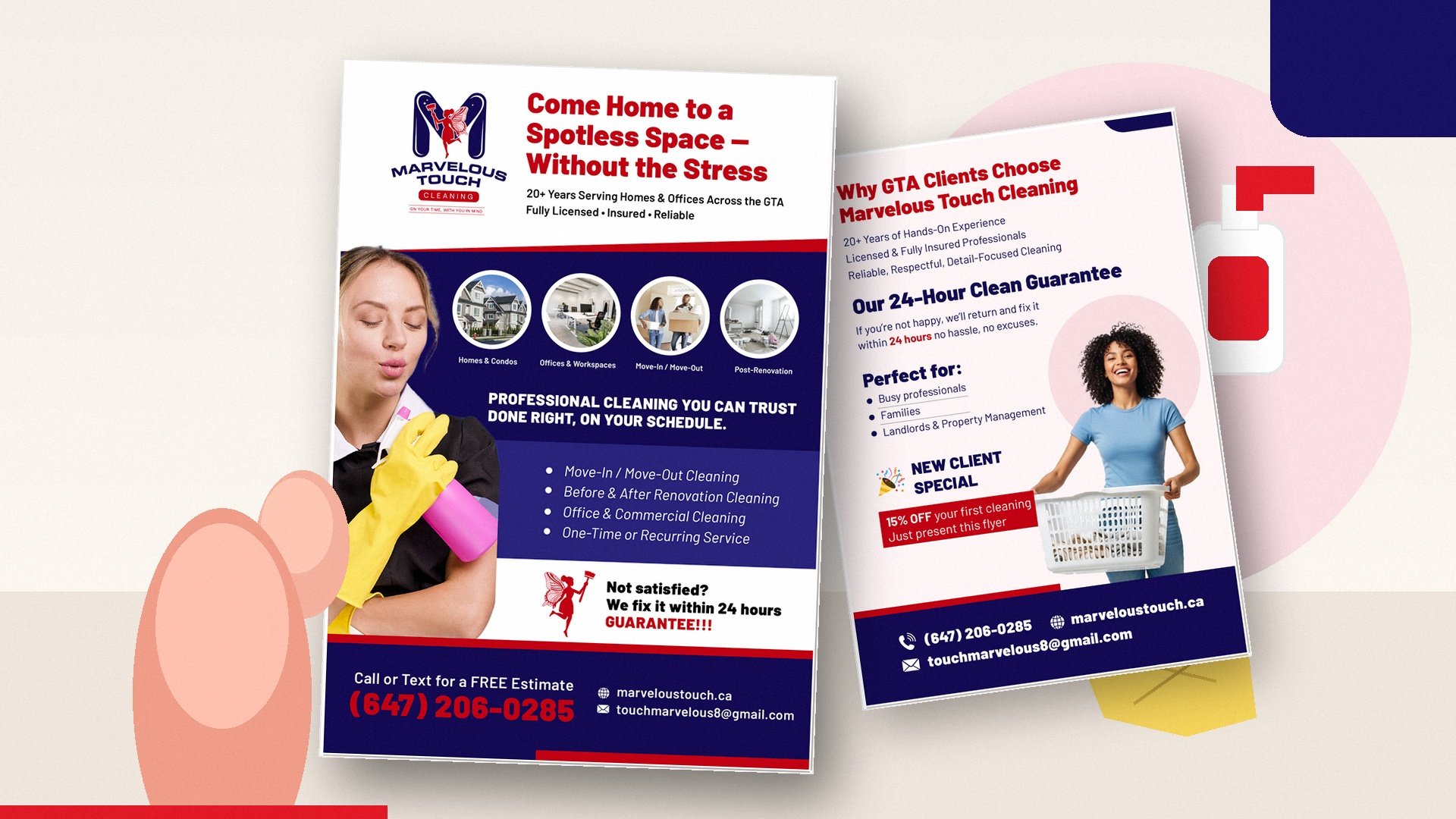
Front Side = Hook + Services + Immediate Action:
NAV built the front around a bold headline (“Come Home to a Spotless Space — Without the Stress”), reinforced with credibility cues (20+ years, licensed & insured), and a tight list of core services (Move-In/Move-Out, Renovation Cleaning, Commercial, One-Time or Recurring). A large phone-first CTA (“Call or Text for a FREE Estimate”) prioritizes fast conversions.Back Side = Trust Stack + Guarantee + Offer:
The back focuses on why clients choose the company—experience, professionalism, and detail-focused service—then anchors the decision with a bold 24-hour clean guarantee (“If you’re not happy, we’ll return and fix it within 24 hours”). It closes with a simple new client acquisition lever: “15% OFF your first cleaning” with “Just present this flyer.”Rebrand Consistency:
The flyer uses Marvelous Touch’s updated visual identity (bold red/navy contrast, clean hierarchy, recognizable brand marks) to ensure the piece feels consistent with the refreshed logo and overall brand direction.Designed for Distribution:
Clear sections, high legibility, and repeated contact details make the flyer effective in multiple placements—handouts, mail campaigns, front desks, property management offices, and digital PDFs.
Deliverables
Print-ready, two-sided flyer (CMYK, bleed-safe, 300 DPI)
Digital share version for email/social distribution
Structured layout system enabling quick swaps for future promos (seasonal offers, service-area targeting, referral campaigns)
Impact
This dual-sided flyer gives Marvelous Touch Cleaning a reliable sales asset: the front creates immediate interest and service clarity, while the back removes hesitation using trust signals, a guarantee, and a first-time customer incentive—turning passive awareness into booked estimates.