
Project Description: Logo & Visual Identity for Marvelous Touch Cleaning
Client: Marvelous Touch Cleaning
Project Type: Logo Design & Visual Identity System
Services Provided: Brand Strategy Support, Logo Design, Visual Identity, Brand Guidelines, Digital + Print Asset Package
Overview
NAV Branding designed a bold, memorable logo and visual identity for Marvelous Touch Cleaning—a cleaning company positioned around the idea of results so good they feel almost “magical.” The goal was to create a brand that instantly communicates trust, sparkle-clean transformation, and standout service, while remaining professional and usable across uniforms, vehicles, marketing materials, and digital platforms.
Issues Identified
Needed stronger differentiation in a crowded market: Many cleaning brands look interchangeable; Marvelous Touch needed a visual identity that felt distinctive and easy to recognize.
Balance “friendly” with professional credibility: The brand concept included a whimsical edge, but still needed to signal reliability and seriousness.
Multi-format usability: The logo had to work in small sizes (social icons), large formats (vehicle decals), and embroidery-friendly applications (uniforms).
Key Creative Solution
NAV Branding built the identity around a strong, story-driven mark:
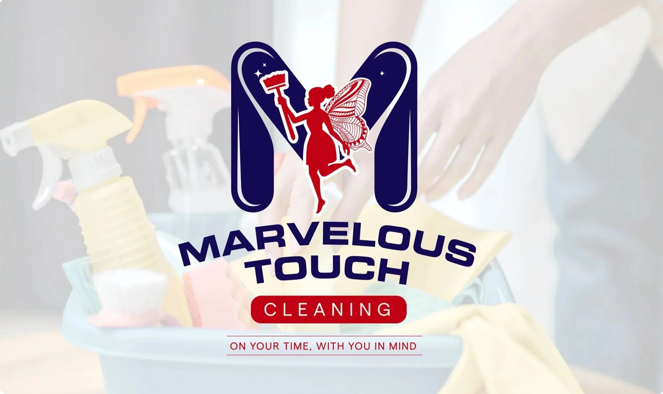
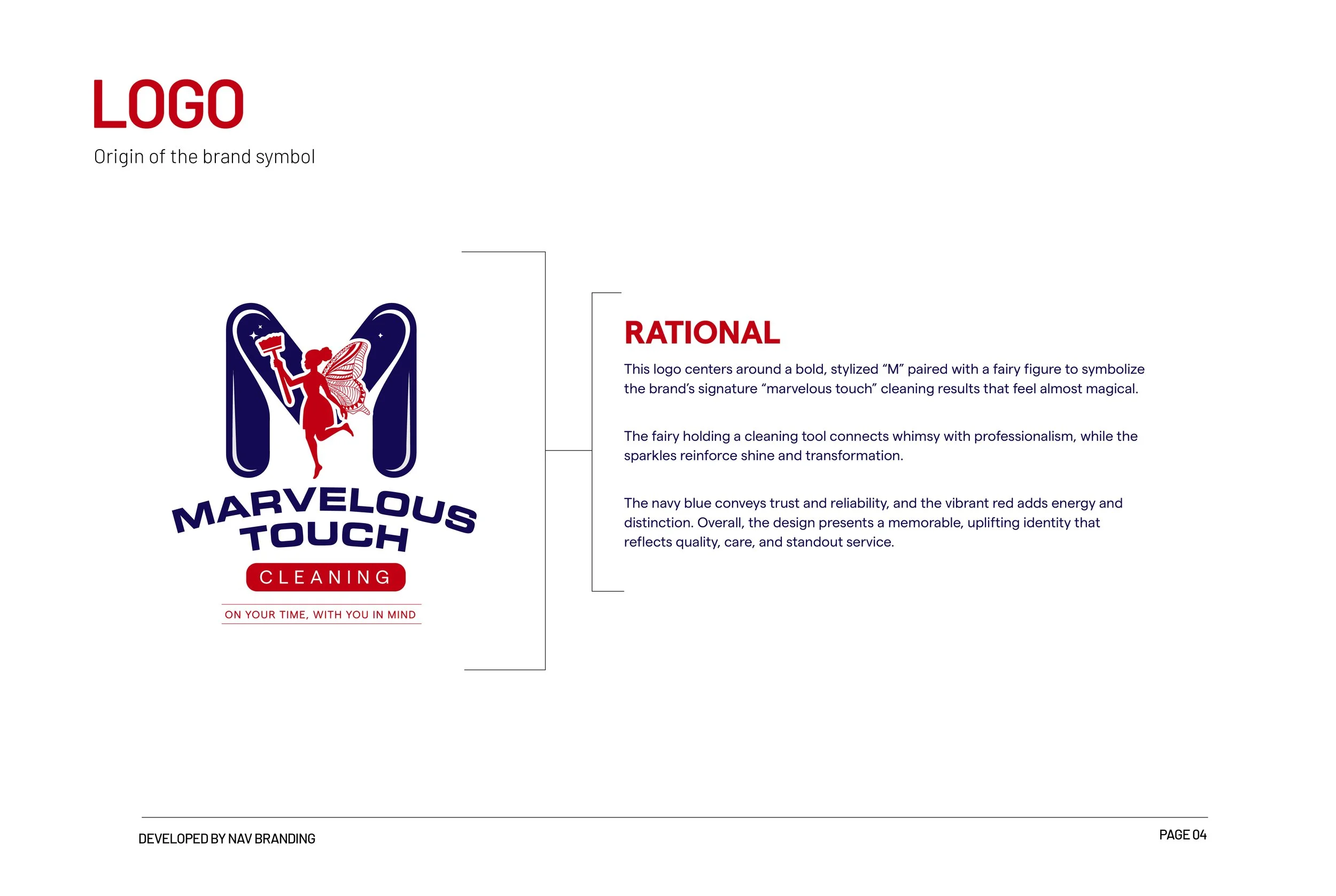
Stylized “M” Monogram: A bold, simplified letterform acts as the primary brand anchor—strong, readable, and easy to remember.
Fairy Figure + Cleaning Tool: A playful character paired with a cleaning tool represents the brand’s “marvelous touch”—results that feel effortless and transformative, without sacrificing professionalism.
Sparkle Accents: Star/sparkle elements reinforce shine, freshness, and the “before-and-after” feeling clients expect from a premium clean.
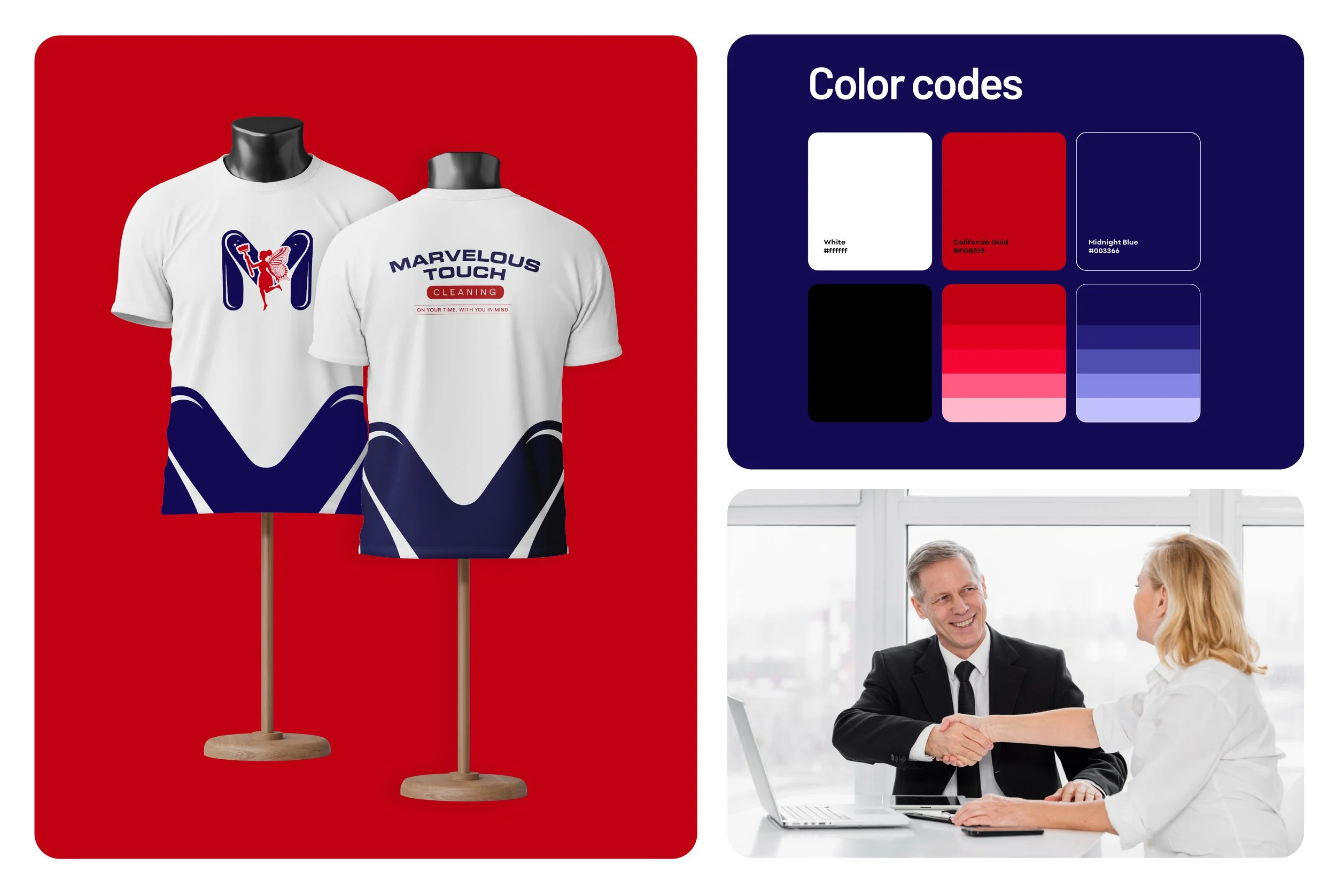
High-Trust Colour Pairing: Navy was selected to communicate trust, stability, and reliability, while vibrant red adds energy, confidence, and strong shelf presence—helping the brand pop on signage and marketing.
Key Outcomes
Distinctive, ownable identity: A logo that feels energetic and upbeat while still credible—ideal for residential and commercial audiences.
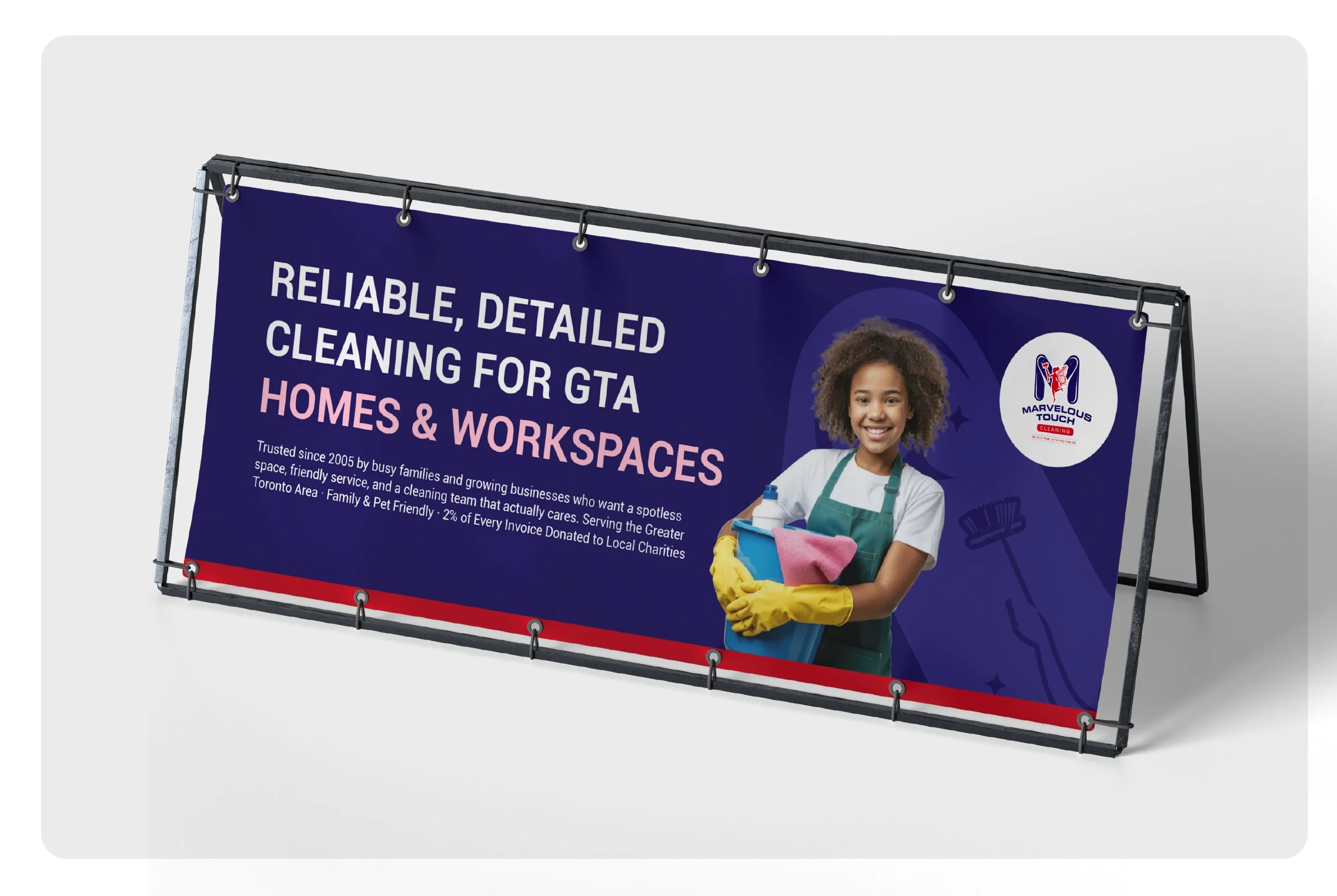
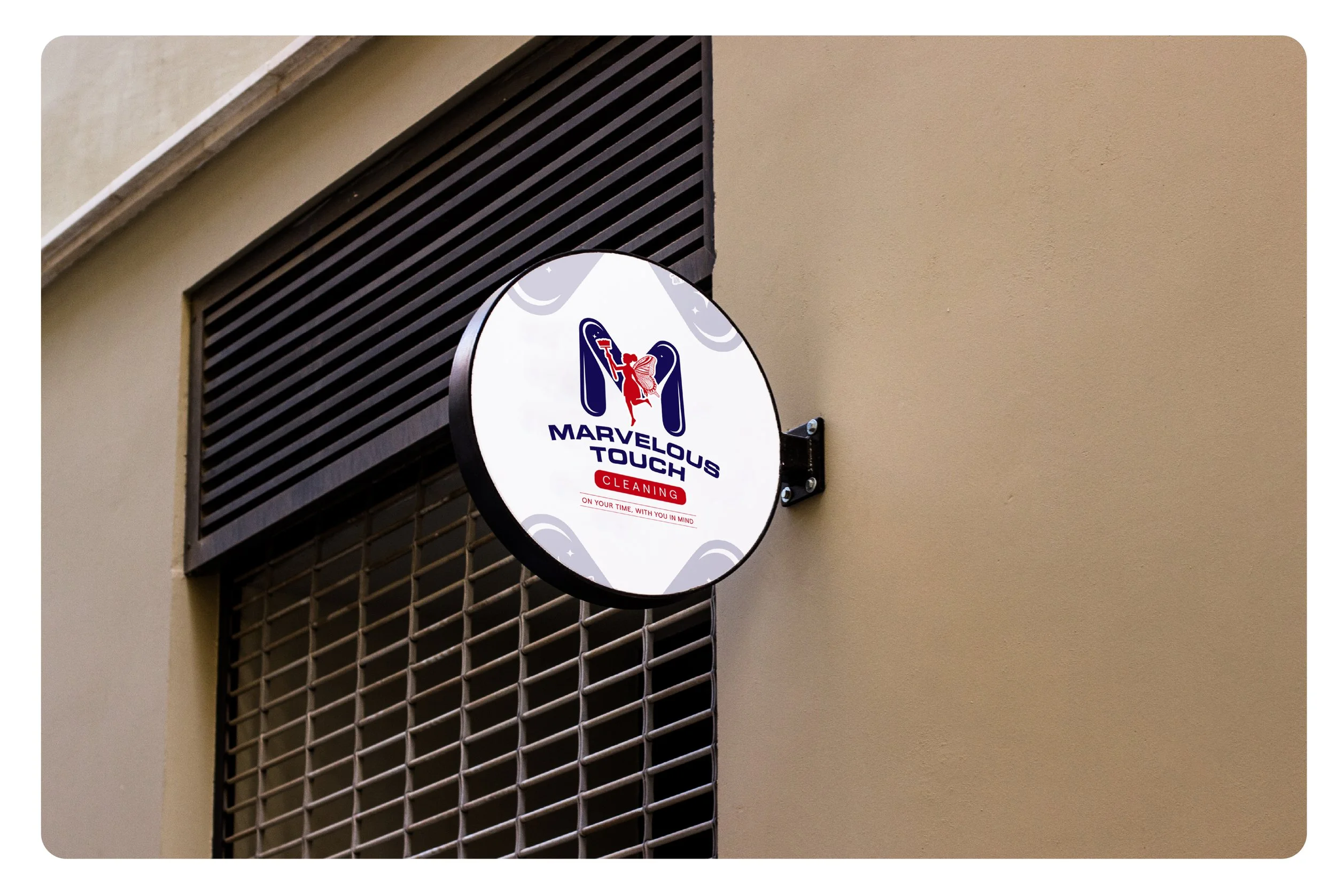
Clear hierarchy and readability: Strong typography and badge-style layout make the name legible at a distance, perfect for uniforms, yard signs, and vehicle branding.
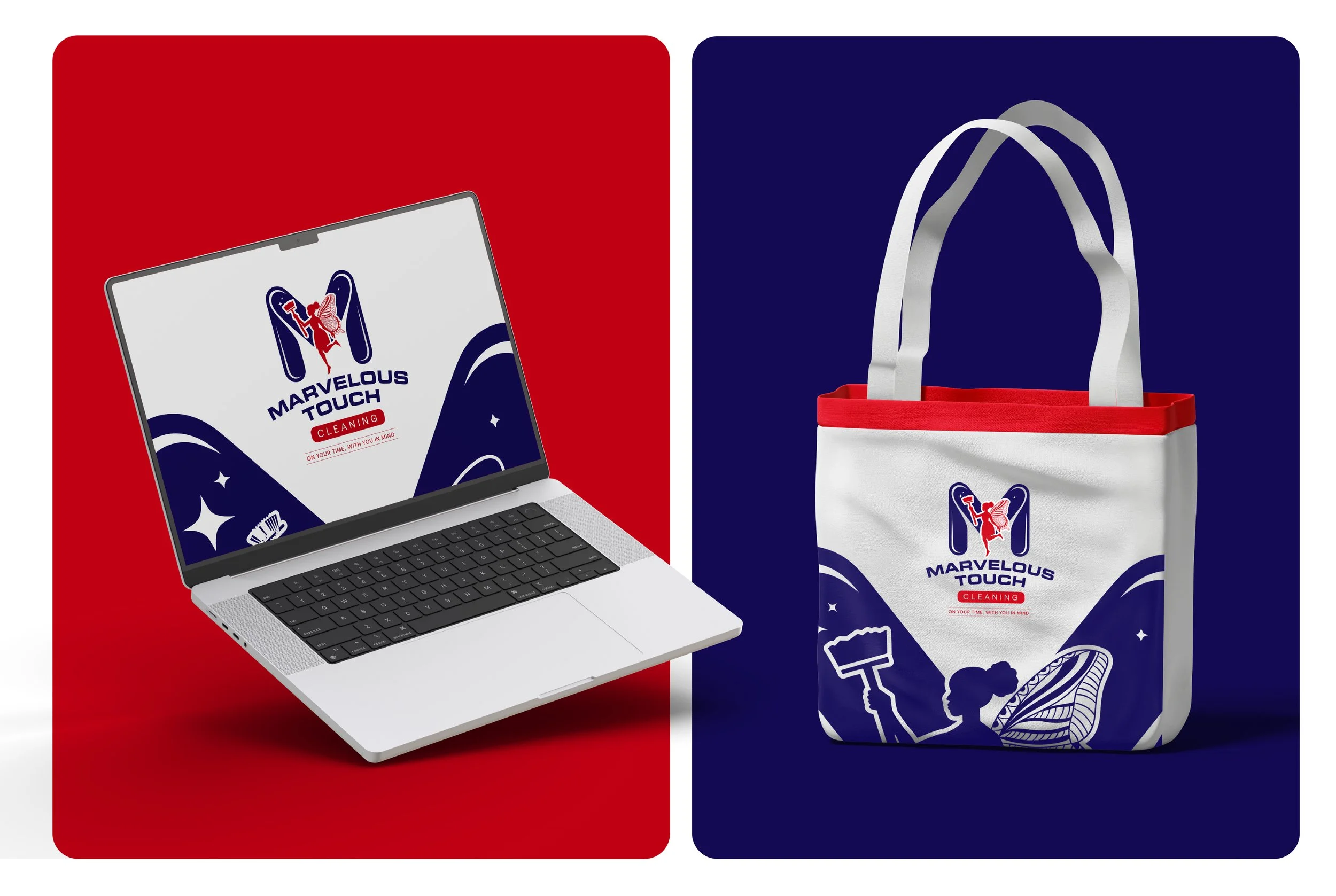
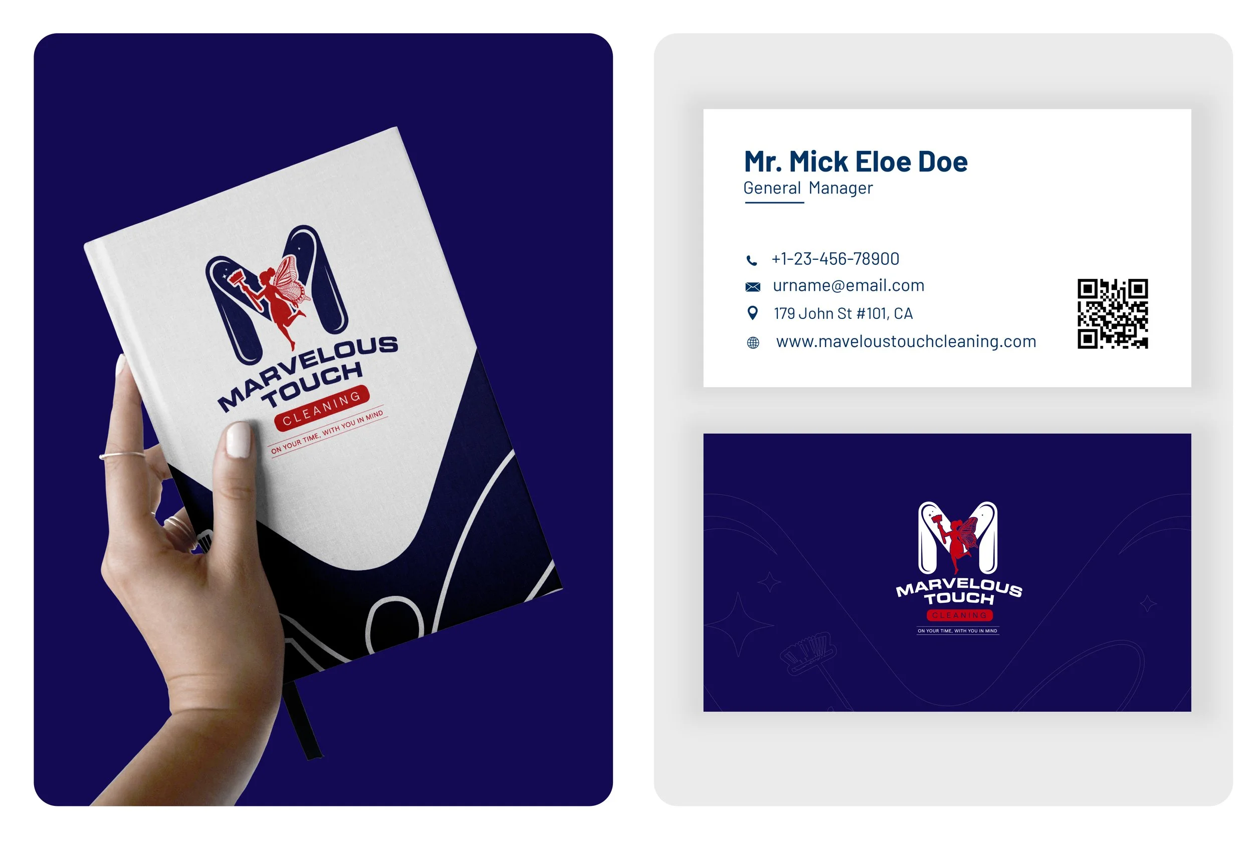
Full logo system for real-world use: Delivered icon-only, stacked, horizontal, and monochrome versions so the brand remains consistent across every format.
Brand guidelines for consistency: Clear rules for spacing, minimum size, and background usage to protect the logo’s clarity across print and digital applications.
Deliverables
Primary logo lockup + alternate versions (horizontal/stacked, icon-only, monochrome)
Brand colour palette and usage guidance (navy/red + supporting neutrals)
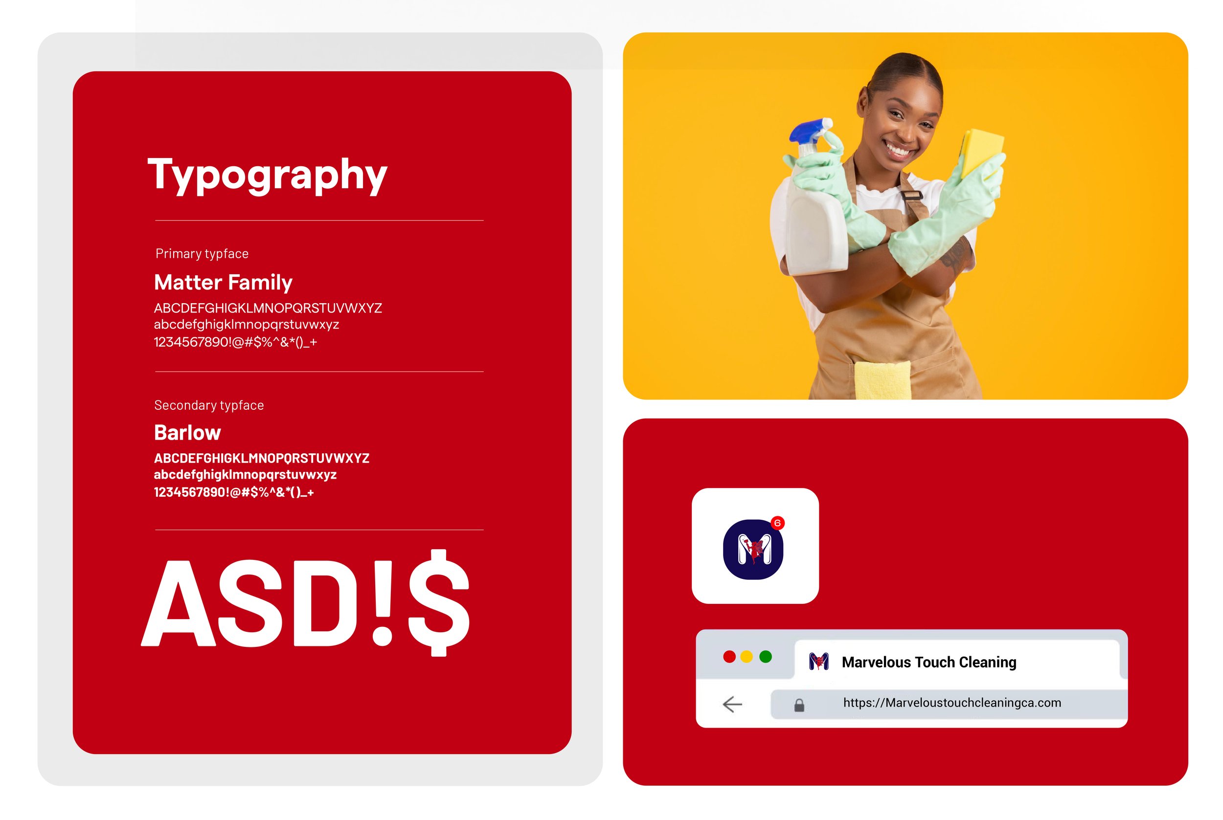
Typography recommendations and hierarchy
Brand guide: spacing rules, sizing, do/don’t usage examples
Export package: AI/SVG masters, print-ready PDFs, web/social PNGs
Impact
Marvelous Touch Cleaning now has a visual identity that instantly communicates what the brand promises: reliable service with remarkable results. The identity stands out in a competitive category, builds trust quickly, and gives the business a professional foundation for marketing, uniforms, print materials, and future growth.
At NAV Branding, we design identity systems that turn everyday services into memorable brands—clear, distinctive, and built to scale.