
Project Description: Logo & Visual Identity for True North Champions League
Client: True North Champions League
Project Type: Logo Design & Visual Identity
Services Provided: Branding, Logo Design, Identity System, Brand Guidelines, Production-Ready Assets
Overview
NAV Branding partnered with the True North Champions League to create a bold, instantly recognizable visual identity for a national-level soccer competition rooted in Canadian pride. The mark fuses a classic sports-crest sensibility with distinctly Canadian symbolism — a stylized beaver — and integrates a soccer ball into the composition to create a single, memorable emblem. The resulting identity balances tradition and modernity, delivering authority for sponsors and organizers while remaining energetic and approachable for players, fans, and community partners.
Challenges Identified
Need for a Unifying Symbol: The league required a mark that represented Canadian identity while clearly communicating the sport and competitive spirit.
Versatility Across Formats: The logo had to scale from small digital icons to large embroidered crests on jerseys, banners, and merchandise without losing detail.
Emotional & Functional Balance: The design needed to feel prestigious enough for a Champions League yet warm and inclusive to reflect community engagement and youth development.
Key Creative Solutions & Visual Strategy
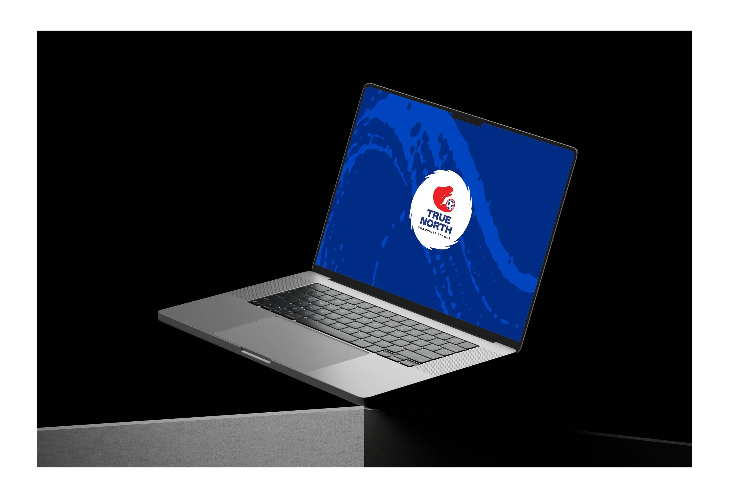
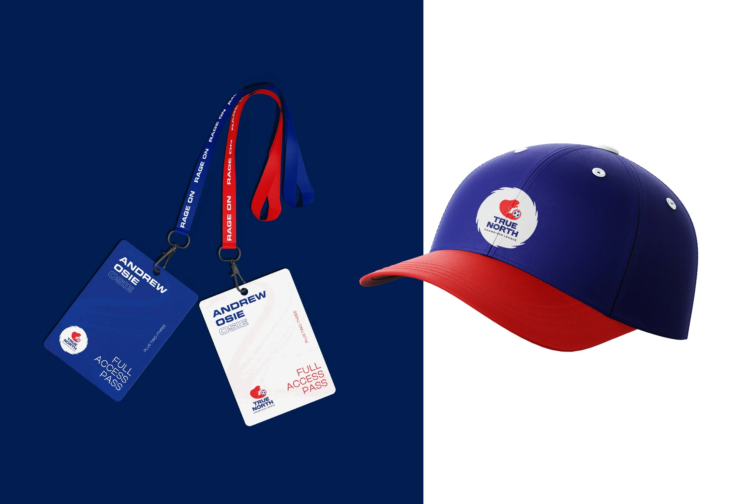
Iconic Primary Emblem: The primary logo features a beaver—chosen for its deep Canadian symbolism—crafted into a circular composition. The beaver’s tail cleverly contains a soccer ball, creating an immediate link between national identity and the sport. This circular composition symbolizes inclusivity, continuity, and community coming together under the league banner.
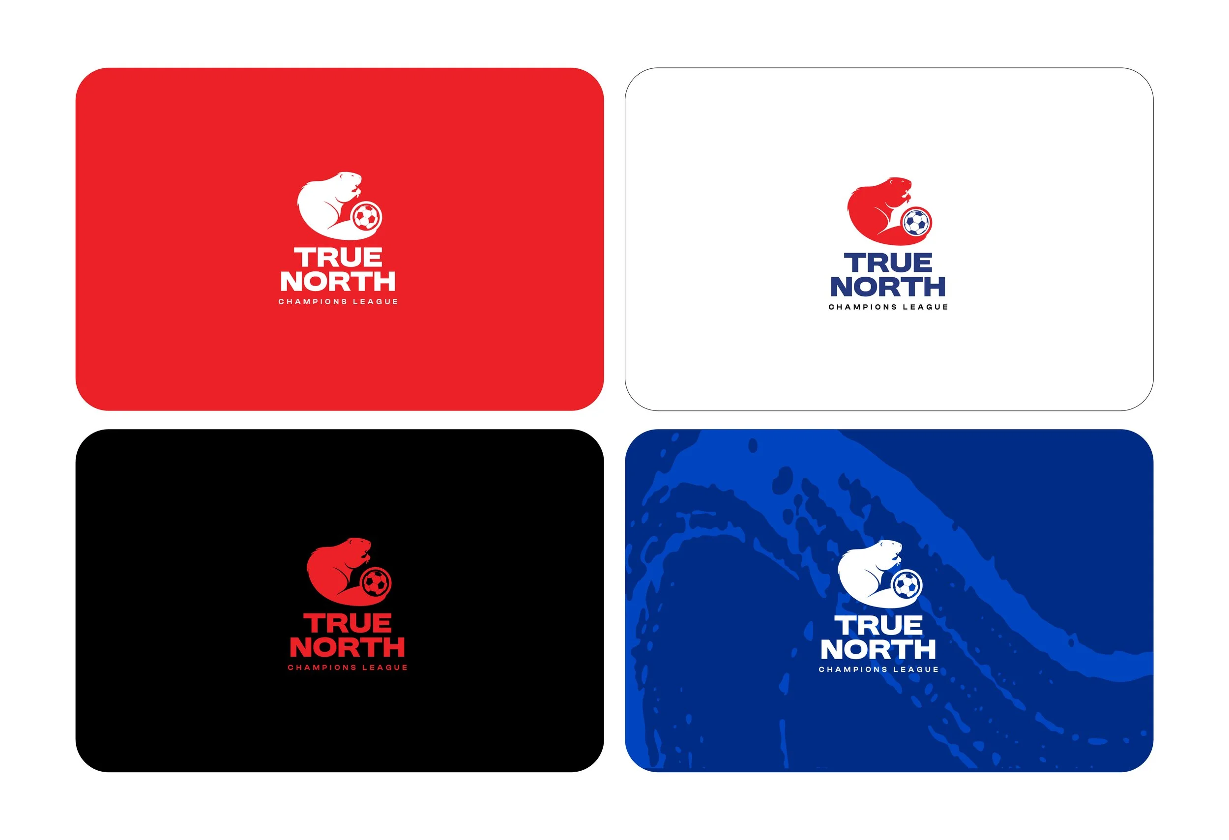
Colour & Tone: A confident palette of primary red paired with a deep blue (used in wordmark and badges) reinforces national pride while ensuring strong contrast and legibility across print and digital.
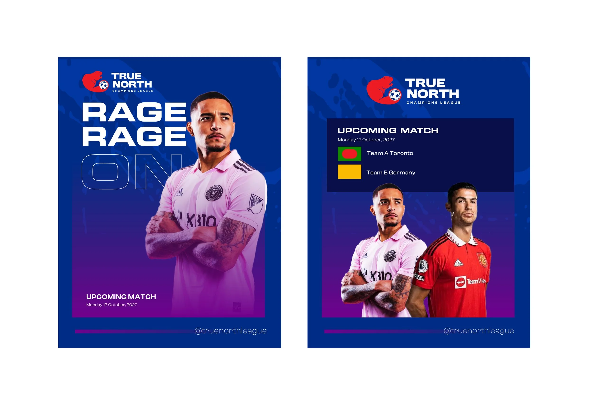
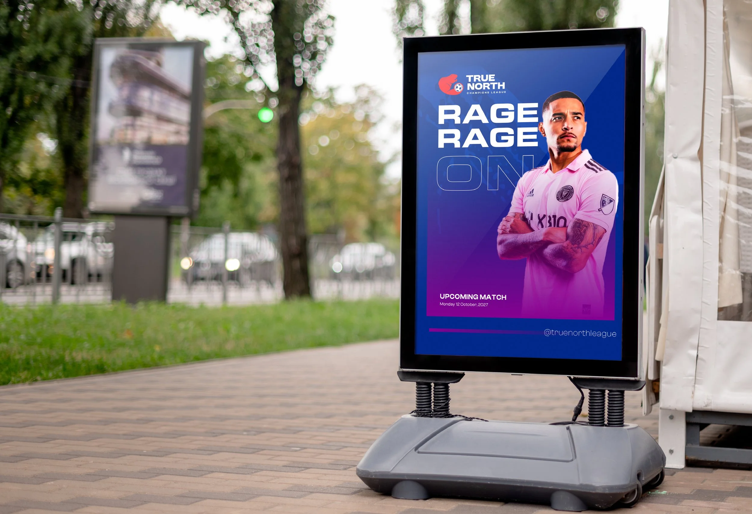
Type & Lockups: Strong, geometric wordmark treatments are paired with the emblem in vertical and horizontal lockups for flexible application. The typography is bold and condensed to read clearly at distance and in embroidery.
Scalable Badge System: A compact CYSA-style badge (emblem only), a full crest (emblem + stacked wordmark), and a horizontal lockup were delivered to address different use cases — jerseys, social avatars, sponsor placements, and signage.
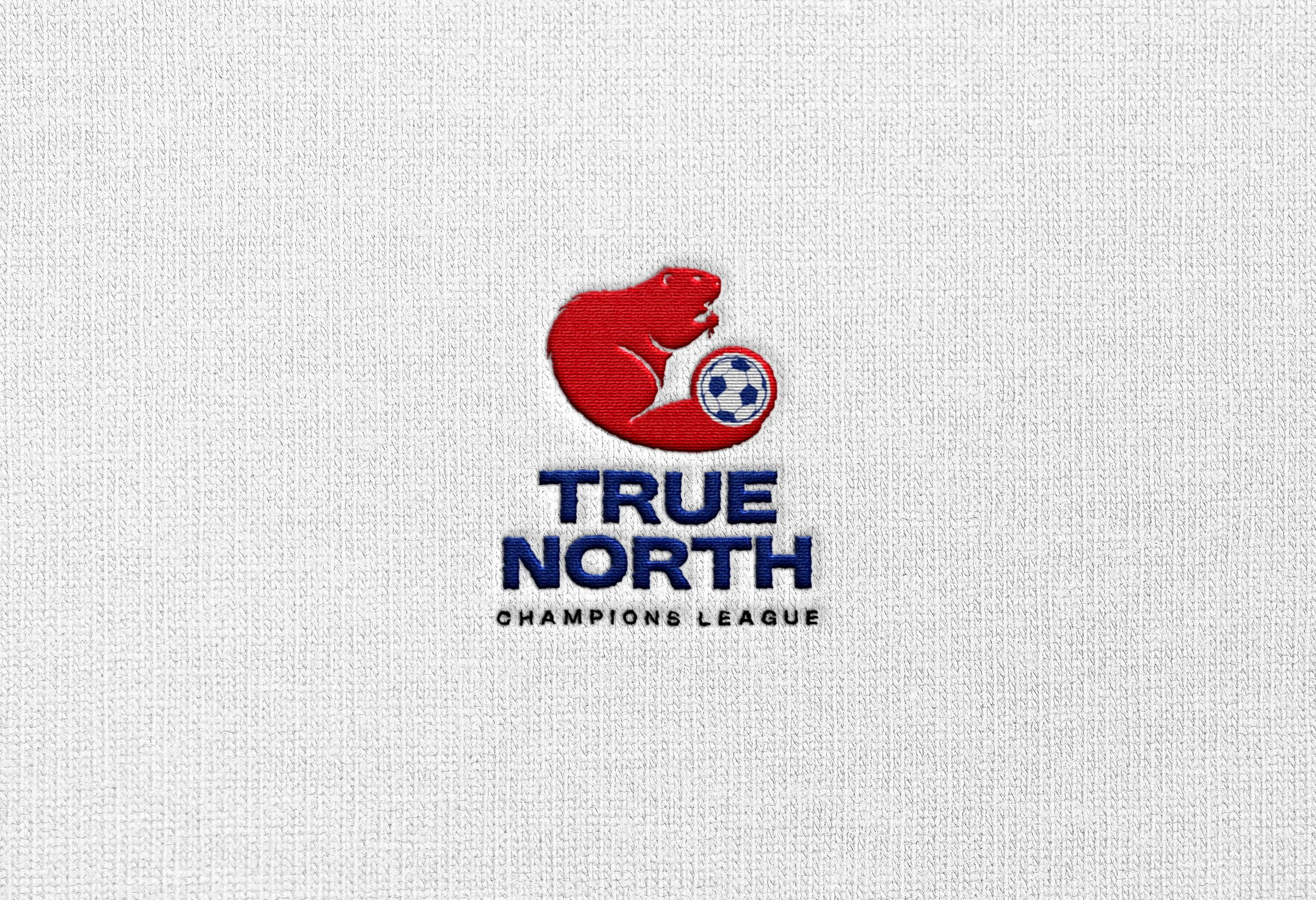
Fabric & Production-Aware Design: The emblem was tested and refined for embroidery and knit textures (see embroidered mockup on knit background) so the mark retains presence and fidelity when stitched on kits, scarves, and other merch.
Deliverables
Full logo suite: full-colour crest, monochrome/white variants, compact badge, and horizontal lockup.
Colour palette and accessible contrast guidance.
Typography system and usage rules (headline, body, and display treatments).
Brand guidelines pages detailing spacing, minimum sizes, do’s/don’ts, and contextual examples.
Production-ready files: vector masters (AI, SVG), print PDFs, PNG exports, favicon, and embroidery-ready vectors.
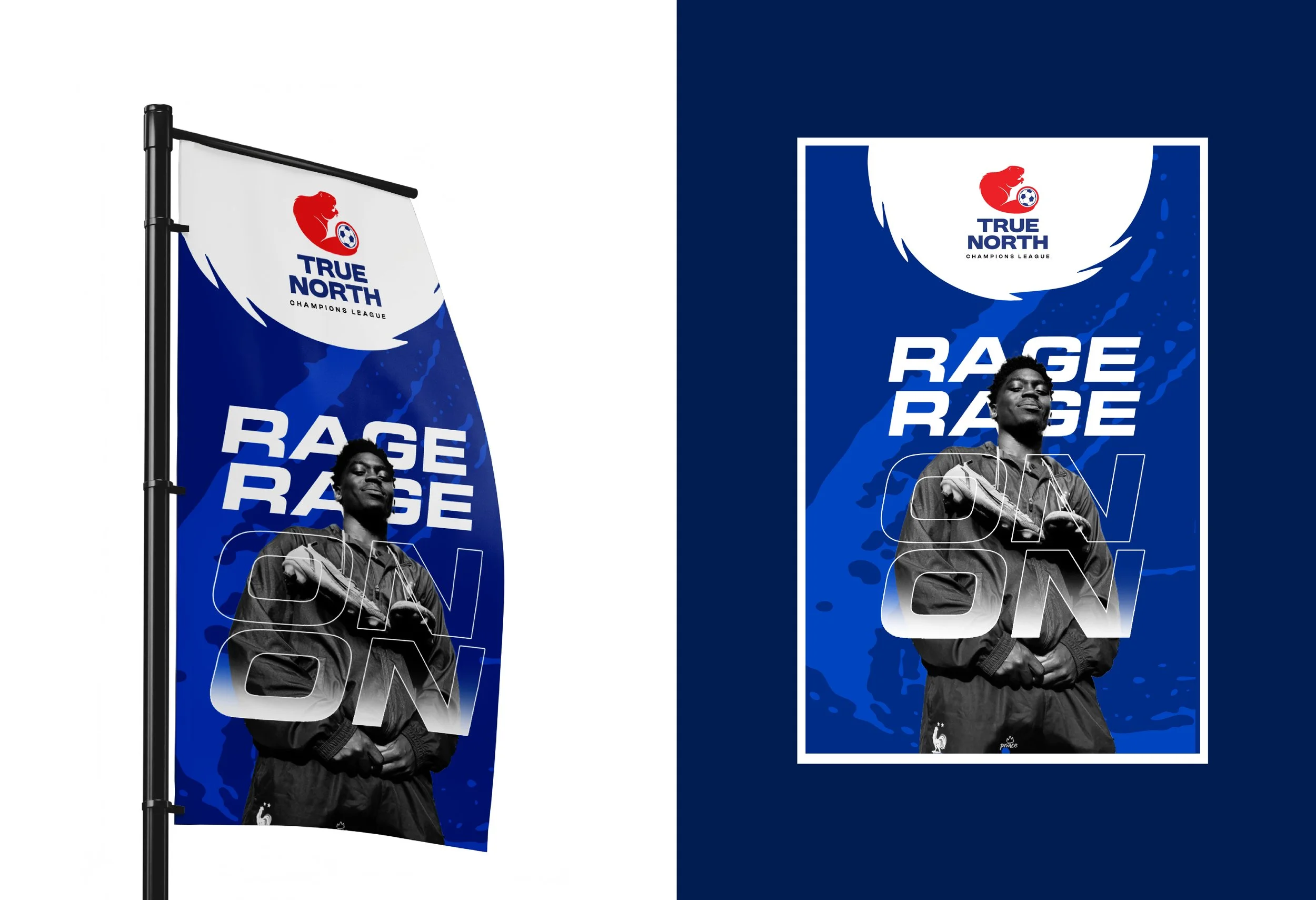
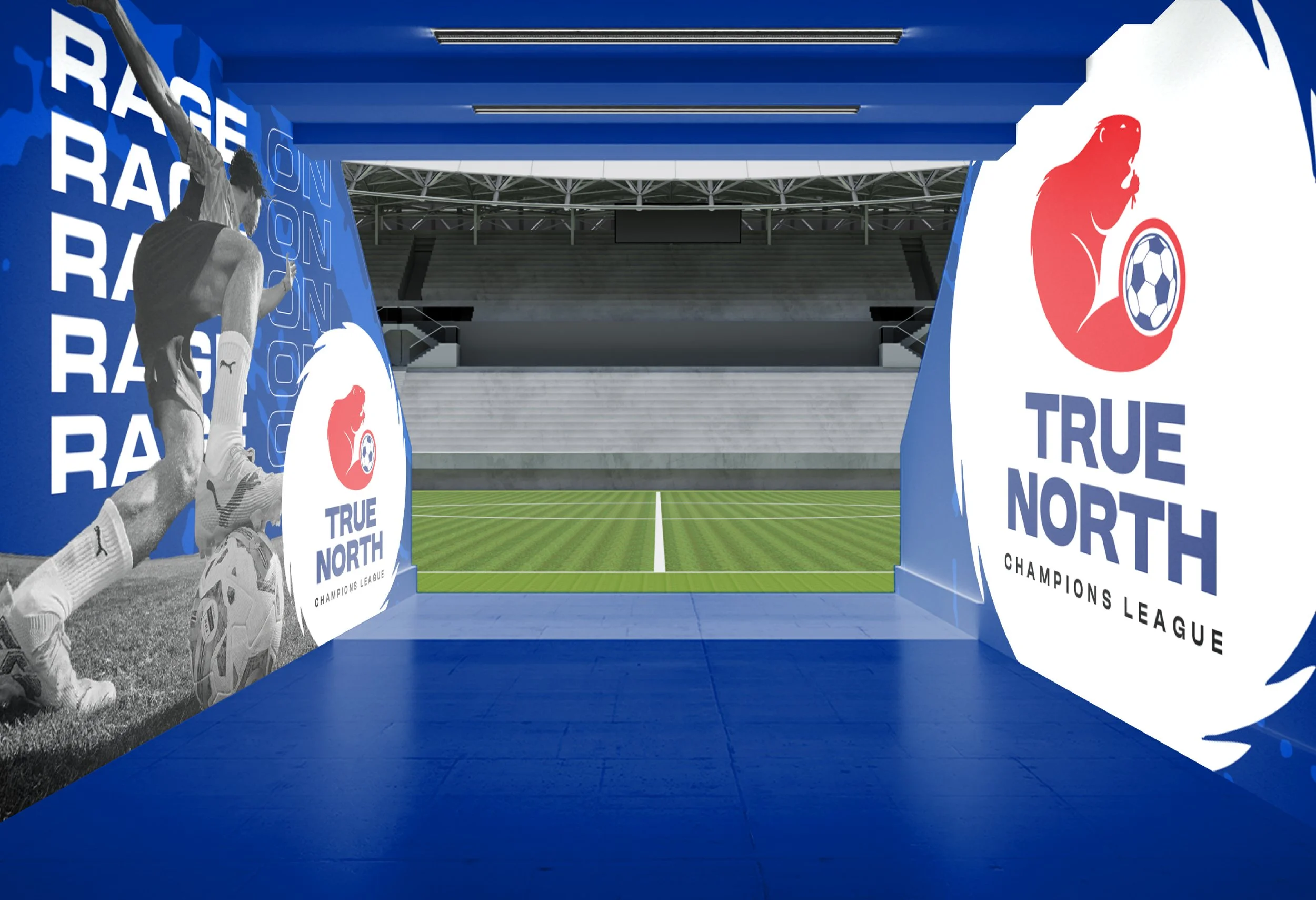
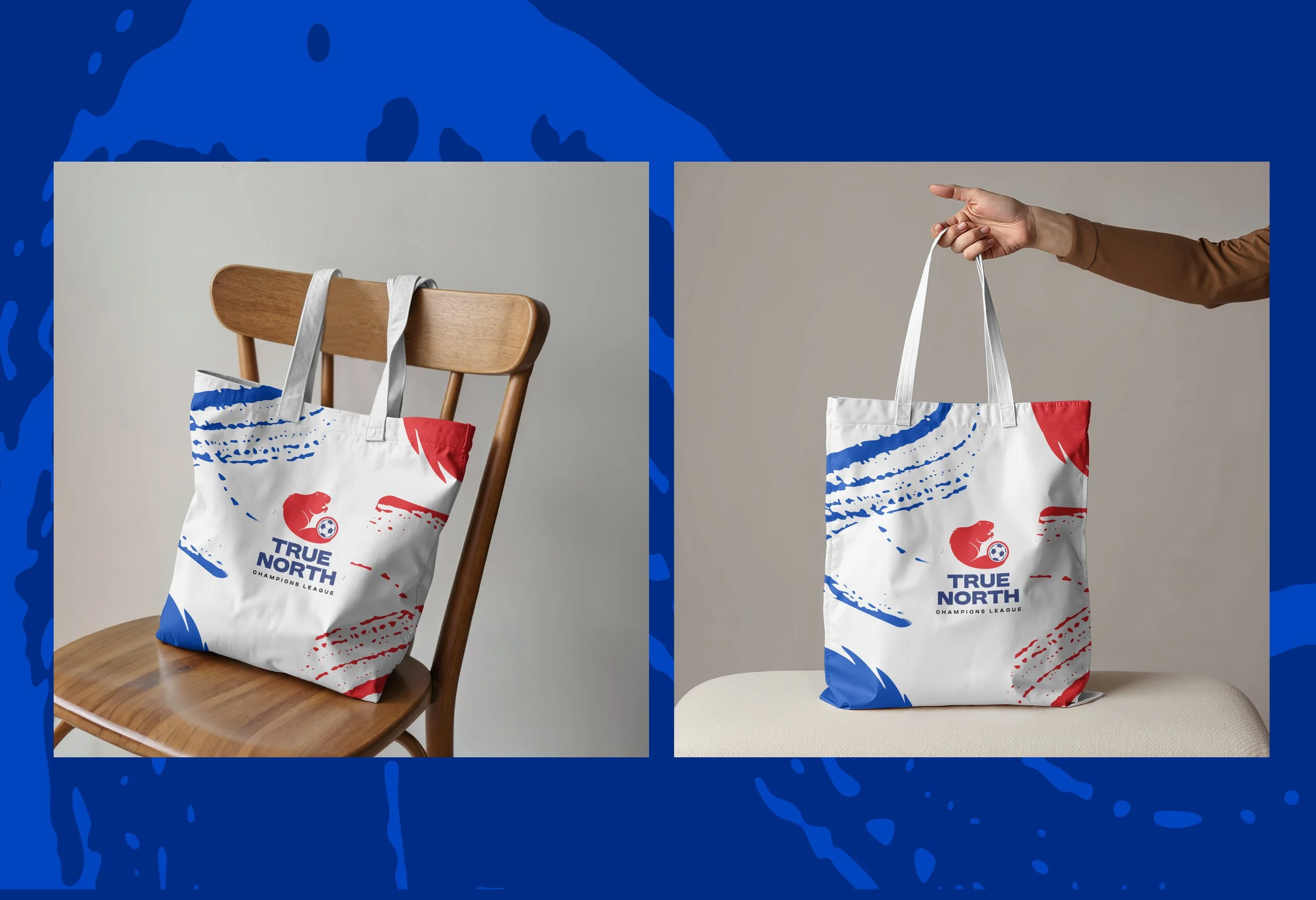
Mockups & sample applications: embroidered jersey patch, knit texture presentation, banner and social templates, and sponsor lockups.
Strategic Applications & Impact
On-field Identity: The crest reads strongly on kit patches and supporter scarves, projecting credibility for the league and pride for teams.
Marketing & Sponsorship: Flexible lockups and clear spacing rules make it simple to co-brand with sponsors and event partners while maintaining mark integrity.
Community & Merch: The badge and compact marks work perfectly for fan merchandise, youth programming, and digital badges for social share and promotion.
Narrative & Symbolism: The beaver + ball motif ties the league to Canadian cultural values (resilience, teamwork) while celebrating the global energy of football — a visual shorthand that resonates with parents, community leaders, and athletes.
Client Feedback & Next Steps
True North Champions League responded positively to the blend of heritage and modern sport aesthetics, noting that the identity “feels proudly Canadian and competitively credible.” NAV Branding supplied the league with the assets and guidelines needed to roll out the brand across events, websites, team kits, and sponsor materials — and remains available to extend the system into seasonal event branding, kit design, and stadium signage as the league grows.
At NAV Branding, we design identities that perform in the real world — visually distinct, production-ready, and meaningful. The True North Champions League identity brings a national story and sporting ambition together in a single, enduring emblem.