
Client: Marvelous Touch Cleaning
Sector: Residential and Commercial Cleaning
Services: Brand Strategy / Visual Identity / Squarespace Web Design and Development / Marketing Collateral
Primary Audience: Homeowners, families, working professionals, property managers and commercial organizations across the Greater Toronto Area
Project Objective: Align the company’s public-facing brand with the trust, professionalism and service reputation it had built since 2005
Marvelous Touch Cleaning / A Complete Visual Identity Rebrand After 20+ Years of Business
Building a cohesive brand system for an established GTA cleaning company
The Problem
Marvelous Touch had already earned the trust of its customers through more than two decades of reliable residential and commercial cleaning service. But the company’s public-facing presentation did not fully communicate the maturity, professionalism or quality behind the business.
Its reputation lived mainly in its service history and customer relationships, while its brand, website and marketing materials did not yet express that value as one connected experience. In a competitive category where many companies use similar imagery, promises and language, Marvelous Touch needed to become easier to recognize, understand and trust before the first conversation.
NAV Branding was brought in to modernize the company’s identity and create a clearer customer journey without disconnecting Marvelous Touch from the reputation it had built since 2005.

The Strategic Challenge
The project needed to go beyond making the company look more polished.
The new brand had to feel approachable enough for homeowners and families, while maintaining the structure and credibility expected by property managers and commercial clients. It needed to be recognizable as a cleaning brand without falling into the familiar visual conventions that make many companies in the category feel interchangeable.
The website also had to do more than establish an online presence. It needed to help visitors quickly understand the available services, determine whether Marvelous Touch served their needs, build confidence in the company and move naturally toward requesting a quote.
Most importantly, the logo, website, business cards and promotional materials could not feel like separate design projects. Every touchpoint needed to reinforce the same promise of reliability, professionalism and noticeable results.

The Strategic Insight
The central insight behind the project was simple:
The business had already earned trust. The new brand needed to make that trust visible.
Marvelous Touch did not need to become a different company. It needed a brand system that made its existing strengths easier to see.
NAV positioned the company at the intersection of reliability and transformation. Reliability represented its experience, care, consistency and dependable service. Transformation represented the visible and emotional difference customers experience when a space has been thoroughly cleaned, refreshed and restored.
That idea gave the brand a clear strategic foundation: Marvelous Touch does more than clean spaces. It gives customers back spaces that feel refreshed, cared for and ready to enjoy.
The Solution
NAV Branding partnered with Marvelous Touch to create a connected brand and customer-experience system spanning strategy, identity, digital experience and marketing collateral.
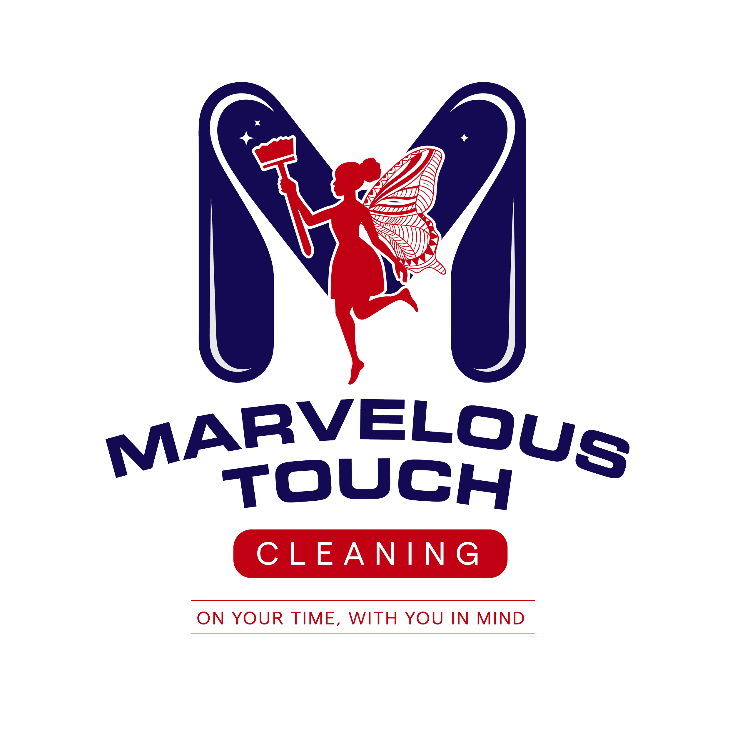
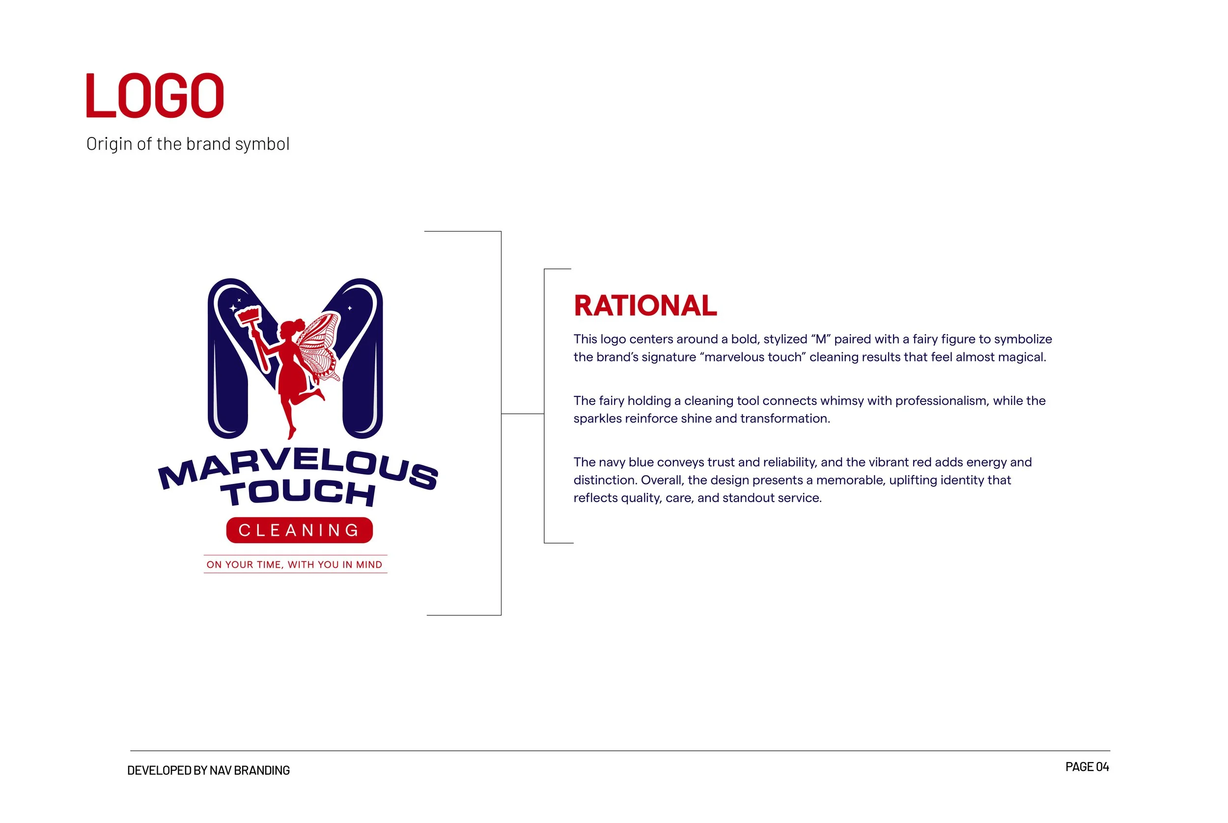
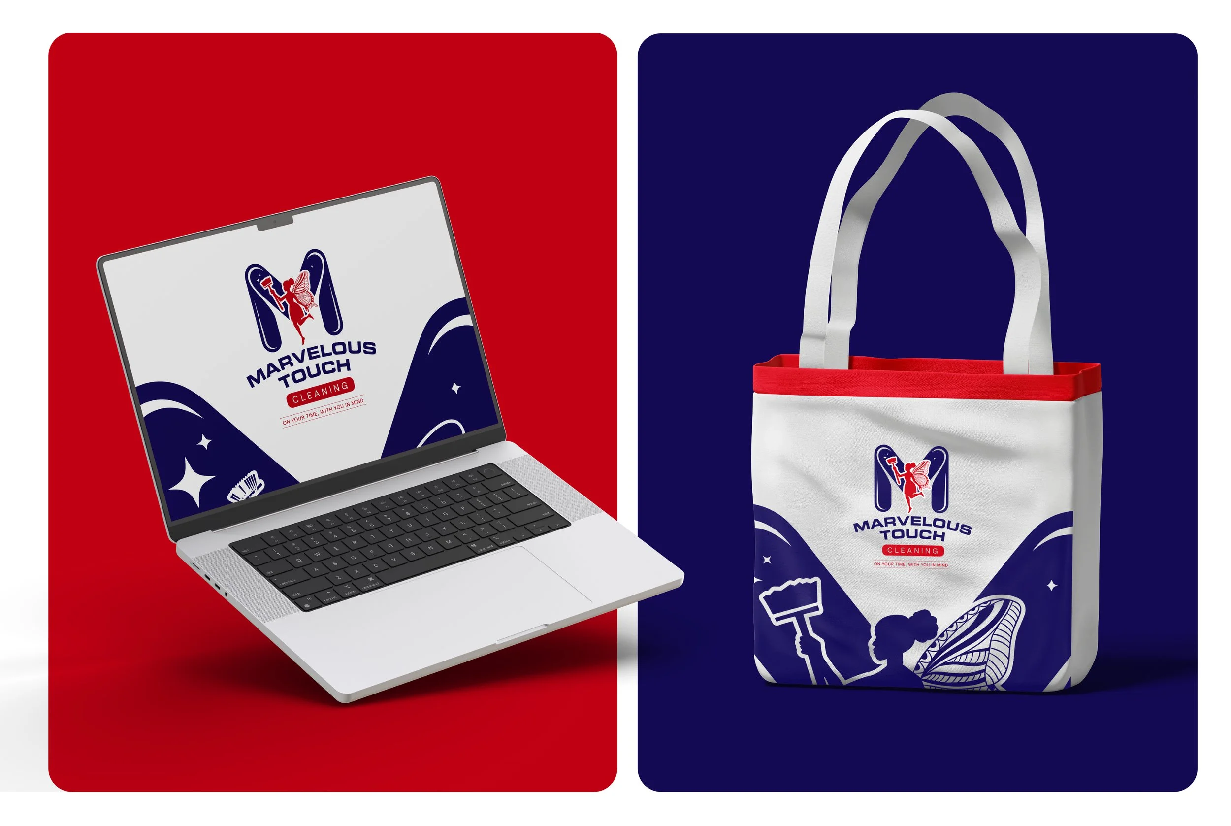
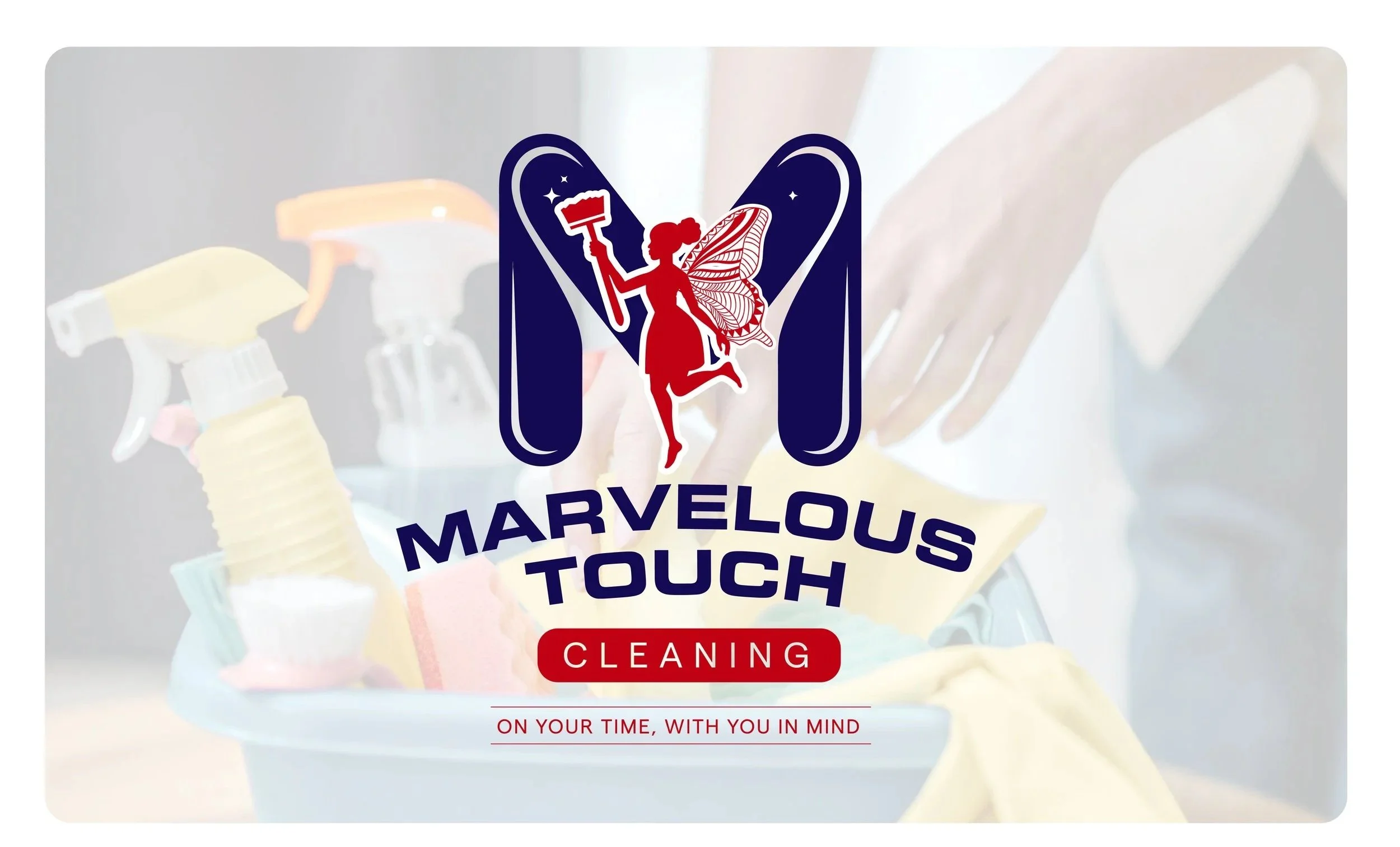
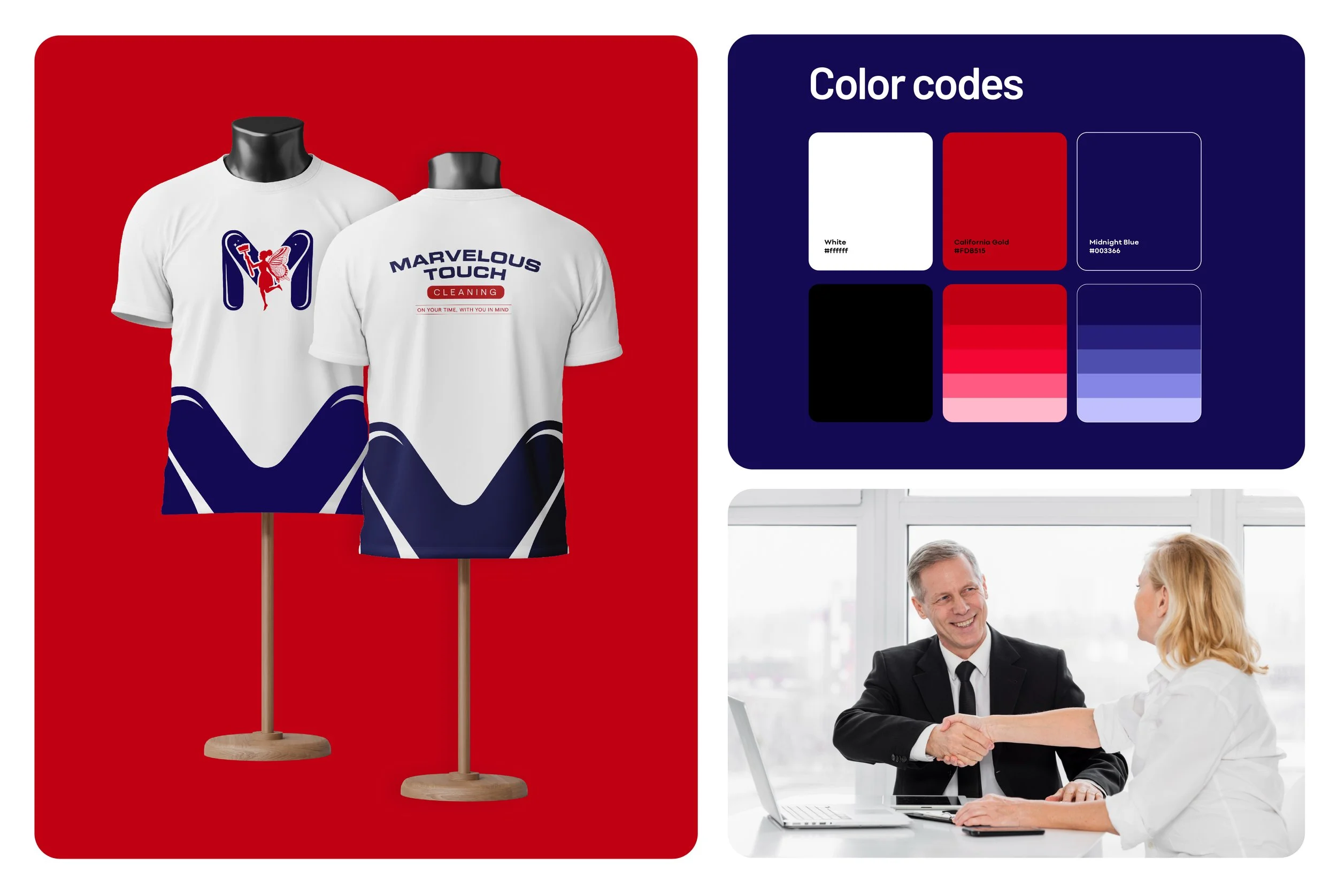
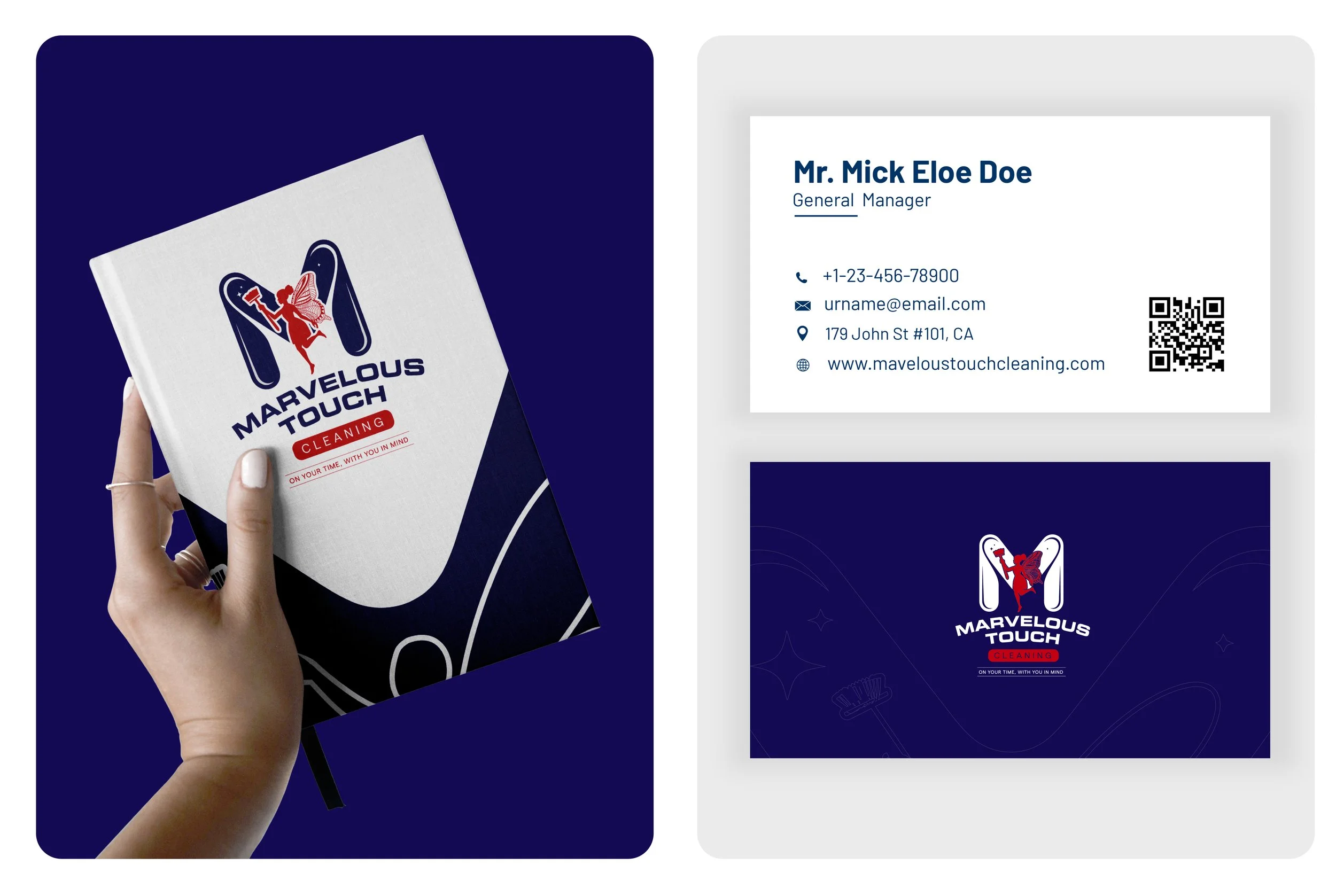
The visual identity was built around a stylized “M,” a fairy-inspired figure, cleaning imagery and sparkle accents. Together, these elements expressed the transformation suggested by the Marvelous Touch name while preserving the professionalism required for both residential and commercial markets. Navy introduced trust and dependability, while red added energy, confidence and stronger recognition.
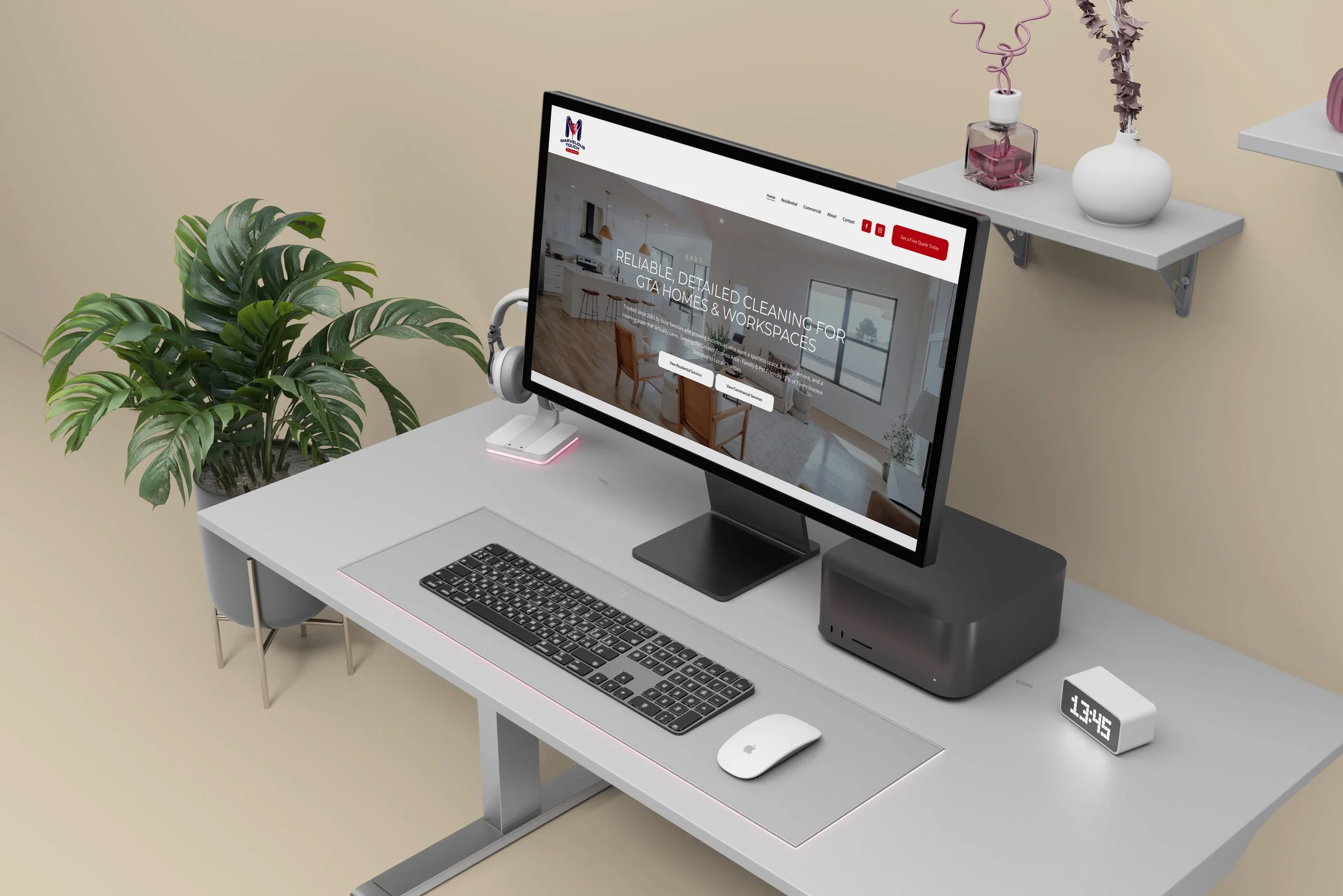
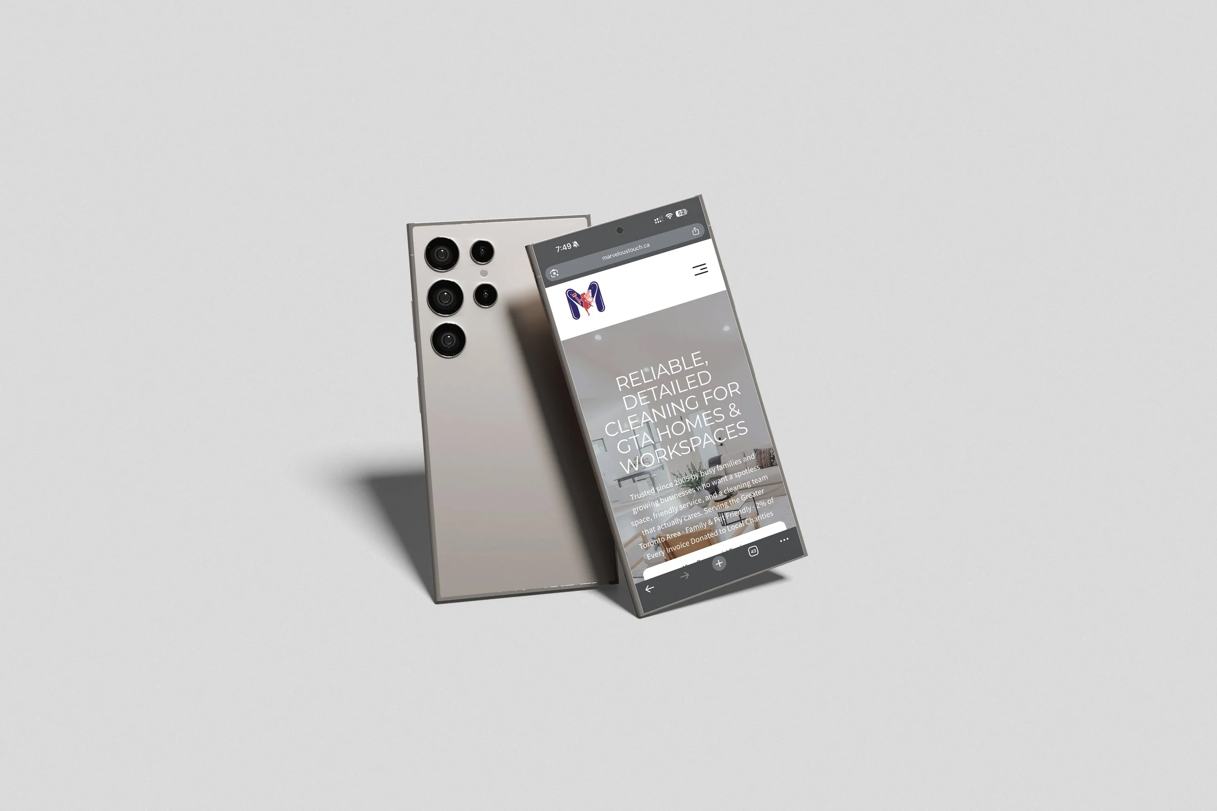
NAV then translated the identity into a responsive Squarespace website structured around the questions customers are most likely to ask: What services are available? Does the company serve customers like me? Can I trust the team? How do I request a quote?
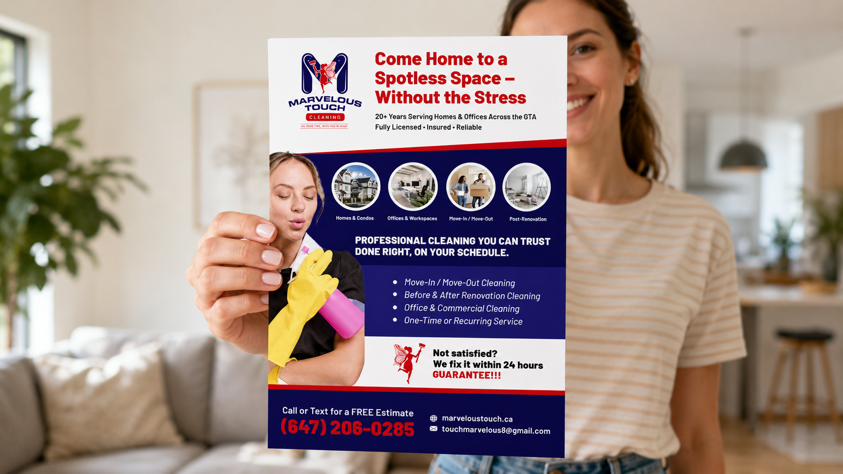
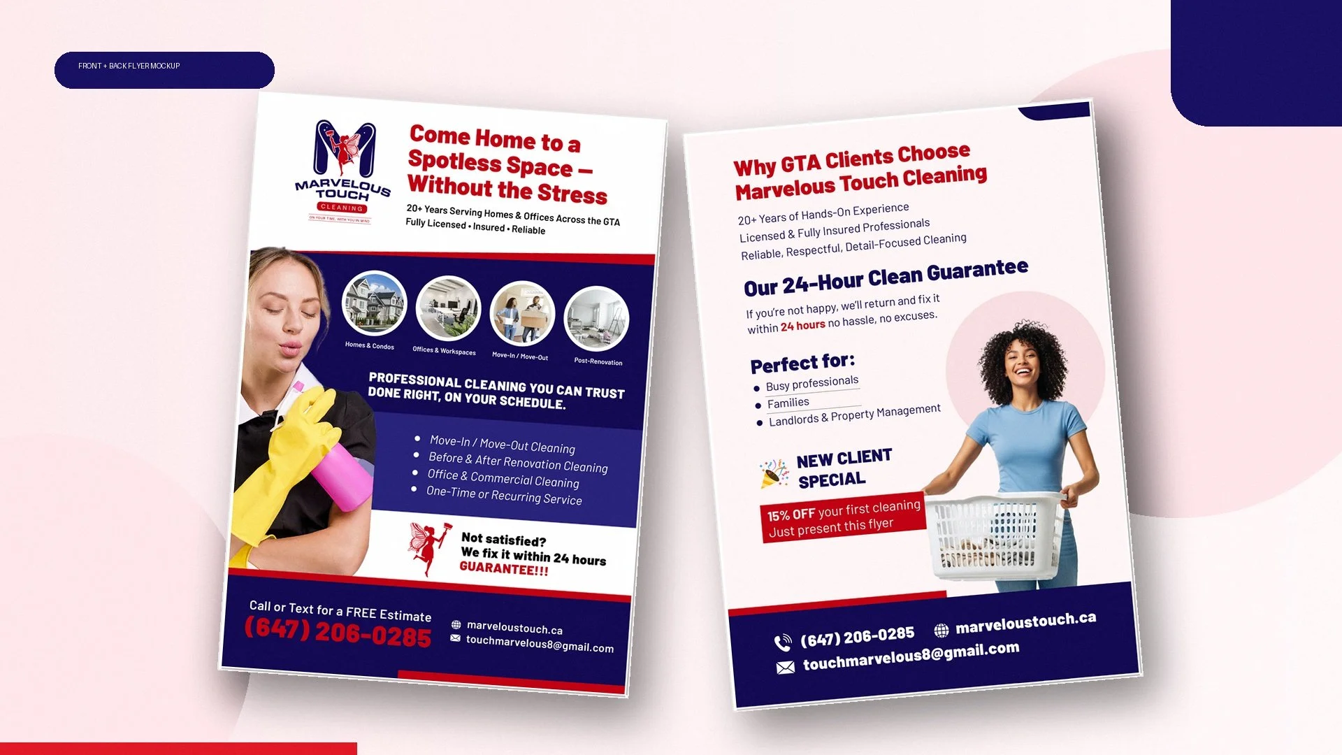
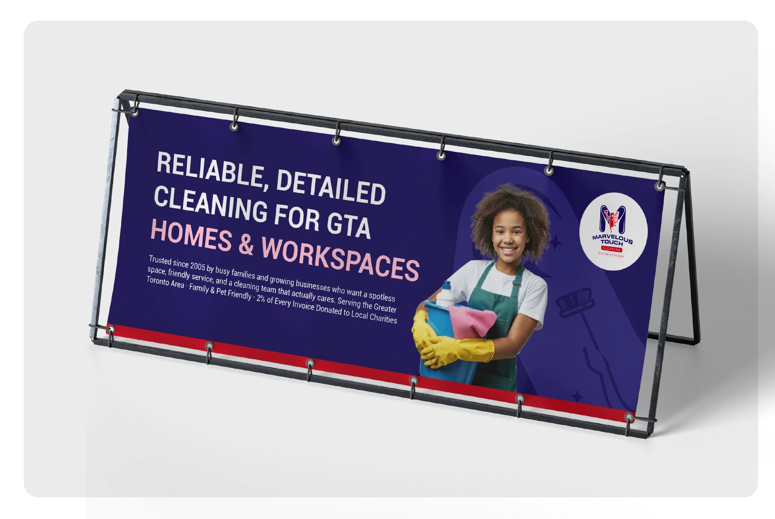
Business cards and a dual-sided promotional flyer extended the same visual language into networking, referrals, local promotion and commercial business development. Rather than treating each asset independently, NAV designed every touchpoint to work as part of one unified system.
The Deliverables
NAV Branding created a complete brand system that included:
Brand strategy support, audience considerations, positioning direction and a central visual concept.
A primary logo, alternate configurations, icon variations and monochrome versions.
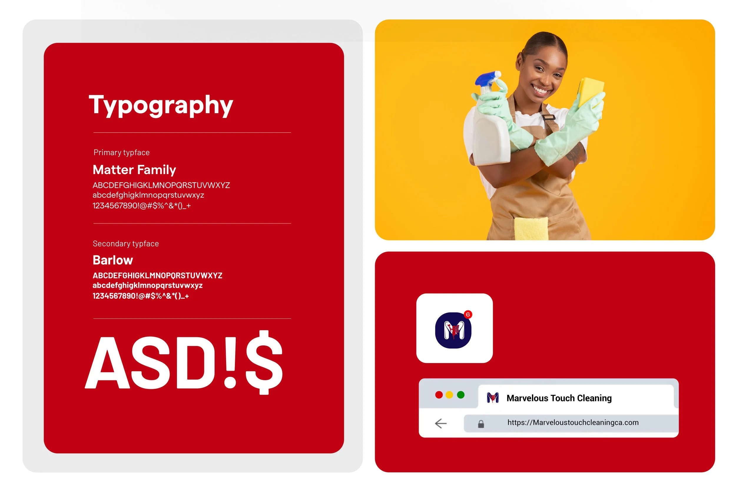
A defined colour palette, typography hierarchy and practical brand guidelines.
A responsive Squarespace website with clear residential and commercial service pathways.
Structured service content, testimonials, local service-area information and repeated quote-request calls to action.
Tap-to-call and direct-contact functionality, foundational SEO structure and a manageable platform for internal updates.
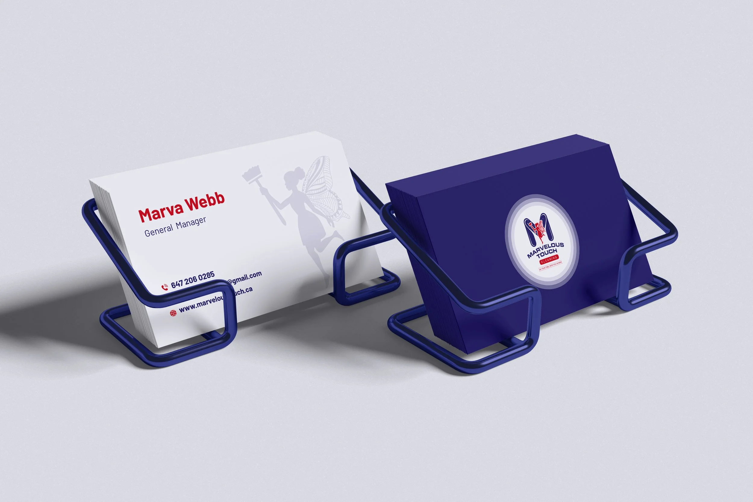
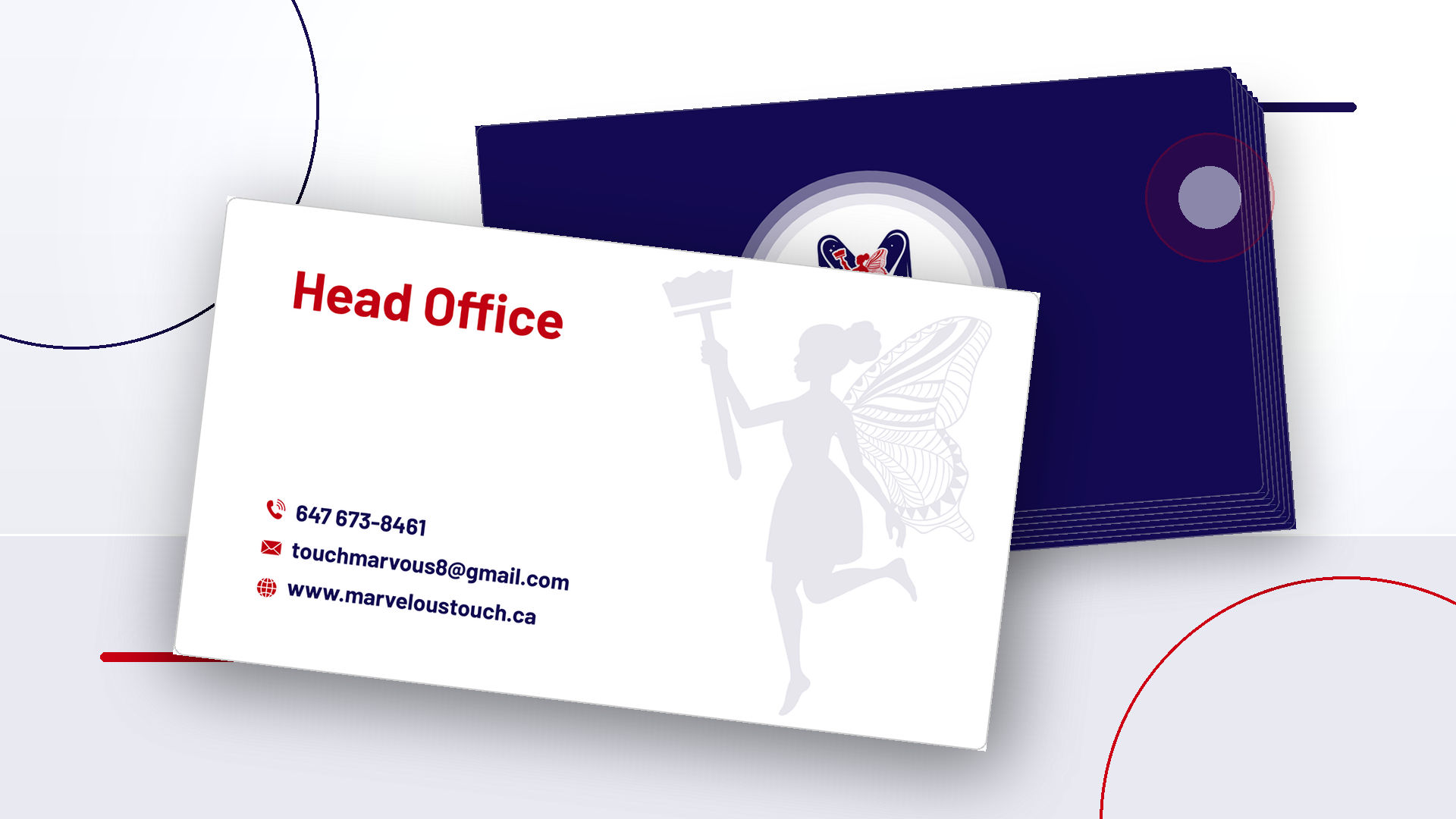
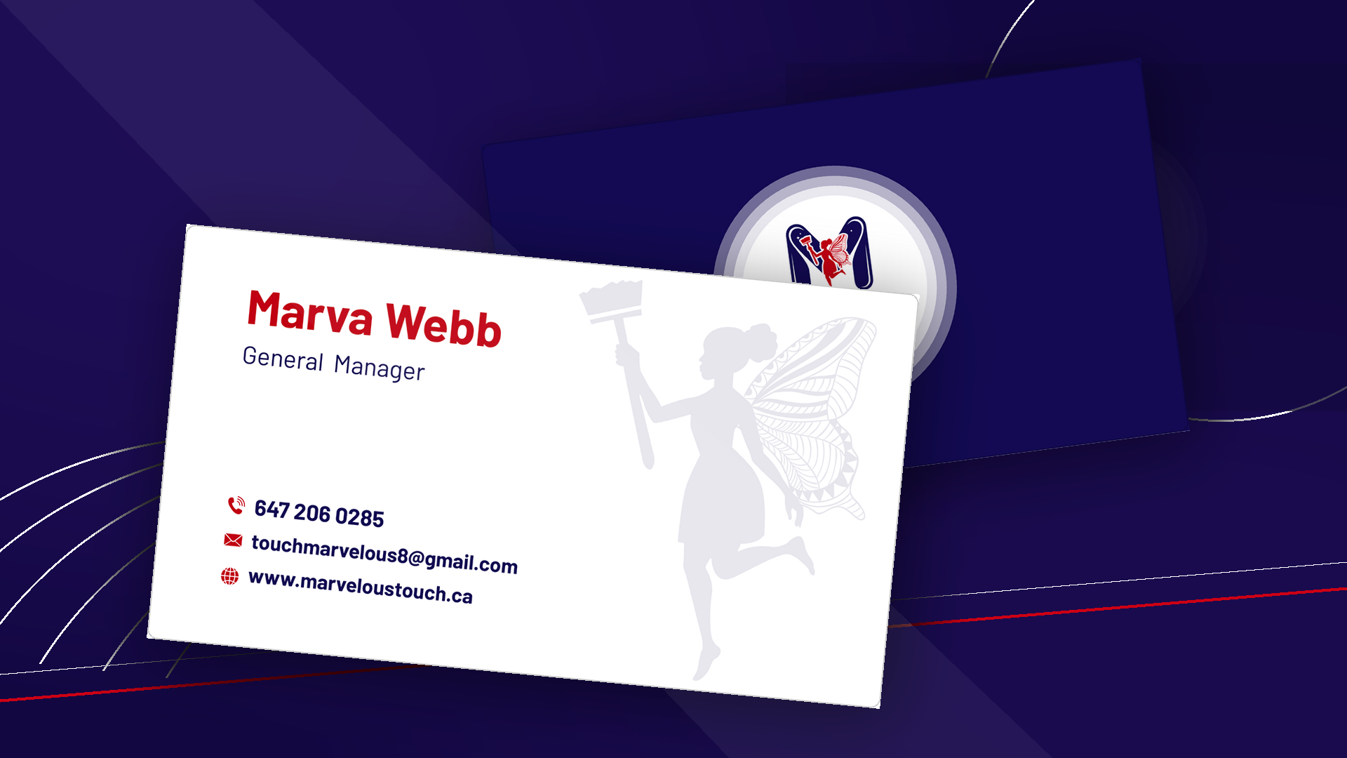
A repeatable two-sided business card system.
A dual-sided promotional flyer for community distribution, referrals, property-management outreach and digital sharing.
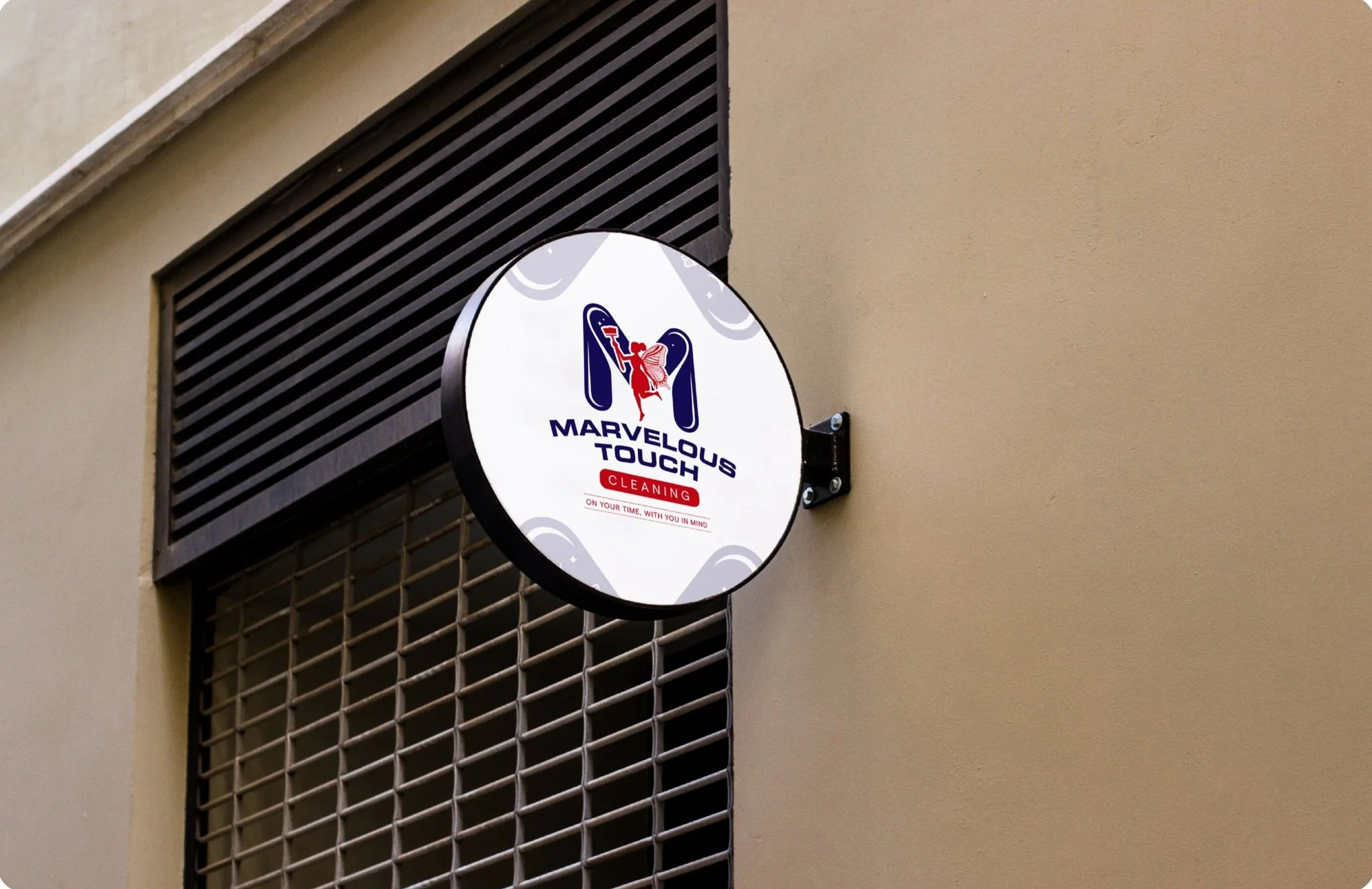
Production-ready digital and print files designed to support future applications, including uniforms, vehicles and signage.

The Outcome
The completed rebrand aligned Marvelous Touch’s public presentation with the quality, longevity and professionalism of the business.
Customers encountering the company through a flyer, website, business card or direct conversation now experience the same colours, visual language, service promise and standard of professionalism. That consistency reduces uncertainty and helps the company appear organized, established and intentional—qualities that matter when customers are deciding who to trust inside their homes, workplaces and managed properties.
The new website gives residential and commercial visitors clearer service pathways and a more direct route from interest to quote request. The identity and collateral create stronger differentiation in a crowded category while giving Marvelous Touch a scalable foundation for future campaigns, team growth and physical brand applications.
The most important result was not any single logo, webpage or printed item. It was the cohesion created across the complete customer journey.
Making Established Businesses Look Established
Many businesses build credibility long before their branding catches up. Their value exists in years of experience, loyal customers, reliable service and the trust they have earned—but prospective customers may not see that value when they first encounter the company. Through this project, Marvelous Touch transformed an established service business into an established brand. NAV Branding turned its reputation into a clear, recognizable and connected experience designed to carry the company into its next stage of growth.

“Great to work with; they listened to my requests, made the changes where needed and made sure it was what I wanted. Overall, great experience and price; would recommend”
— Marva Webb, Owner, Marvelous Touch Cleaning

Has Your Business Outgrown the Way It Currently Looks?
Your company may already have the experience, reputation and service quality. NAV helps make that value visible through a clear, cohesive and strategically designed brand—across every place your customers encounter your business.