
Project Description: Flyer Design — Creative Respite for BetterPath Skills Development
Client: BetterPath Skills Development
Project Type: Program Flyer Design (Print + Web)
Services Provided: Graphic Design, Layout & Composition, Art Direction, Print-Ready Production
Overview
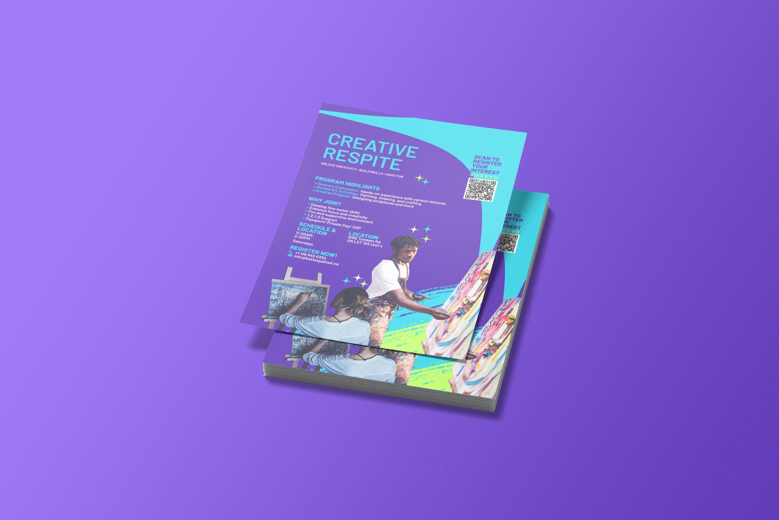
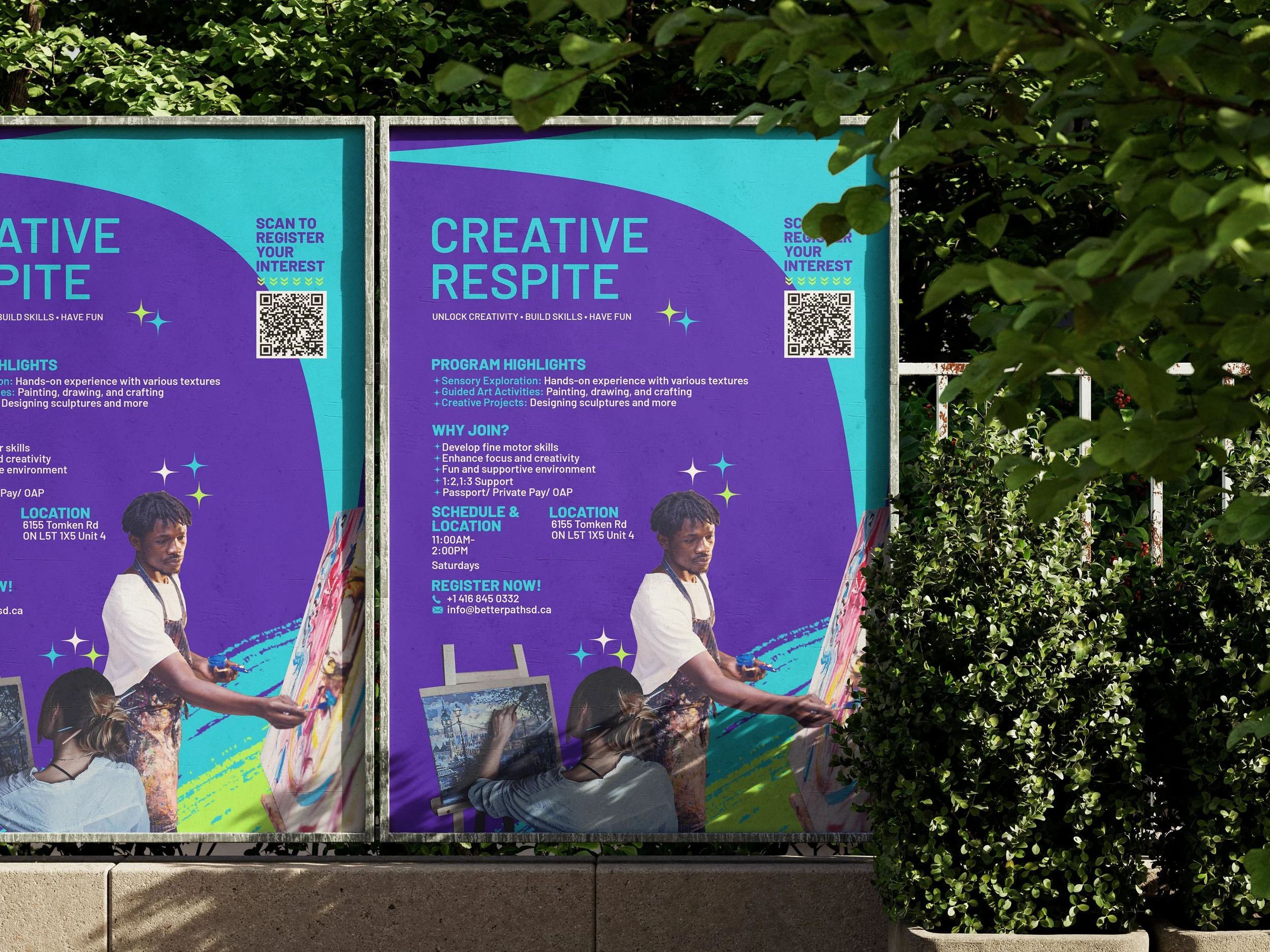
NAV Branding designed a vibrant promotional flyer for BetterPath Skills Development to advertise their Creative Respite program — an art-based, skills-building drop-in for youth. The brief called for a high-energy, accessible piece that communicates program benefits quickly, drives registrations (via QR code and contact information), and works effectively both as a printed handout and a social/web asset.
Issues Identified
Dense program info, low scan-ability: Program details needed to be readable at a glance so busy parents/staff can understand benefits and logistics quickly.
Lack of expressive visual identity: Existing materials didn’t reflect the creativity and energy of the program or the supportive atmosphere BetterPath provides.
Conversion friction: There was no single, easy way to register from the flyer — registrations required a clear CTA and a scannable link.
Key Outcomes
Eye-catching visual hierarchy: Large headline (“CREATIVE RESPITE”) and a succinct tagline (“Unlock Creativity • Build Skills • Have Fun”) immediately communicate purpose and tone.
Information made scannable: Program Highlights, Why Join, Schedule & Location, and Register Now sections clearly separated.
Built for conversion: A prominent QR code, along with phone and email contact information, puts registration just one scan or tap away.
Emotive photography & colour: High-impact photos of hands-on art, paired with a bold purple/cyan palette, convey creativity, warmth, and approachability while ensuring legibility.
Design Highlights
Bold colour system: A complementary purple + cyan palette creates energy and strong contrast for legibility in print and on-screen.
Supportive iconography & micro-graphics: Small star/sparkle accents, along with paint-stroke textures, reinforce the artistic theme without cluttering the copy.
Accessible typography: Readable headline and body typefaces with good contrast and spacing for accessibility (parents, caregivers, and program staff).
Practical layout: Two-column composition that adapts easily to A4/A3 print and social formats.
Deliverables & Production Specs
Print-ready files: CMYK, 300 DPI PDF with 0.125" bleed (A3 and A4 export variants).
Web/social exports: PNG and optimized JPEG sizes for Instagram/Facebook and email.
Editable source files: Adobe Illustrator/Photoshop/InDesign templates for easy future updates.
Recommended print specs: 170–300 gsm matte stock for handouts; optional satin lamination for event posters.
Included assets: High-resolution photography treatments, QR code integration, and copy blocks finalized for clarity.
Client Feedback & Impact
BetterPath reported the flyer improved event visibility at community centres and partner sites. The clear CTA and QR integration reduced registration friction; staff noted an increase in inquiries after distribution at local clinics and school noticeboards.
Why It Worked
NAV Branding balanced vibrancy with clarity — the flyer reflects the playful, skill-building nature of Creative Respite while prioritizing readability and conversion. The result is a flexible marketing asset that performs effectively across both print and digital channels, helping BetterPath reach families and caregivers who will benefit most from the program.