
Project Description: Respite Posters & Flyer Suite for BetterPath Skills Development
Client: BetterPath Skills Development
Project Type: Print & Digital Collateral — Posters, Flyers & Campaign Assets
Services Provided: Graphic Design, Art Direction, Print Production, Template Systems, Digital Exports
Overview
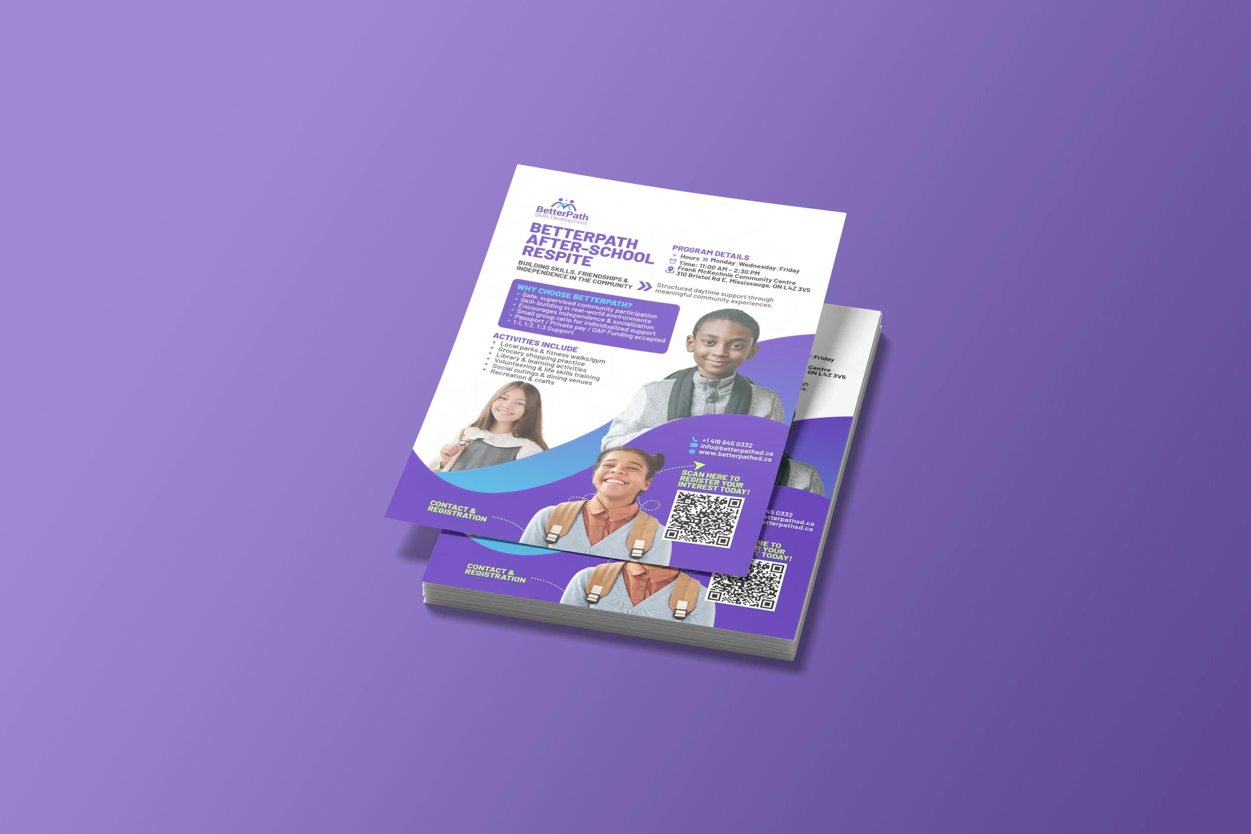
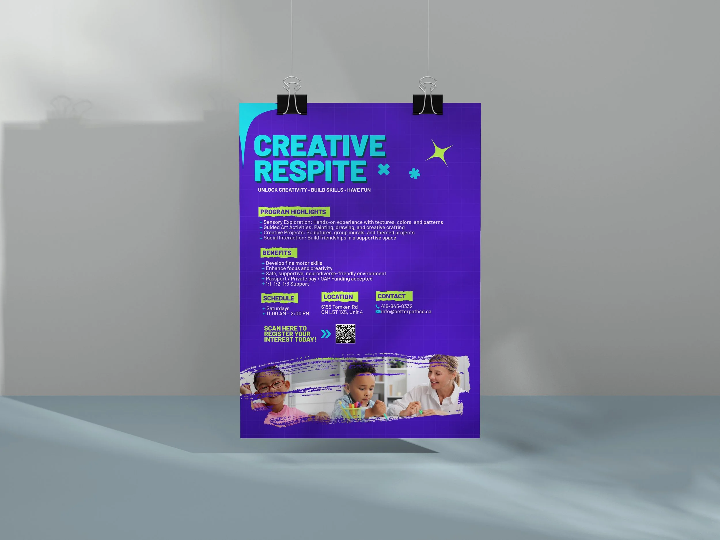
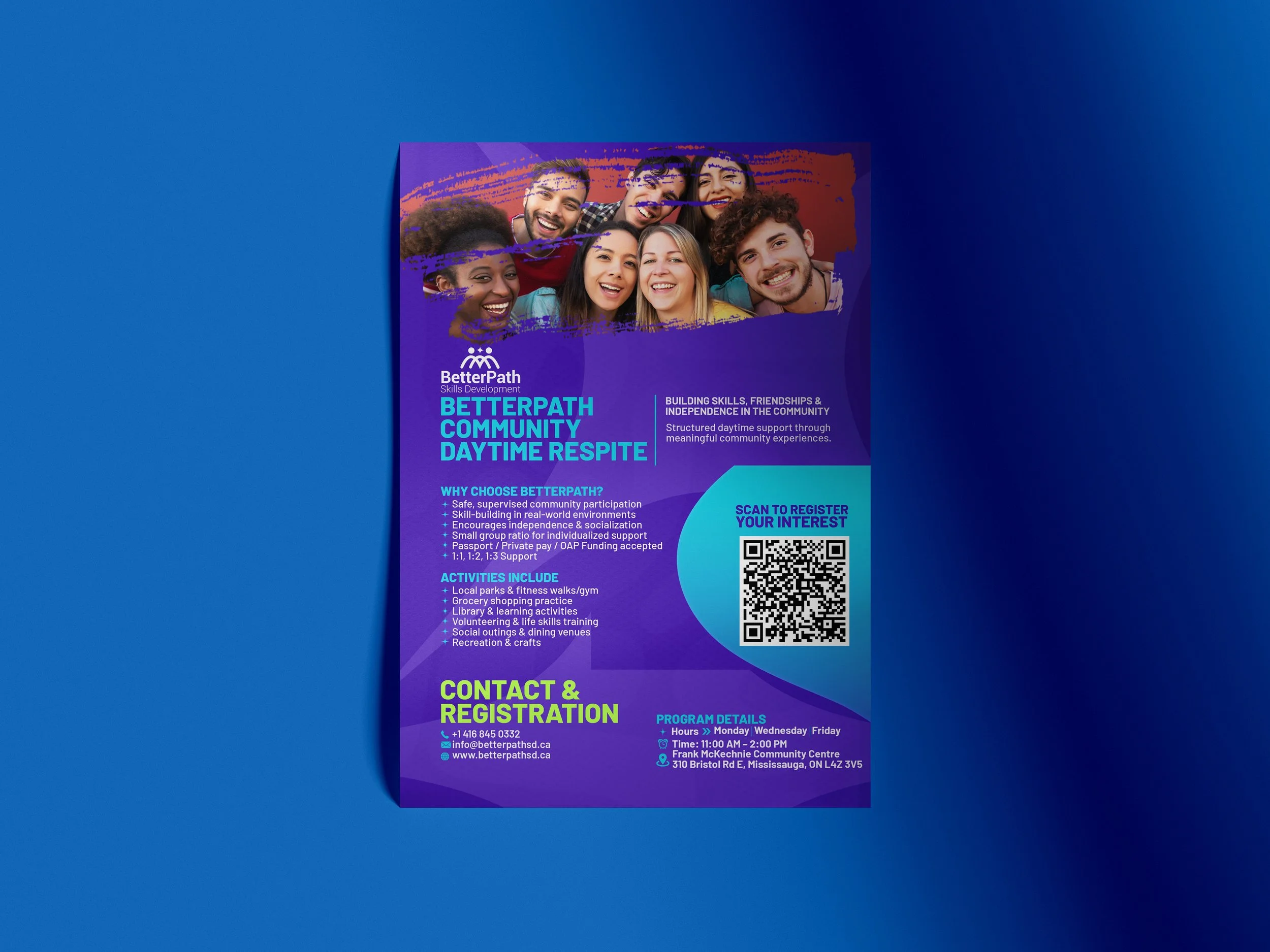
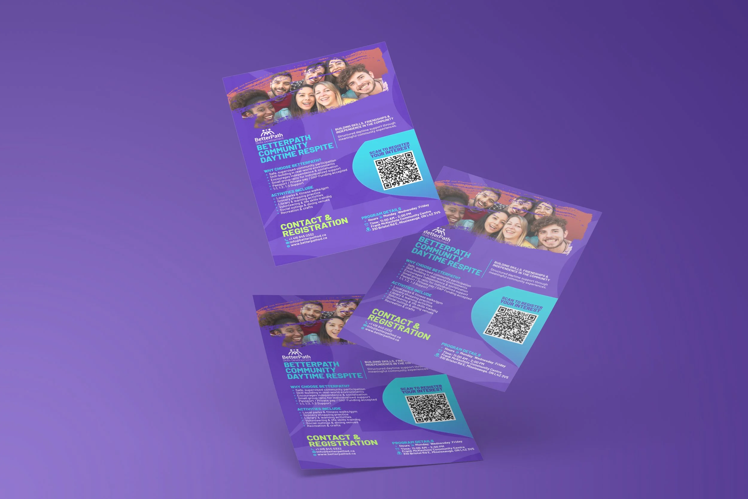
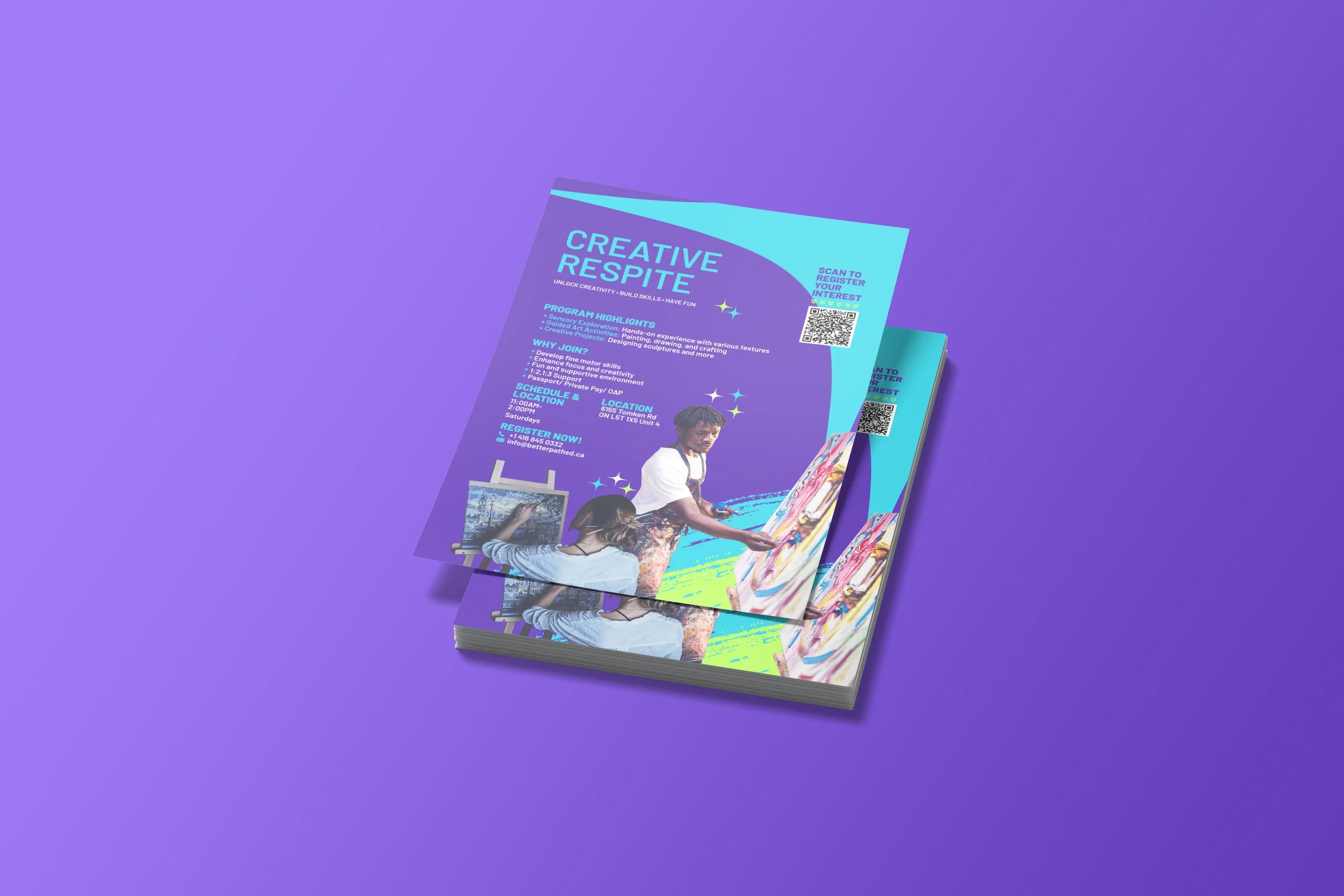
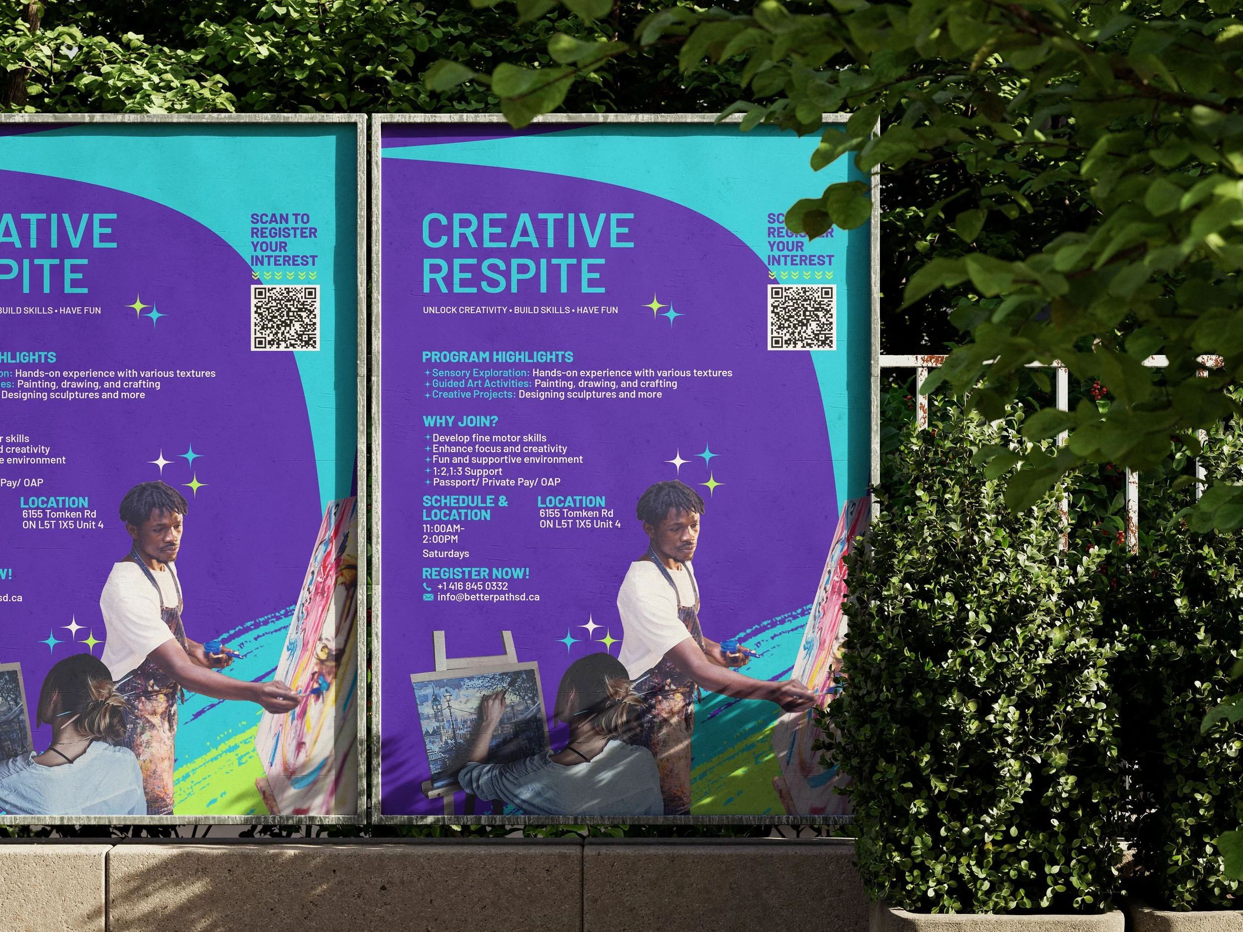
NAV Branding designed a cohesive suite of promotional materials for BetterPath’s respite programs — including Creative Respite, Community Daytime Respite, and After-School Respite. The collection includes posters, handbills, A4/A3 flyers, event-ready banners, and social/web exports. The visual system pairs energetic, kid-friendly photography with bold paint-stroke textures, a high-contrast purple/cyan palette, and clear CTAs (including scan-to-register QR codes) to drive awareness and sign-ups across community partners, schools, and local clinics.
Issues Identified
Fragmented Marketing Assets: Existing outreach materials were inconsistent and hard to adapt for different programs and placements (noticeboards, social, partner kiosks).
Low Scan-ability & Conversion: Busy layouts and small CTAs made it difficult for caregivers to quickly find key info or register interest.
Print Production Risks: Assets were not originally optimized for large-format printing nor for embroidery/merch mockups — causing color and bleed issues in previous runs.
Multi-Audience Need: Materials had to speak to caregivers, funders, and referral partners while remaining friendly and accessible for neurodiverse audiences.
Key Outcomes
Unified Visual System: We established a repeatable design language — bold purple backgrounds, cyan accents, paint-stroke hero bars, and playful iconography — so every asset reads as part of the same campaign while remaining adaptable for each respite program.
High-Impact Hierarchy: Large headlines (e.g., “CREATIVE RESPITE”), concise bullets (program highlights, benefits), and clearly separated schedule/location/contact blocks make scanning fast and effortless.
Conversion-First CTAs: Prominent QR codes, “Scan to register” copy, phone and email CTAs were placed with visual emphasis to reduce friction and increase conversions.
Print & Production-Ready Files: Delivered CMYK, 300 DPI PDFs with proper bleeds, dielines, and paper/finish recommendations for posters, handouts, and retractable banners. Color profiles and embroidery-friendly mockups were included for merch and staff apparel.
Flexible Templates: Editable source files (InDesign/Illustrator) and export presets for social sizes allow BetterPath staff to update dates, locations, and imagery quickly without re-designing assets.
Design Highlights
Colour & Texture: A vibrant purple/cyan palette provides energy and contrast; neon/acid highlights (lime accents) draw attention to CTAs and schedule info. Paint-stroke elements and torn-edge photo frames reinforce the creative program theme.
Accessibility Considerations: High-contrast type treatments, generous leading, and simplified copy blocks improve readability for caregivers and neurodiverse readers.
Photography & Tone: Realistic, joy-focused imagery of kids and facilitators creates trust and conveys the program’s supportive atmosphere.
Modular Layouts: Components (headline block, program bullets, QR module, contact strip) can be reflowed for A3 posters, A4 flyers, social posts, and event handouts without losing hierarchy.
Deliverables
Full asset suite: A3 poster, A4 flyer, DL handbill, social image exports (Instagram/Facebook stories + feed, LinkedIn), retractable banner mockups.
Source files: InDesign/AI layered masters, editable fonts, SVG/PNG logos, and QR-code modules.
Print specs: CMYK PDFs (300 DPI) with 3mm bleed, dielines, recommended stocks (170–350gsm matte for flyers; 13–18oz vinyl for banners).
Production guides: color swatches, margin/bleed rules, and embroidery/knit considerations for merchandise.
Template pack: quick-edit templates for localized dates/locations and alternate program names (Community Daytime / After-School).
Client Feedback & Impact
BetterPath reported improved visibility across community touchpoints after rollout. Staff noted faster registration workflows due to the QR-driven sign-up path and an uptick in inquiries from referral partners. Distribution at clinics and partner centres produced measurable increases in web traffic to program pages and clearer, more consistent outreach during intake conversations.
Why It Worked
NAV Branding balanced playful, creative visuals with practical marketing discipline: every poster and flyer was designed to communicate quickly, convert reliably, and print predictably. The modular system means BetterPath can scale the campaign, swap program imagery, or spin up seasonal variants without losing brand cohesion — keeping outreach fast, consistent, and effective.
At NAV Branding, we design collateral that performs in real communities: clear, beautiful, and built to get people the help and programs they need.