
Project Description: Logo & Visual Identity for The Divine Mind Holistic Services
Client: The Divine Mind Holistic Services
Project Type: Logo Design & Visual Identity System
Services Provided: Brand Strategy Support, Logo Design, Visual Identity, Brand Guidelines, Digital + Print Asset Package
Overview
NAV Branding designed a complete logo and visual identity for The Divine Mind Holistic Services—an RMT-led holistic wellness centre focused on restoring balance through the union of body, mind, and spirit. The goal was to create a brand that feels grounded and professional, while still communicating warmth, healing, and long-term care. The identity needed to support both clinical credibility and the centre’s holistic philosophy—what they describe as clinical precision with holistic intuition, guided by their H.A.R.M.O.N.Y model.
Issues Identified
Needed a mark with meaning (not generic wellness): The brand required symbolism that clearly communicates whole-person healing without relying on overused spa clichés.
Balance clinical + holistic: As an RMT-led practice, the identity needed to feel credible and structured, while still inviting and restorative.
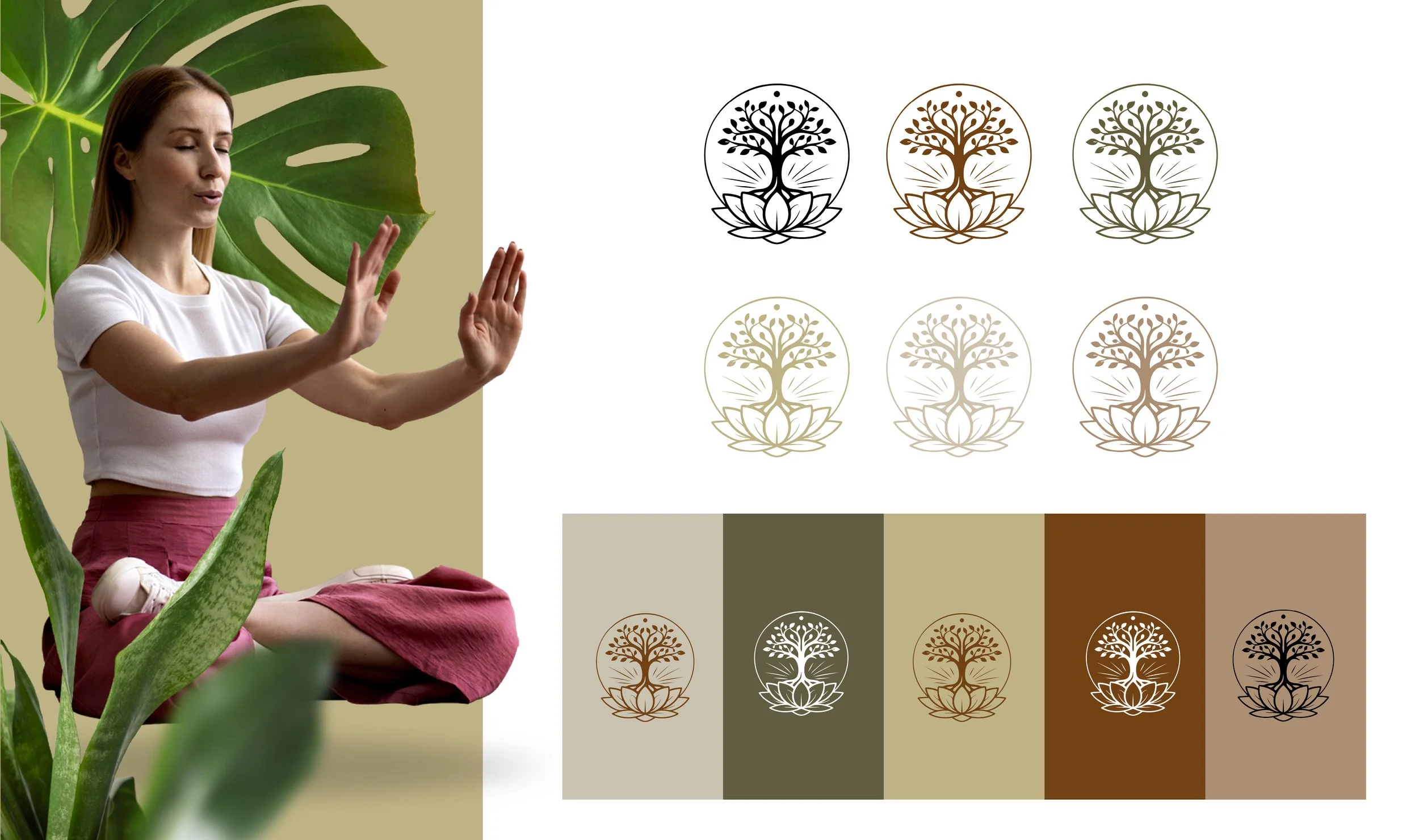
Versatility across touchpoints: The logo had to work consistently across signage, website headers, print collateral, social, and small-format usage—without losing detail or legibility.
Key Creative Solution & Visual Strategy
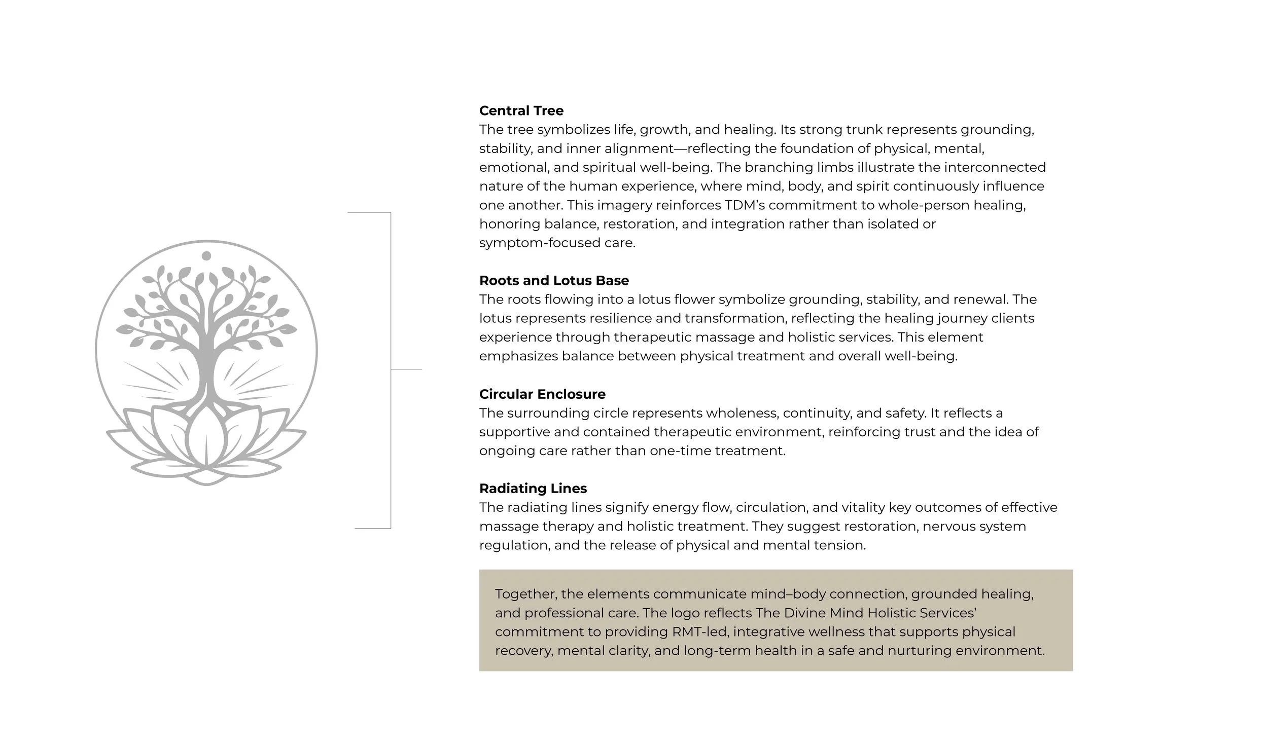
NAV Branding developed an emblem that visually encodes The Divine Mind’s approach to care:
Central Tree: Represents life, growth, and healing. Its strong trunk signals grounding, stability, and inner alignment—reflecting the foundation of physical, mental, emotional, and spiritual well-being.
Roots + Lotus Base: The roots flowing into a lotus symbolize grounding, renewal, resilience, and transformation, mirroring the client journey through therapeutic and holistic services.
Circular Enclosure: Communicates wholeness, continuity, and safety—a contained, supportive environment that reinforces trust and ongoing care (not a one-time treatment).
Radiating Lines: Suggest energy flow, circulation, and vitality, tying to outcomes of effective treatment—restoration, nervous system regulation, and tension release.
Together, the mark communicates mind–body connection, grounded healing, and professional care—a visual anchor for the brand’s promise.
Key Outcomes
A distinctive emblem with narrative depth: The symbol feels intentional and ownable while staying simple enough for repeat use.
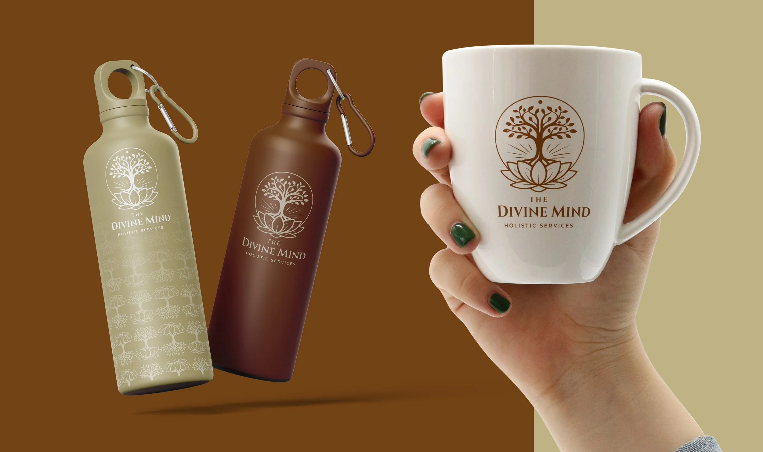
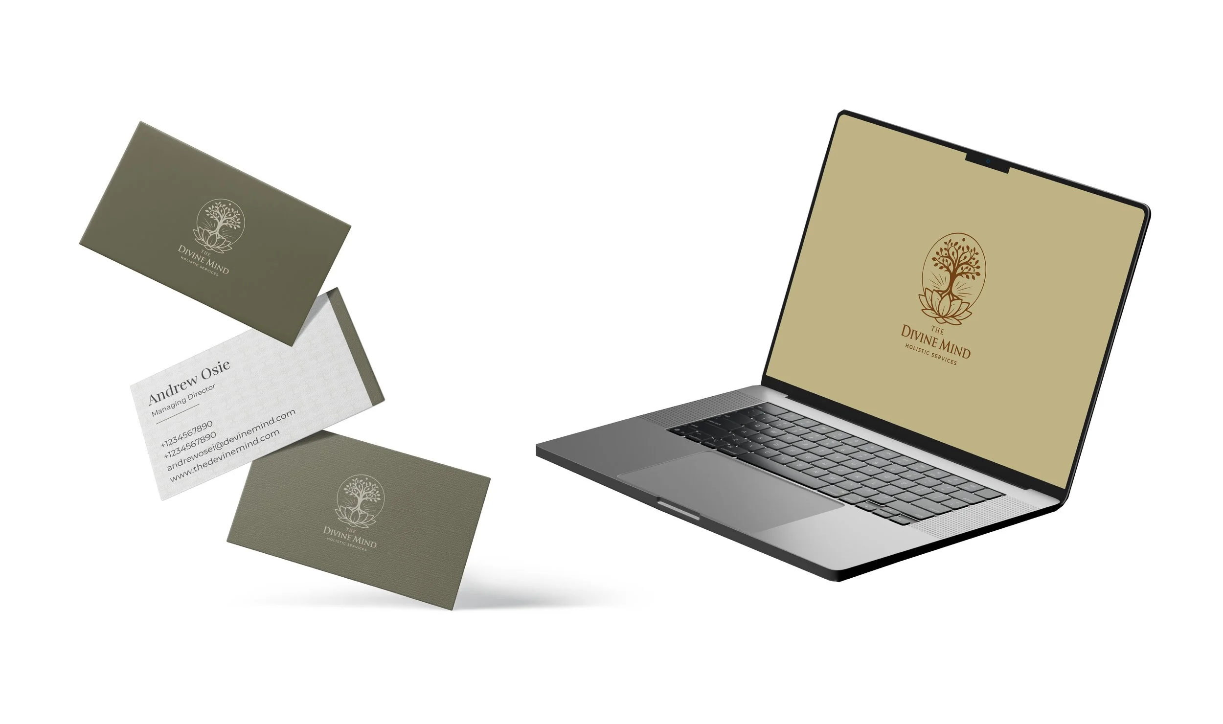
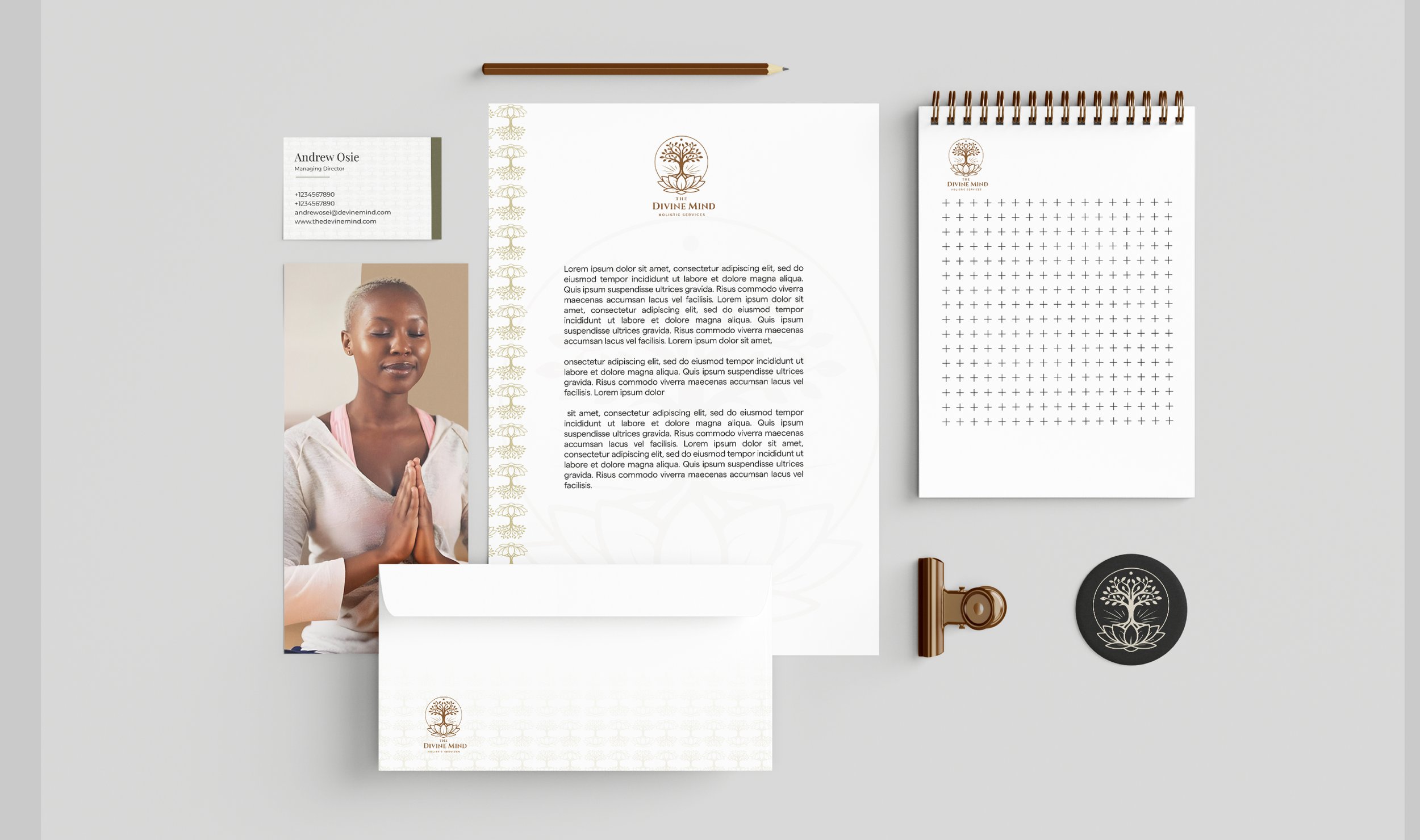
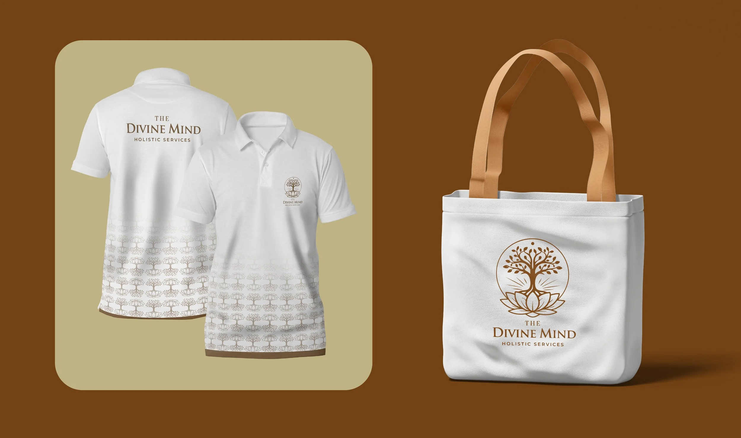
A complete logo system: Primary emblem + wordmark lockups, icon-only usage, monochrome versions, and background-safe variants for consistent application.
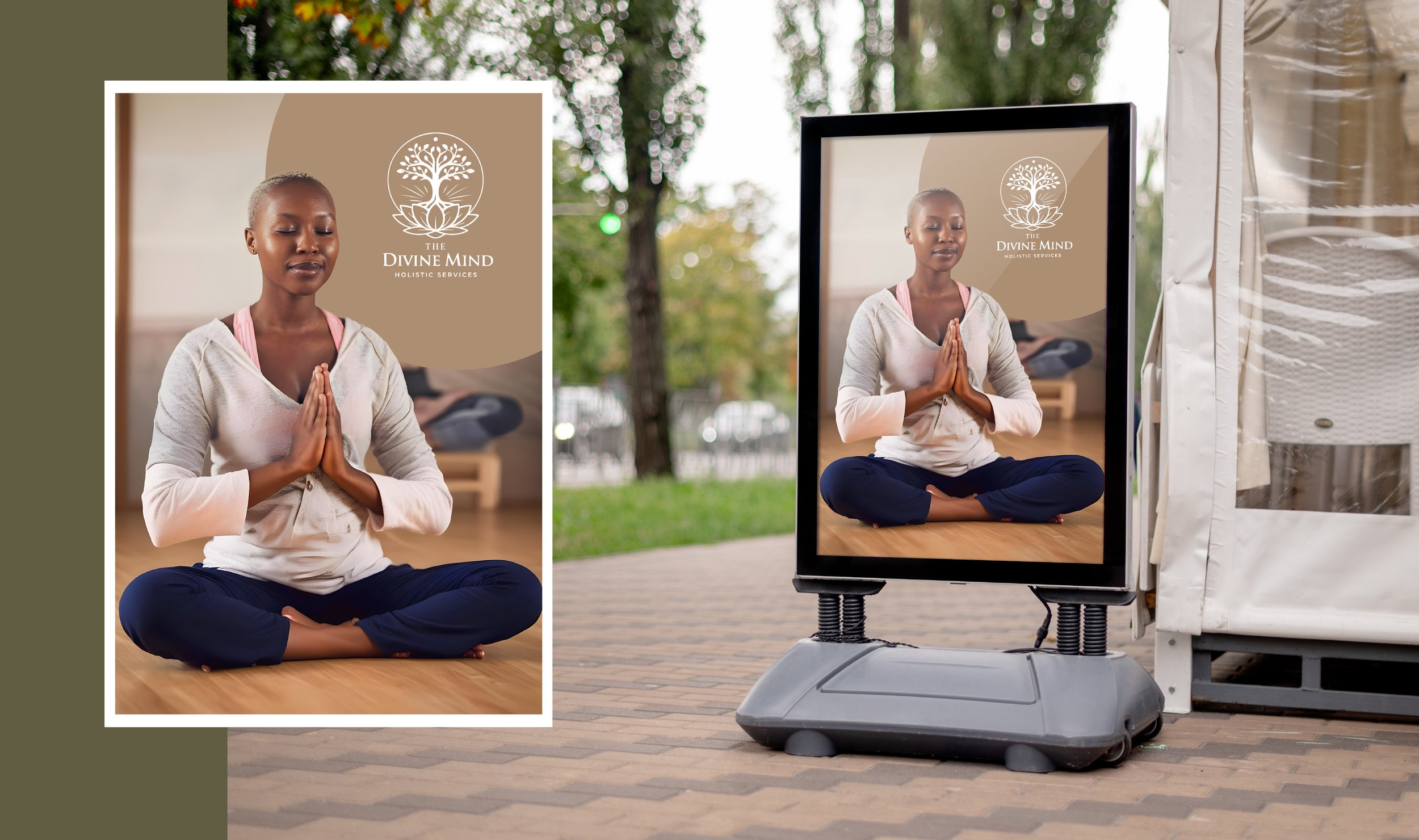
Calm, premium visual direction: A clean, wellness-forward aesthetic that supports both clinical trust and holistic serenity.
Brand guide for consistency: Clear rules for spacing, sizing, placement, and usage across print and digital so the brand stays cohesive as it grows.
Deliverables
Full logo suite (primary, secondary, icon-only, horizontal/stacked, mono variants)
Typography system (headline + body hierarchy)
Color direction and usage guidance (wellness-appropriate, calming, high legibility)
Brand guidelines: clear-space, minimum size, do/don’t rules, mockups/examples
Export package: AI/SVG masters, print-ready PDFs, and web PNGs
Impact
The Divine Mind Holistic Services received a visual identity that aligns with their mission: whole-person healing delivered with professional structure. The brand now has a confident, consistent look that supports marketing, builds trust quickly, and gives clients a sense of calm and safety before they ever walk through the door.
At NAV Branding, we don’t just design logos—we build identity systems that communicate meaning, credibility, and emotion in one cohesive visual language.