


Project Description: Logo & Visual Identity for Zen Flõ Ecotherapy
Client: Zen Flõ Ecotherapy
Project Type: Logo Design & Visual Identity System
Services Provided: Branding, Logo Design, Visual Identity, Brand Guidelines, Digital + Print Assets
Overview
NAV Branding designed a refined logo and visual identity for Zen Flõ Ecotherapy—a nature-forward wellness brand rooted in calm, restoration, and grounded growth. The goal was to create a brand that feels peaceful and premium, while clearly communicating an eco-therapy focus through subtle symbolism and a clean, modern typographic system.
Issues Identified
Need for instant “calm + nature” recognition: The identity had to quickly signal serenity and natural alignment without feeling generic or overly “hippie.”
Balancing warmth and professionalism: The brand needed to feel inviting and human while still credible and elevated.
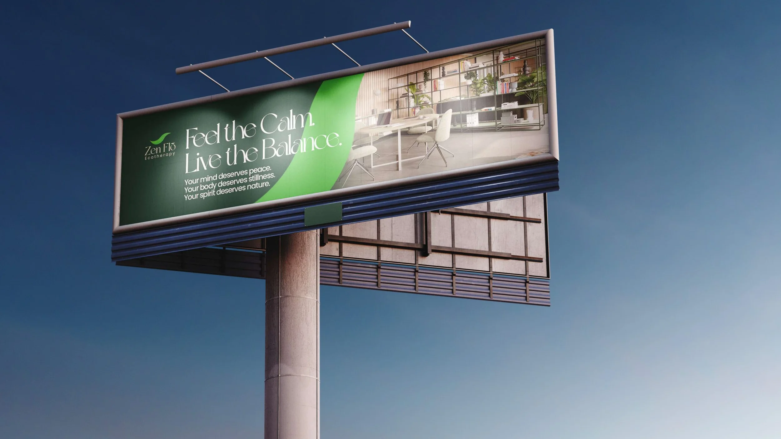
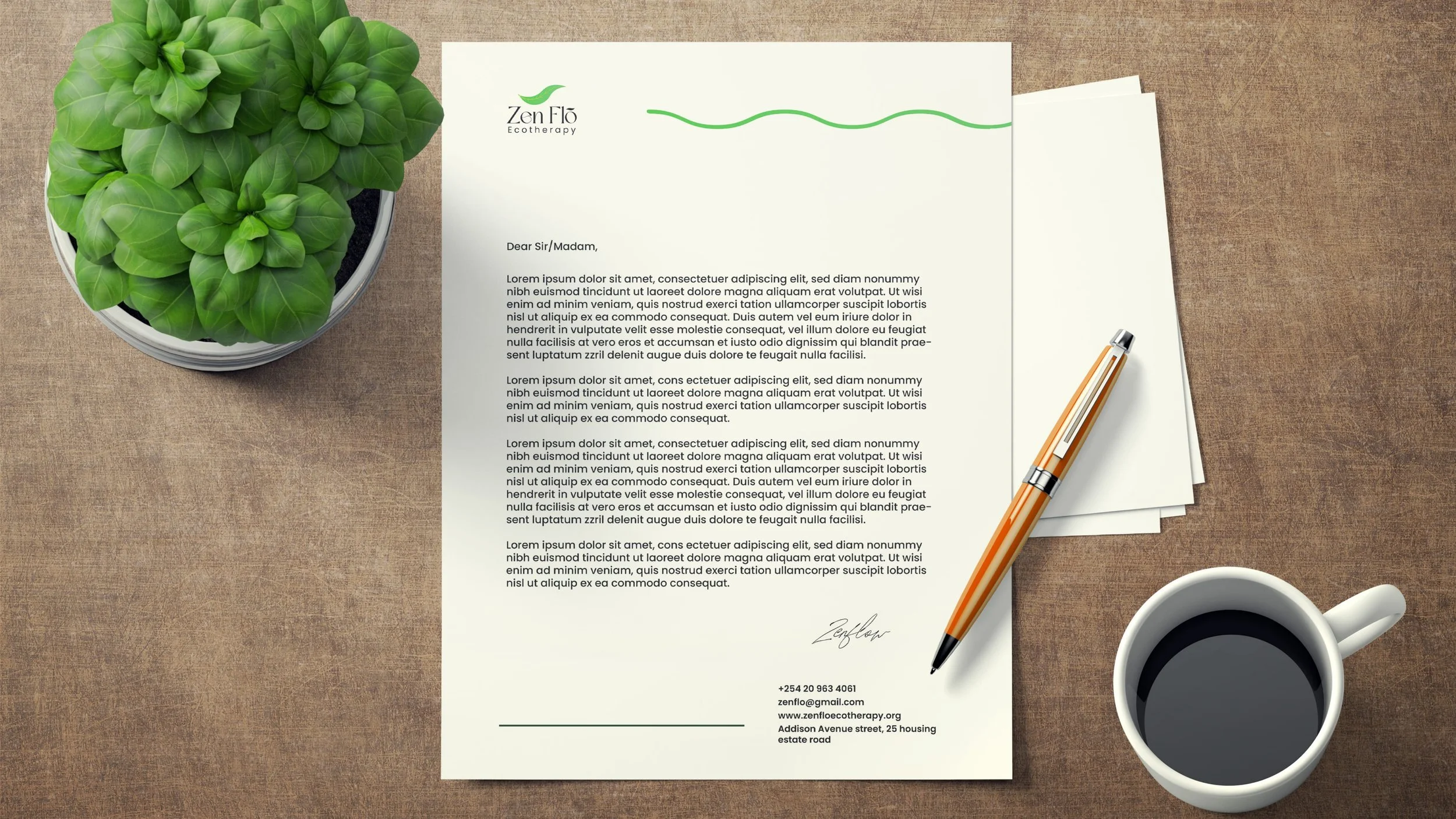
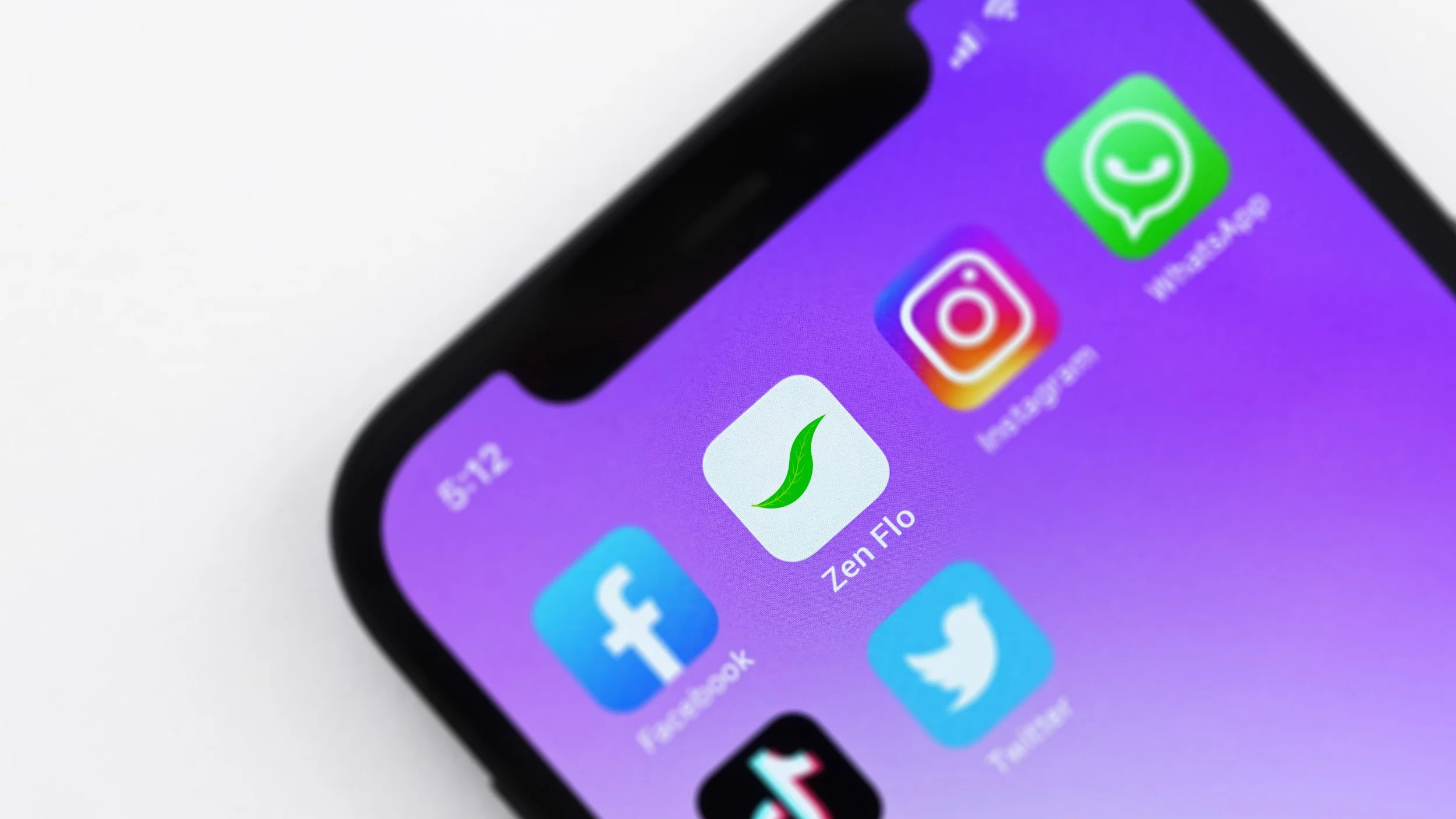
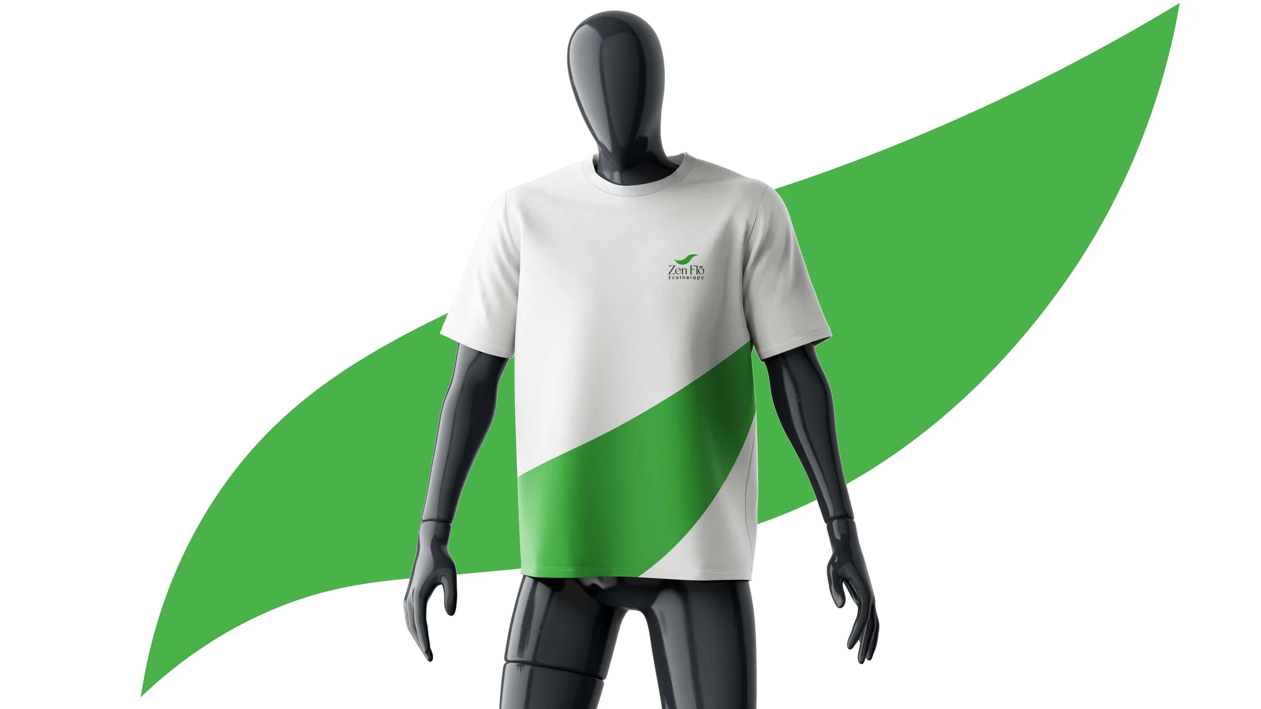
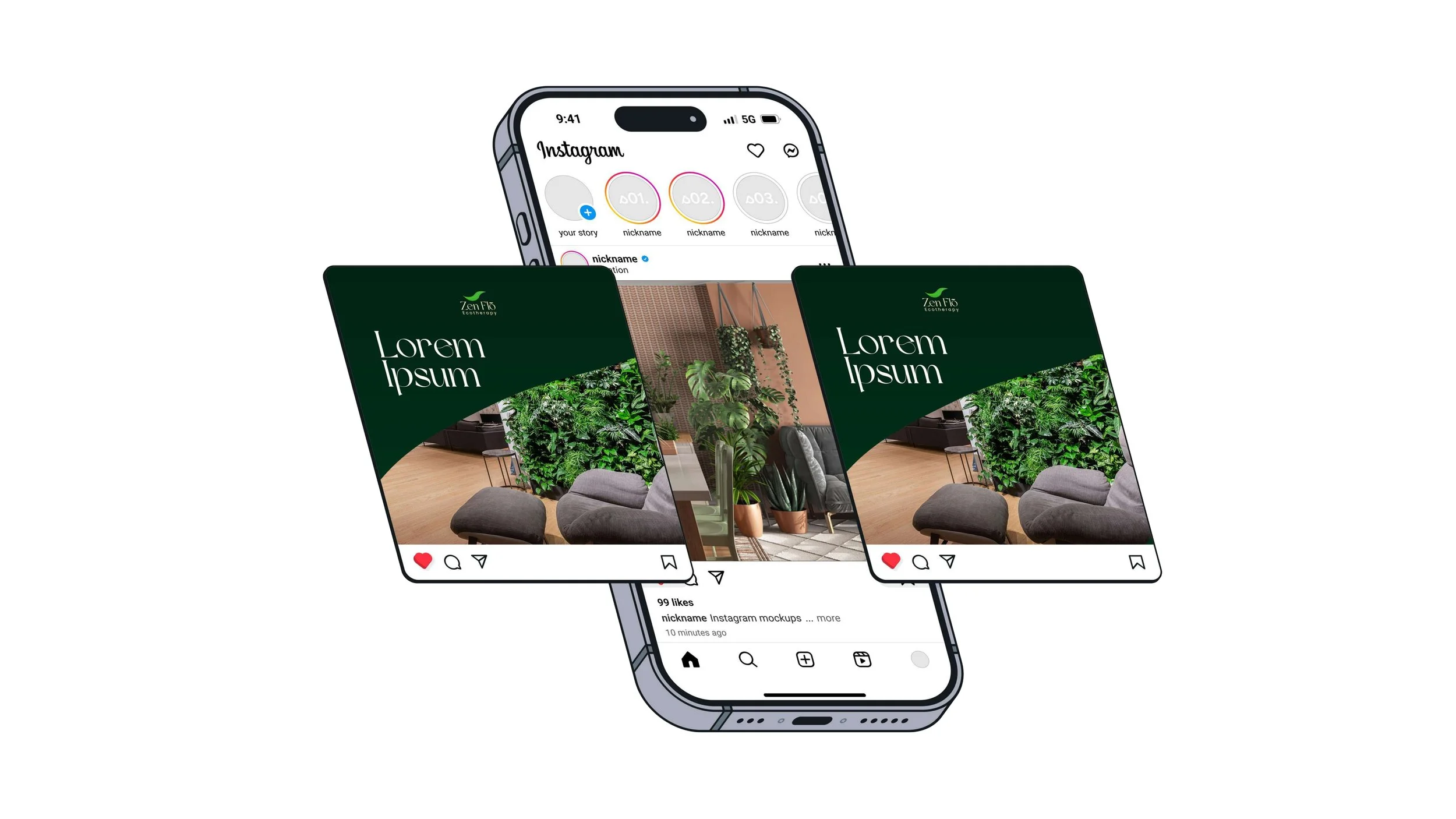
Versatility across touchpoints: The logo had to work on dark and light backgrounds, small formats (social icons) and larger brand applications (signage, print, web headers).
Key Outcomes
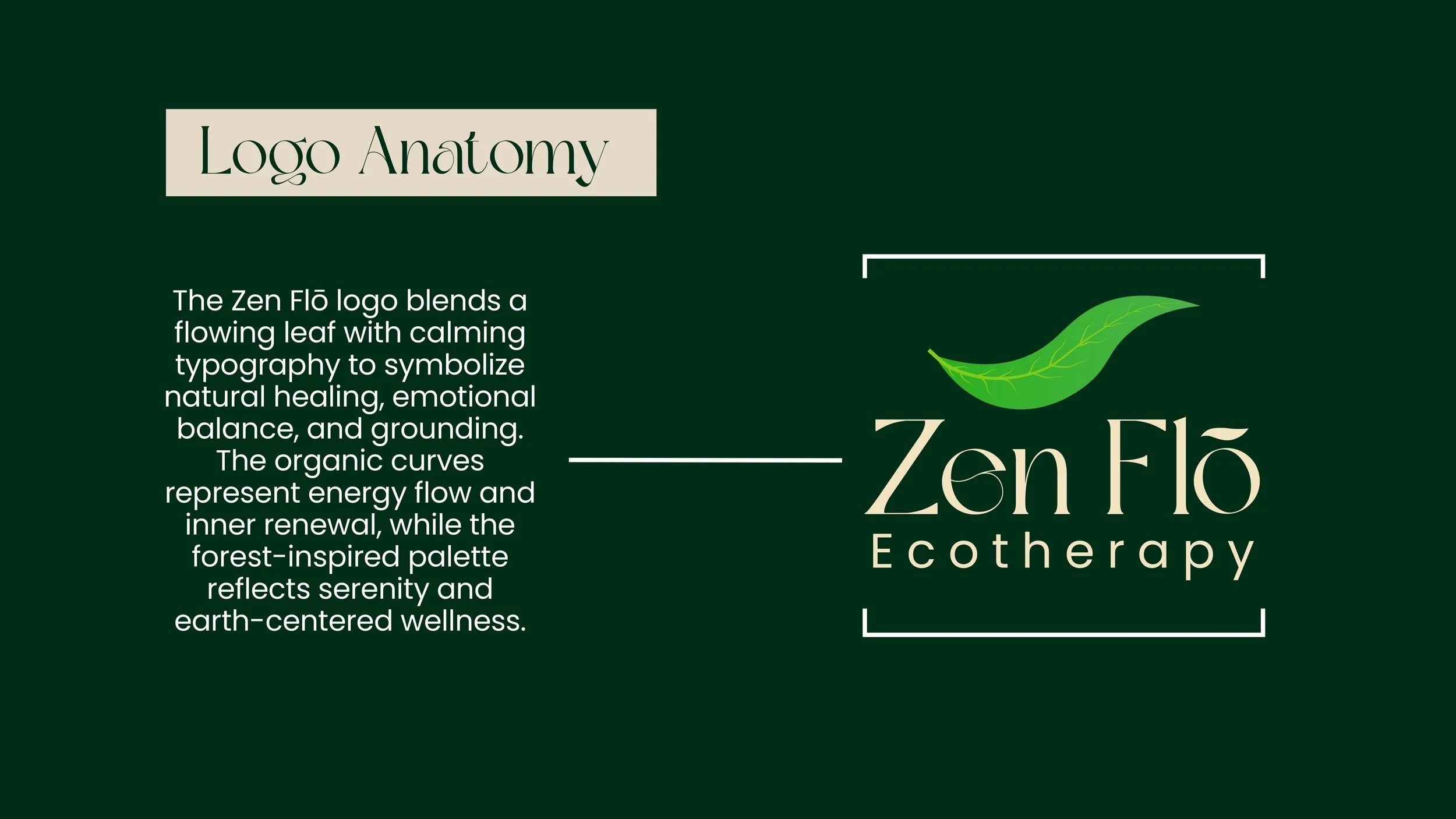
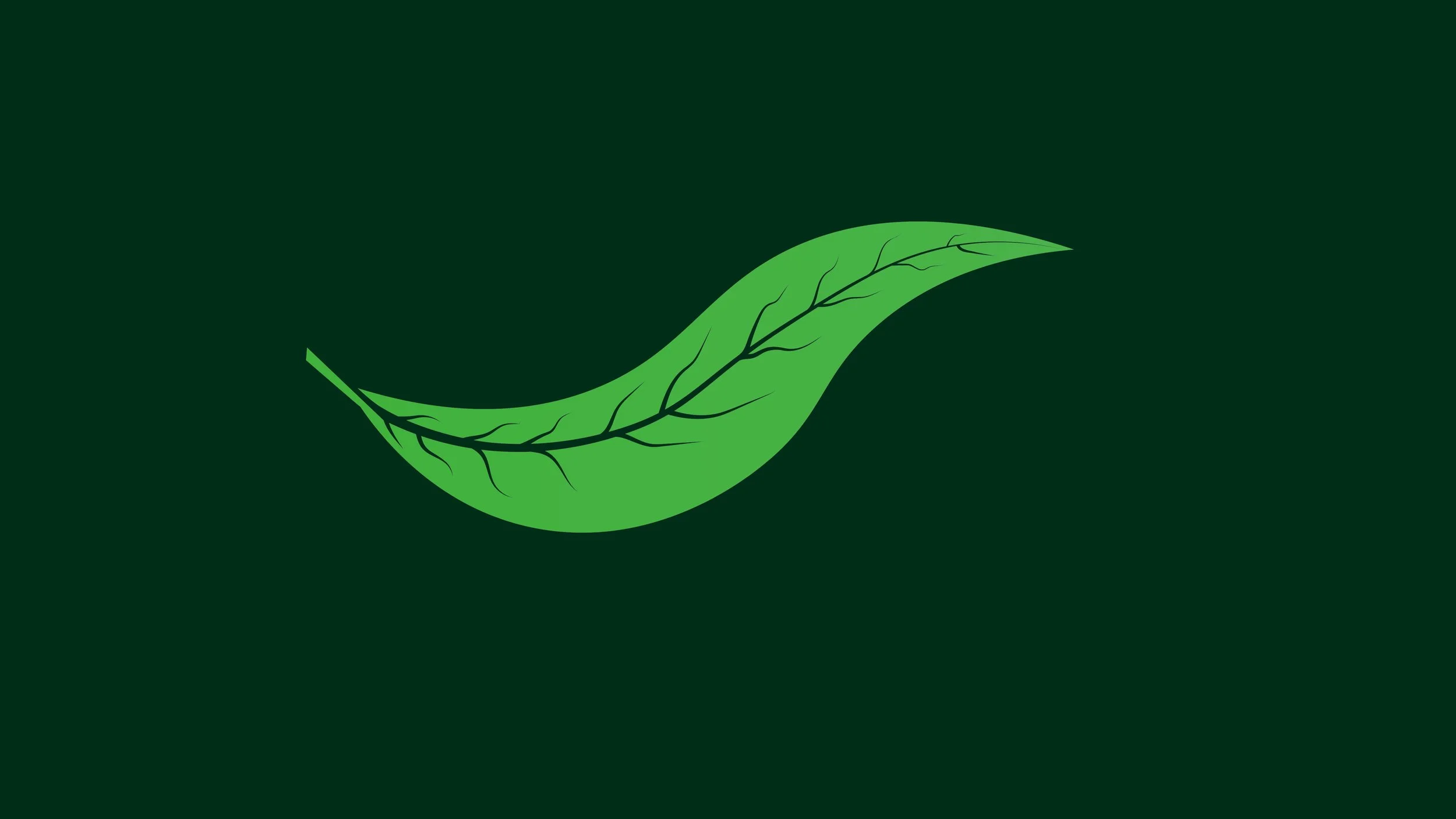
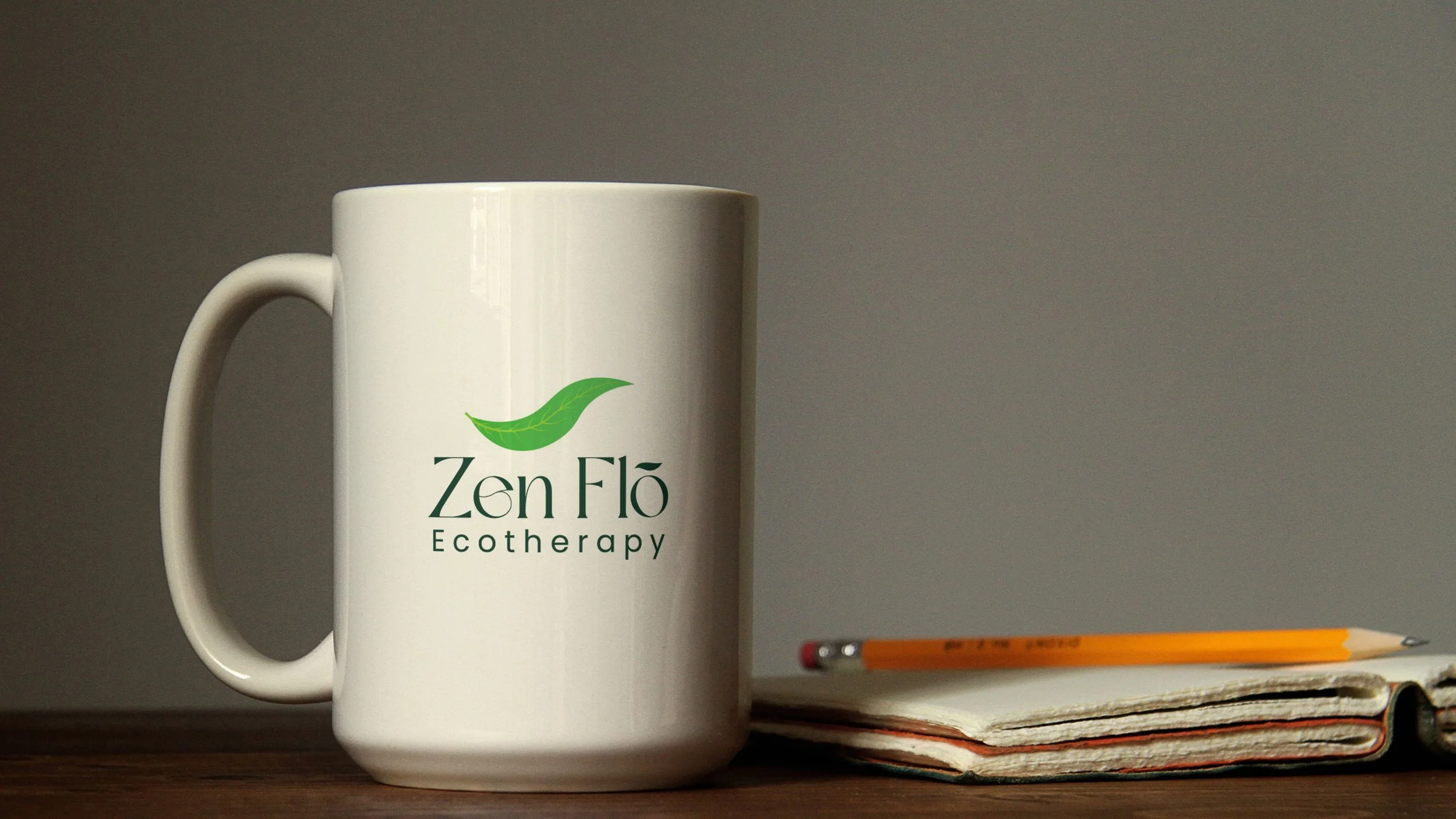
Iconic Nature Mark: NAV created a simplified leaf emblem that communicates eco-therapy instantly. The leaf’s flowing shape reinforces the idea of “Flõ”—movement, breath, rhythm, and ease—without adding visual noise.
Premium Typography System: A high-contrast serif wordmark gives the brand a sophisticated, boutique feel, while the clean supporting type for “Ecotherapy” keeps it readable and modern.
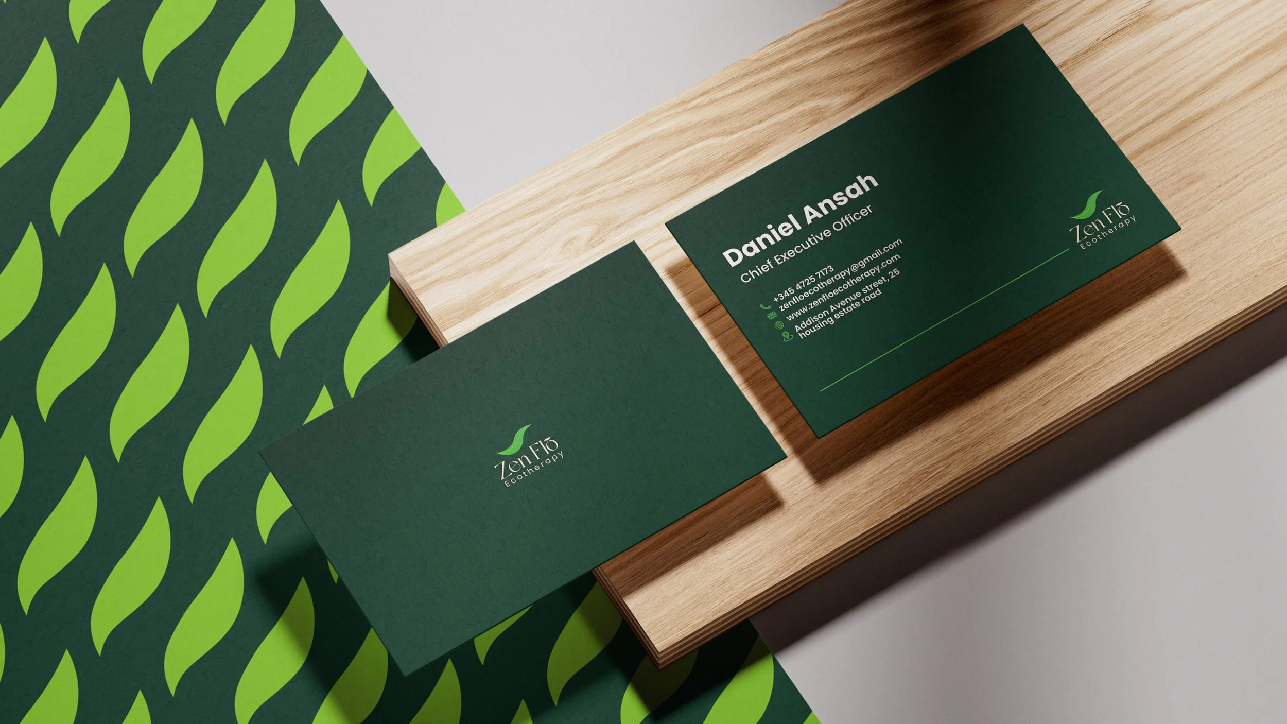
Distinctive Naming Detail: The “Flõ” treatment (including the diacritic) becomes a signature brand cue—unique, memorable, and aligned with the “flow” concept.
Calming Color Palette: A deep forest green foundation paired with warm, soft neutrals creates a grounded, restorative tone. Bright green accents in the leaf add freshness and vitality while maintaining balance.
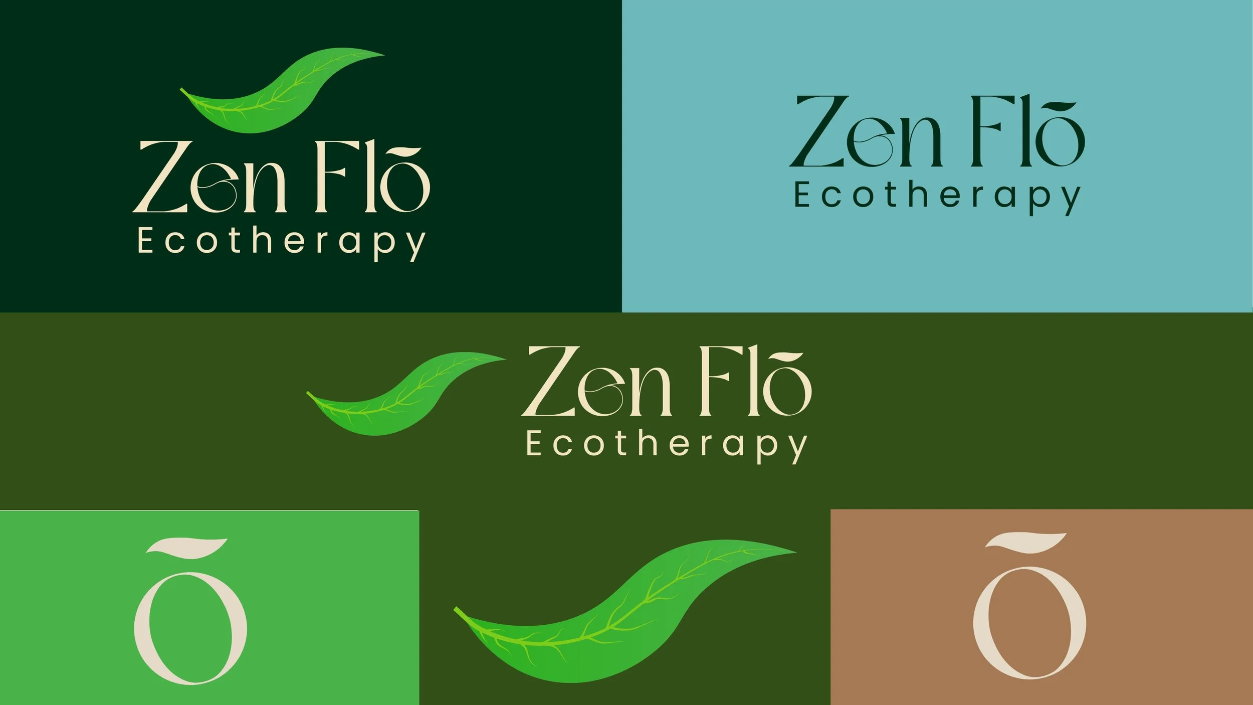
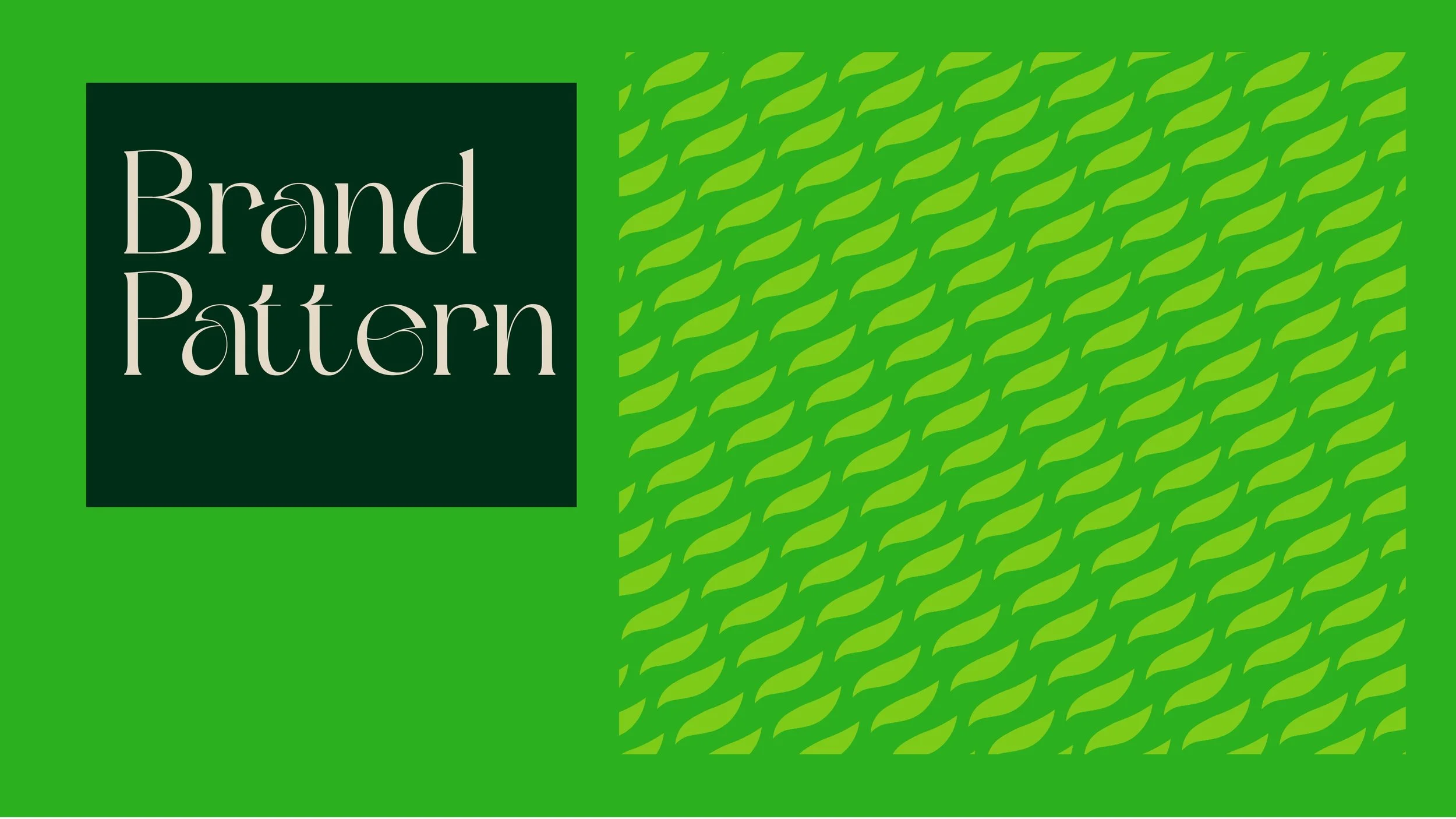
Full Identity Suite: Delivered a complete logo system (primary lockup, icon-only mark, horizontal/stacked options, monochrome variants) plus practical rules for spacing, minimum size, and background usage.
Deliverables
Primary logo lockup + secondary variations (dark/light, mono, icon-only)
Color palette (primary + accent tones) with usage guidance
Typography hierarchy (headings, body, supporting type)
Brand guide outlining clear-space, sizing, and do/don’t examples
Export package: AI/SVG masters, print-ready PDFs, PNGs for web/social, favicon-ready icon
Impact
Zen Flõ Ecotherapy received a cohesive, recognizable identity that feels calm, credible, and unmistakably nature-led. The new brand system provides a strong foundation for consistent marketing across website, social, print collateral, and future expansion—while staying true to the emotional promise of the service: clarity, grounding, and flow.
At NAV Branding, we build identities that are simple enough to scale, distinct enough to remember, and designed with intention—so brands like Zen Flõ can show up with confidence from day one.